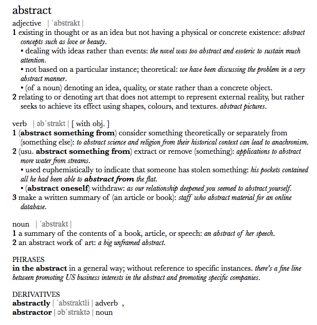
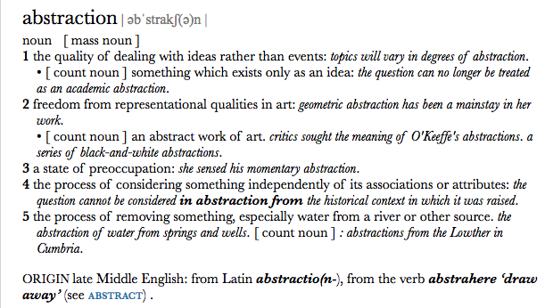
What do we mean by abstraction?
|
Good photographers will say that every photograph is abstract. There are different levels of abstraction, some photographs can be slightly abstract which is when we are able to tell what the subject is, others can be very abstract which is when we cannot tell what the subject is. In this project I will be exploring further into abstraction and research some photographers who are into abstract photography.
|
The Formal Elements
|
Focus:
Light: Line: Repetition: Shape: Space: Texture: Value/Tone: |
Which areas appear clearest or sharpest in the photograph? Which do not?
Which areas of the photograph are brightest? Are there any shadows? Does the photograph allow you to guess the time of day? Is the light natural or artificial? Harsh or soft? Reflected or direct? Are there objects in the photograph that act as lines? Are they straight, curvy, thin, thick? Do the lines create direction in the photograph? Do they outline? Do the lines show movement or energy? Are there any objects, shapes or lines which repeat and create a pattern? Do you see geometric (straight edged) or organic (curvy) shapes? Which are they? Is there depth to the photograph or does it seem shallow? What creates this appearance? Are there important negative (empty) spaces in addition to positive (solid) spaces? Is there depth created by spatial illusions i.e. perspective? If you could touch the surface of the photograph how would it feel? How do the objects in the picture look like they would feel? Is there a range of tones from dark to light? Where is the darkest value? Where is the lightest? |
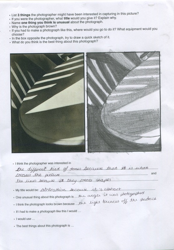
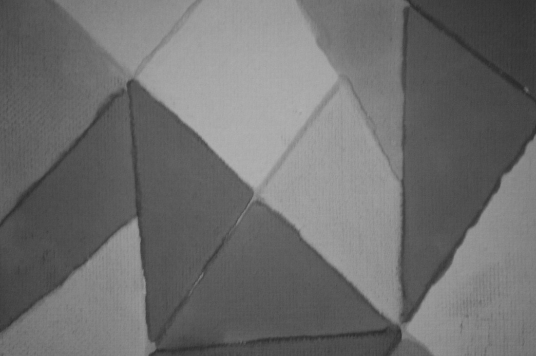
In this lesson our teacher asked us to analyse and recreate this picture by Paul Strand called "Abstraction,twin lakes, Connecticut" which was made in 1916. We can tell that Paul Strand deliberately made this picture abstract to make us look further into the formal elements.
|
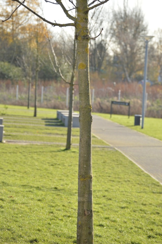
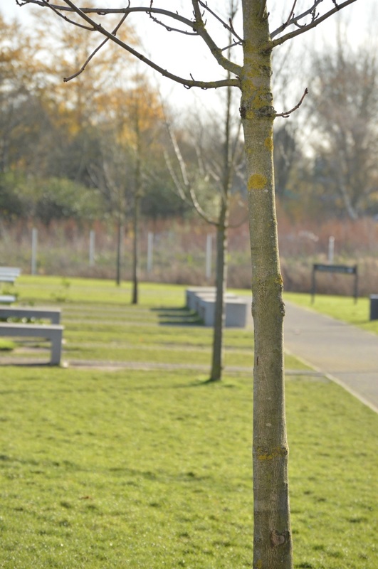
Focus: Here the picture is in focus, however, the sides of the subject are soft. Light: The light in this picture is quite interesting, there is a triangular shape in the middle and some lines coming from the other subject out of the shot Line and Shape: There are a lot of lines in this picture especially straight lines, however the picture is kept interesting by the curved line.All lines are also very geometric. Repetition: The white straight lines are repeated quite often in this picture,they create quite a nice rhythm. There are also some parallel lines which creates this same feeling and almost make a beat. Space: There isn't much space in this picture as it is very tightly cropped, I believe that this is because the photographer wanted to make the picture very abstract so went very close to the subject Texture: The texture in this picture is quite smooth, the patches of light are what make the picture more interesting. Value/Tone: this picture has a range of different tones from light to dark, we can see some deep shadows but also mid tones. |
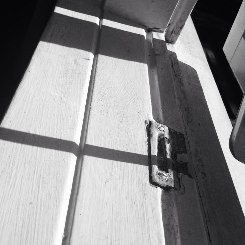
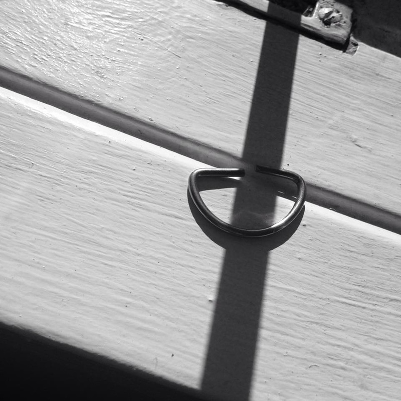
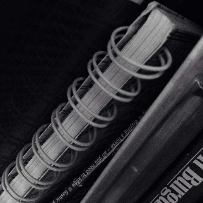
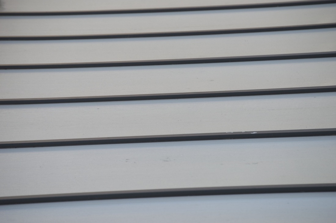
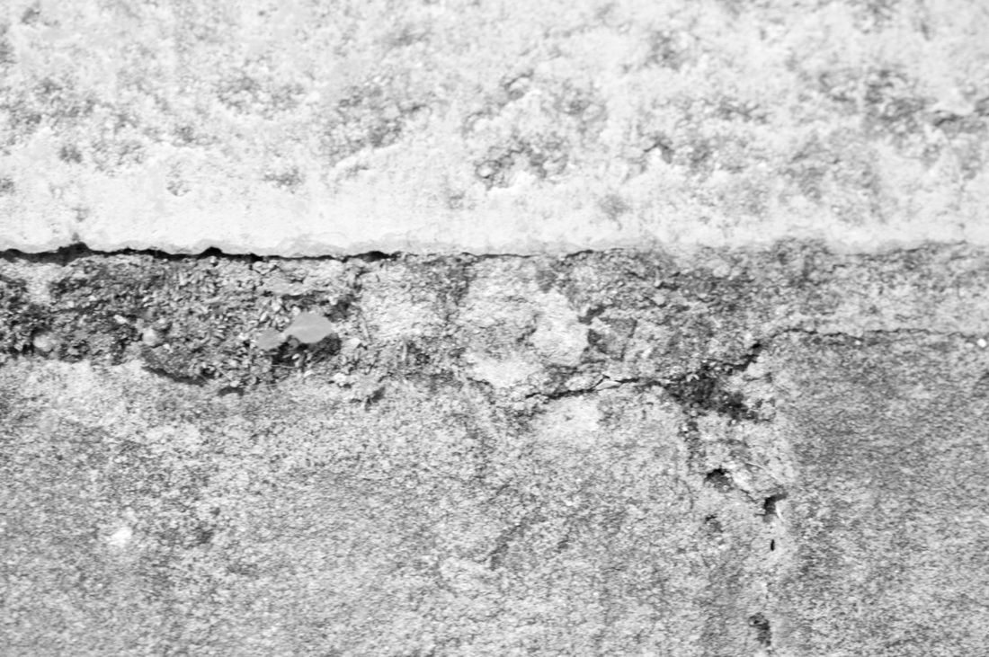
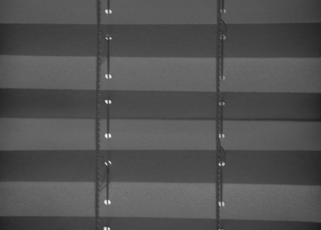
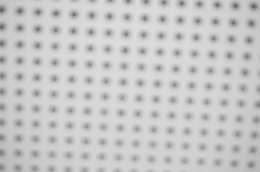
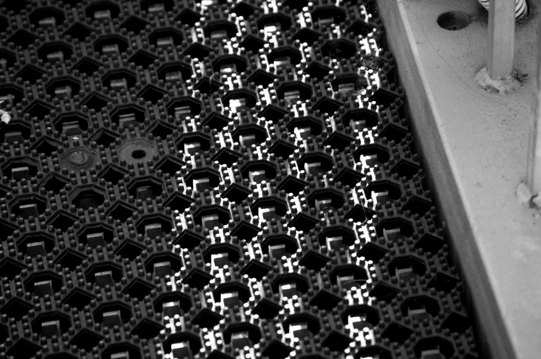
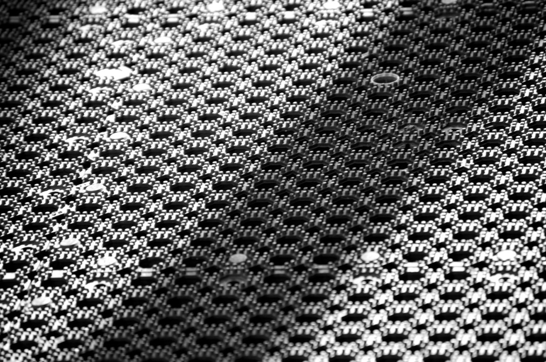
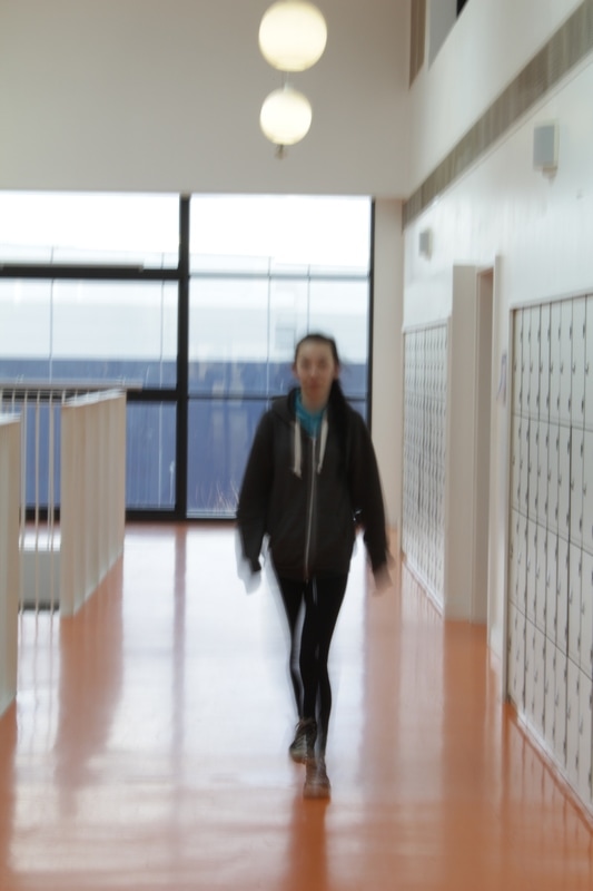
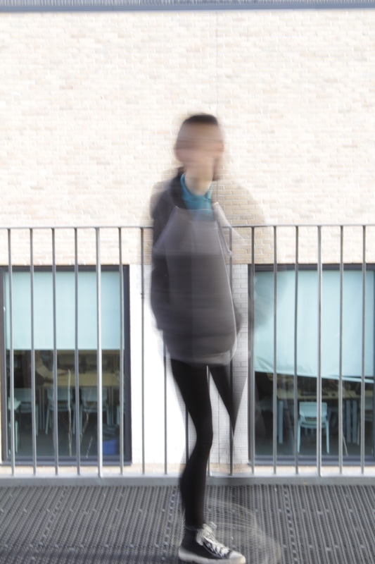
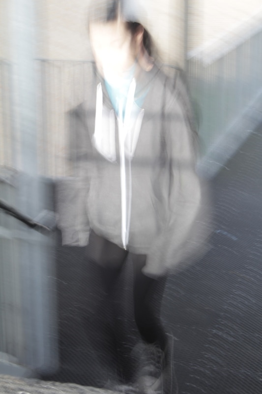
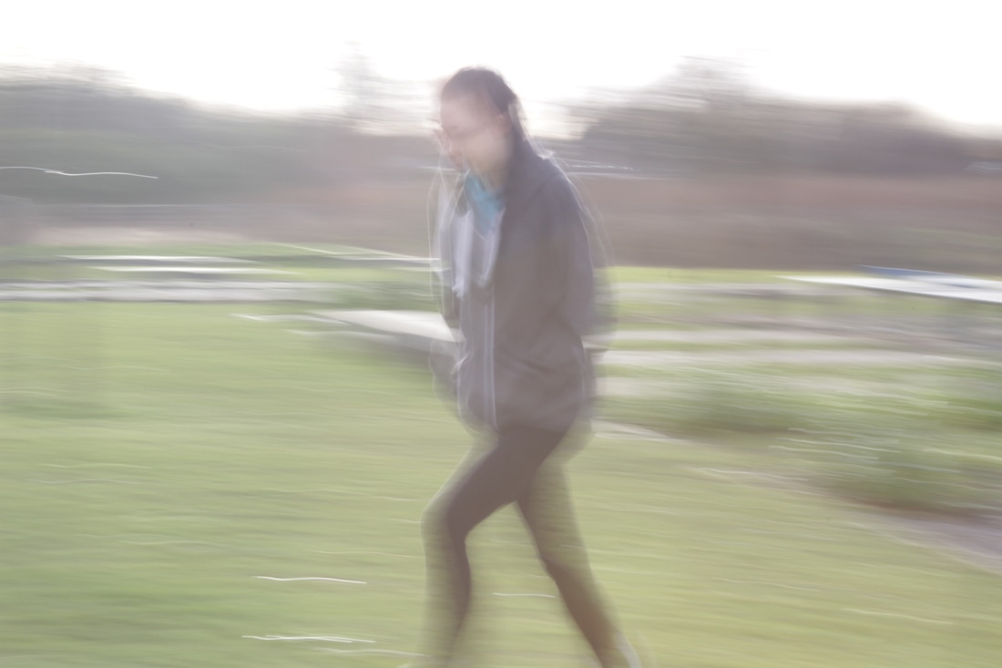
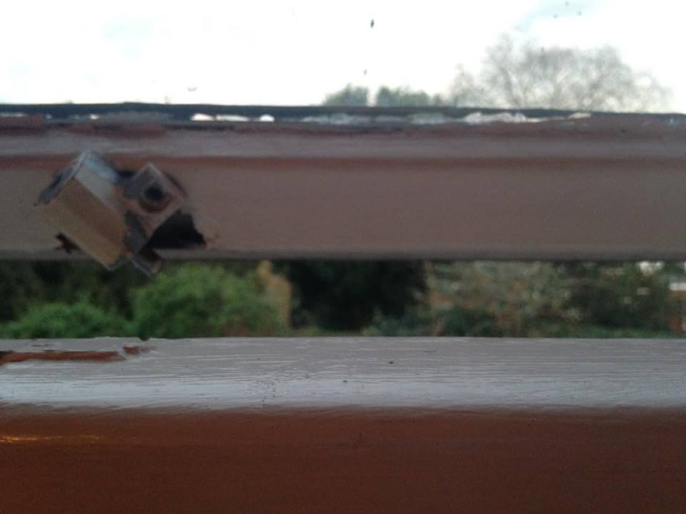
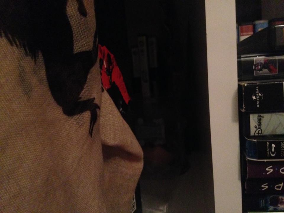
My first set of abstract pictures
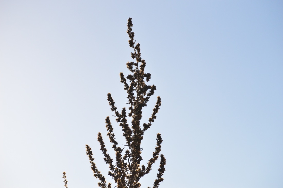
I was keen to create some photographs that explored my initial understanding of abstraction. I thought I might look for strange objects, patterns and shapes, obstructions and other surprising scenes.
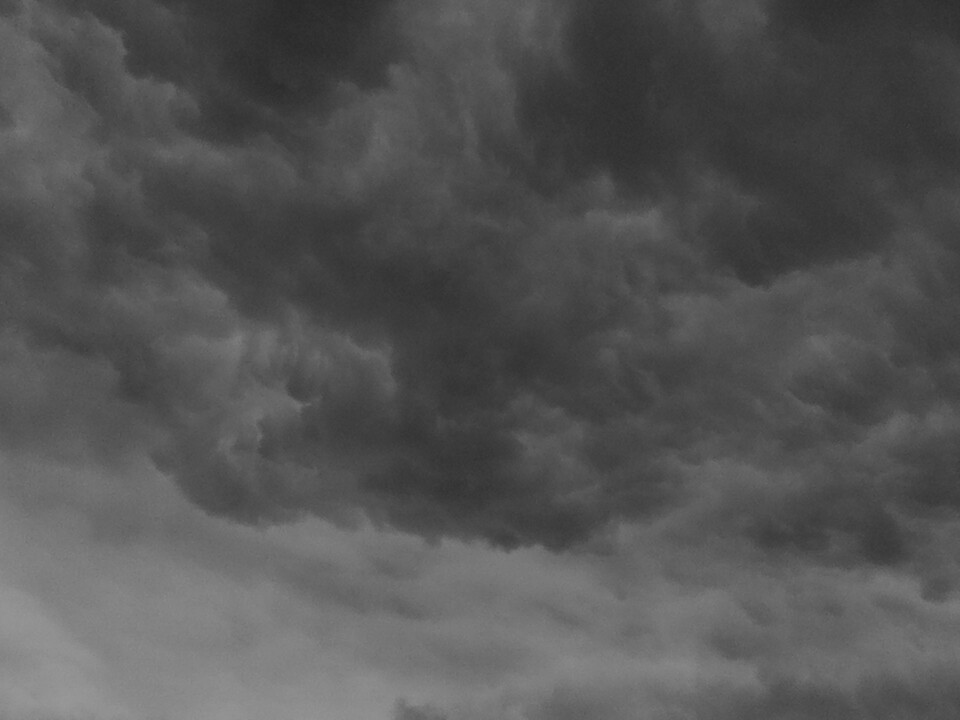
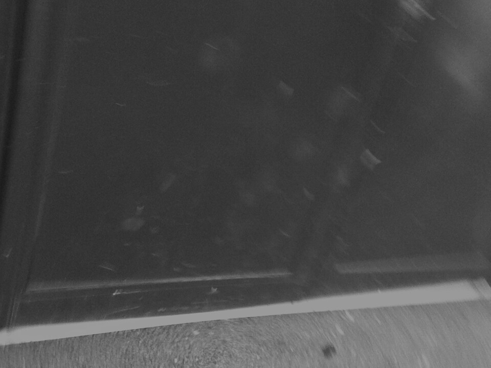
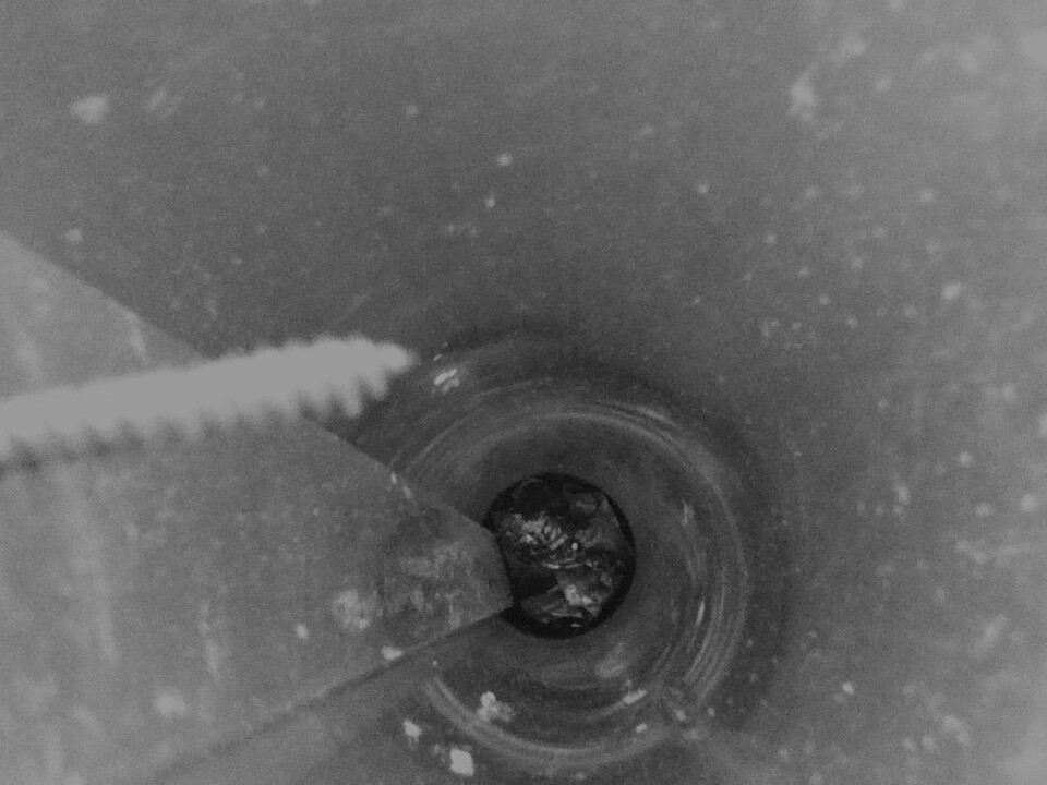
I am quite pleased with the set of pictures which I have produced especially considering this was my first time making abstract photographs. I think that next time I will explore more about abstraction using light and longer exposure.
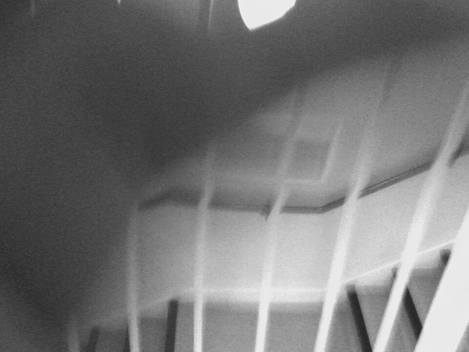
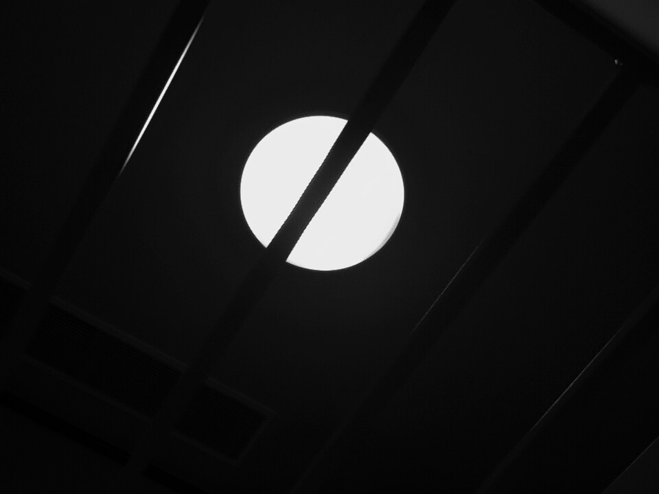
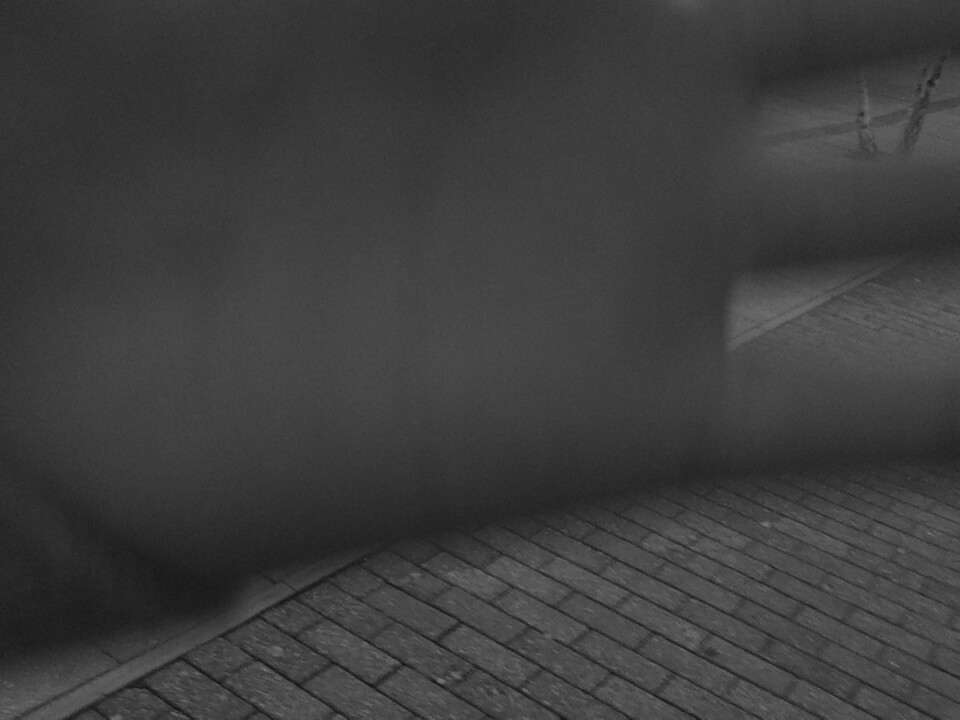
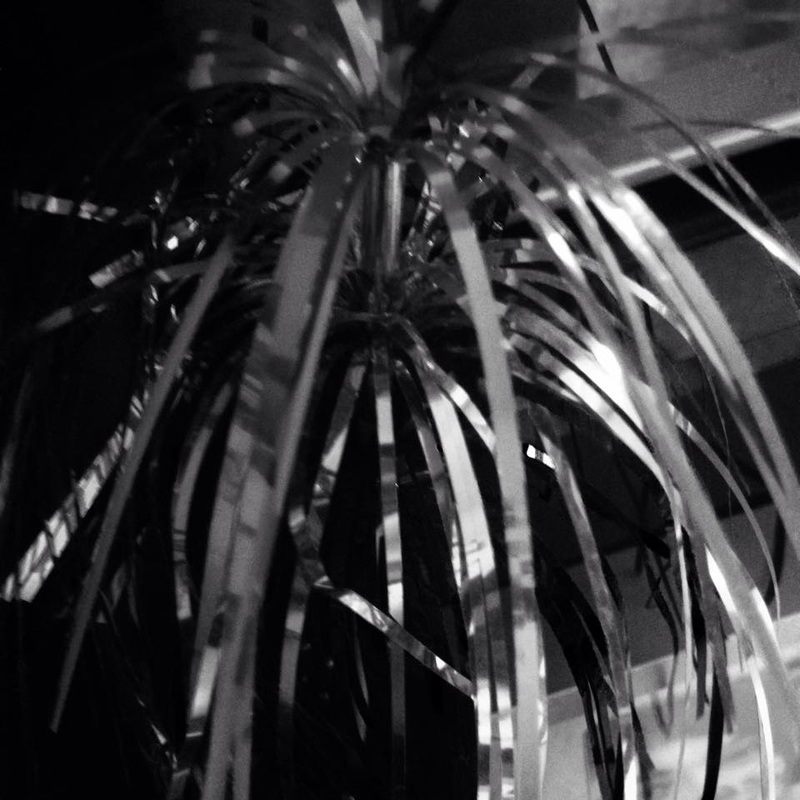
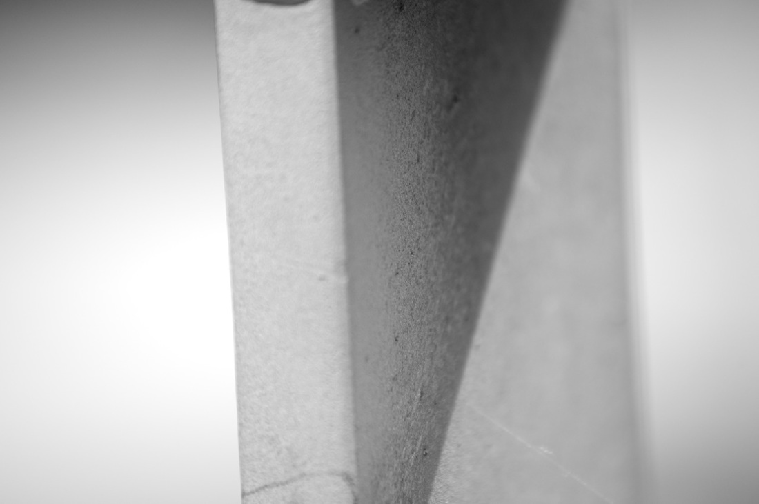
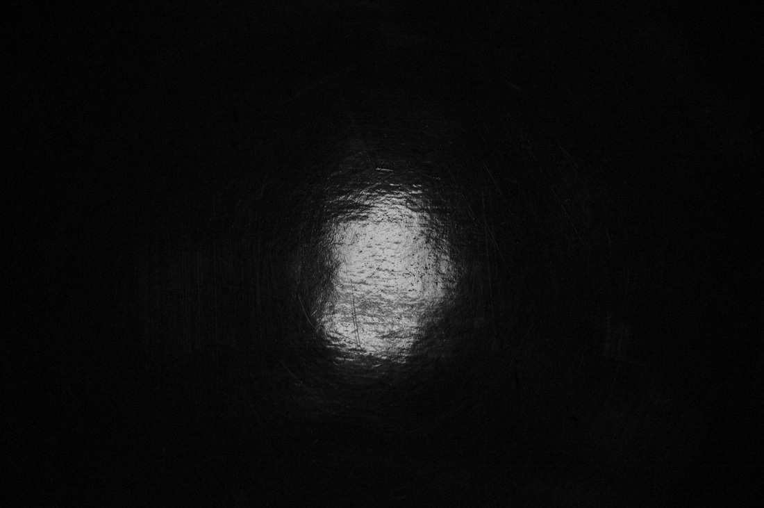
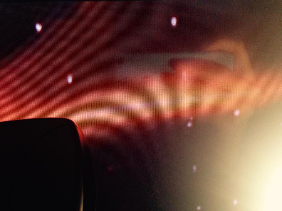
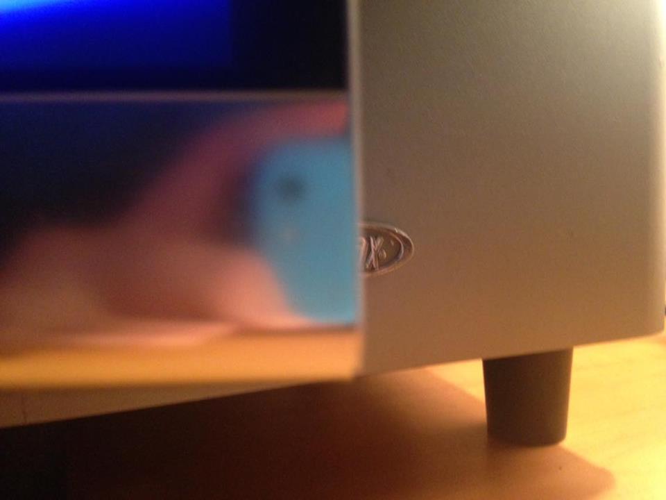
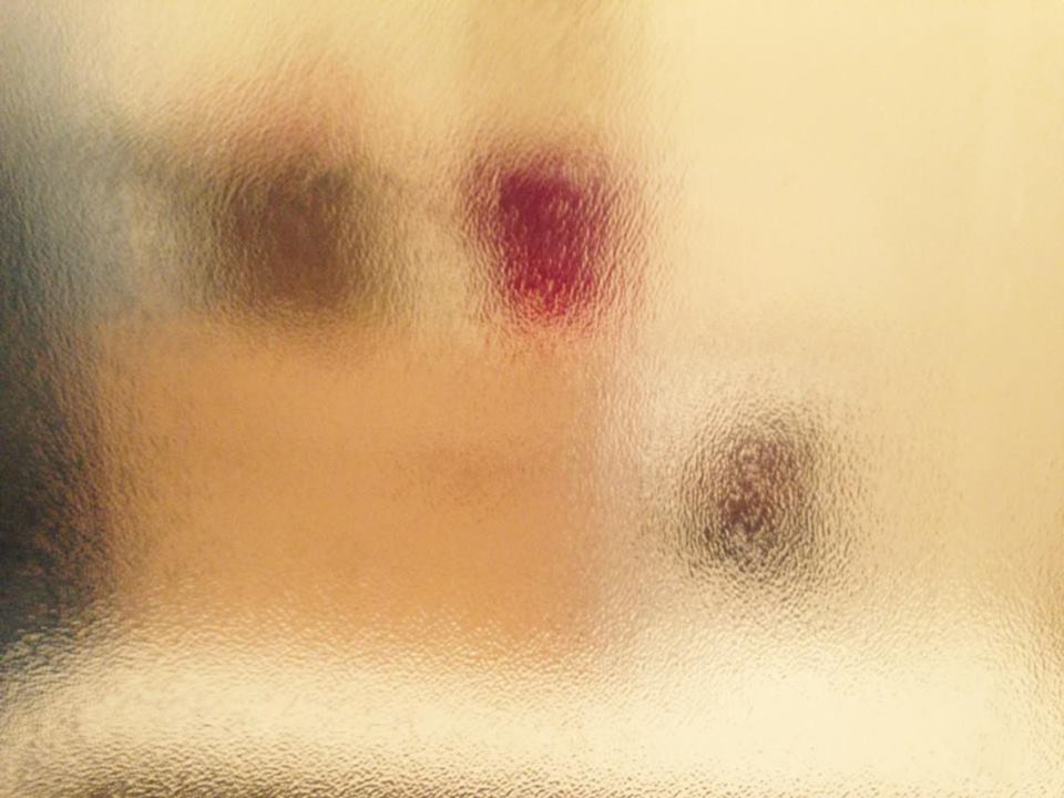
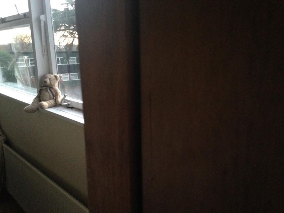
Abstract pictures from home
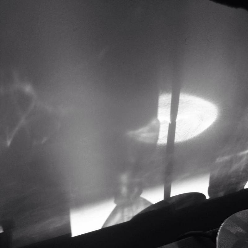
When taking these pictures I was mostly focusing on Light and Lines,I was trying to get a silhouette and a very abstract picture.

|

|
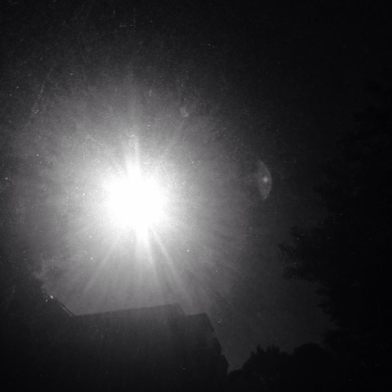
I like both of these pictures the most because I think that they are very abstract and the lighting of the picture really makes it abstract and give it more of an abstract look, to take those pictures I made sure that I was positioned in a dark place but that the light was still hitting the object, the difference between those two pictures is that the picture on the right is the sun so the light of the sun is what is making the whole picture very abstract, in this picture everything around the sun look very dark so we cannot work out what is around it. whereas the picture on the right is a party object which is glossy and had different shades of colours which helped with the lighting and also the contrast is also quite string in this picture.
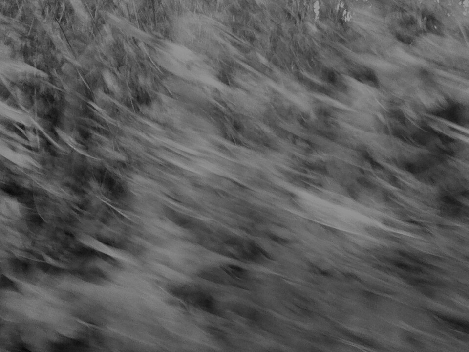
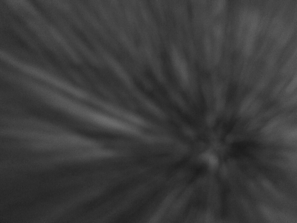
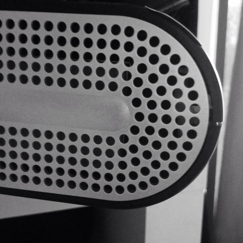
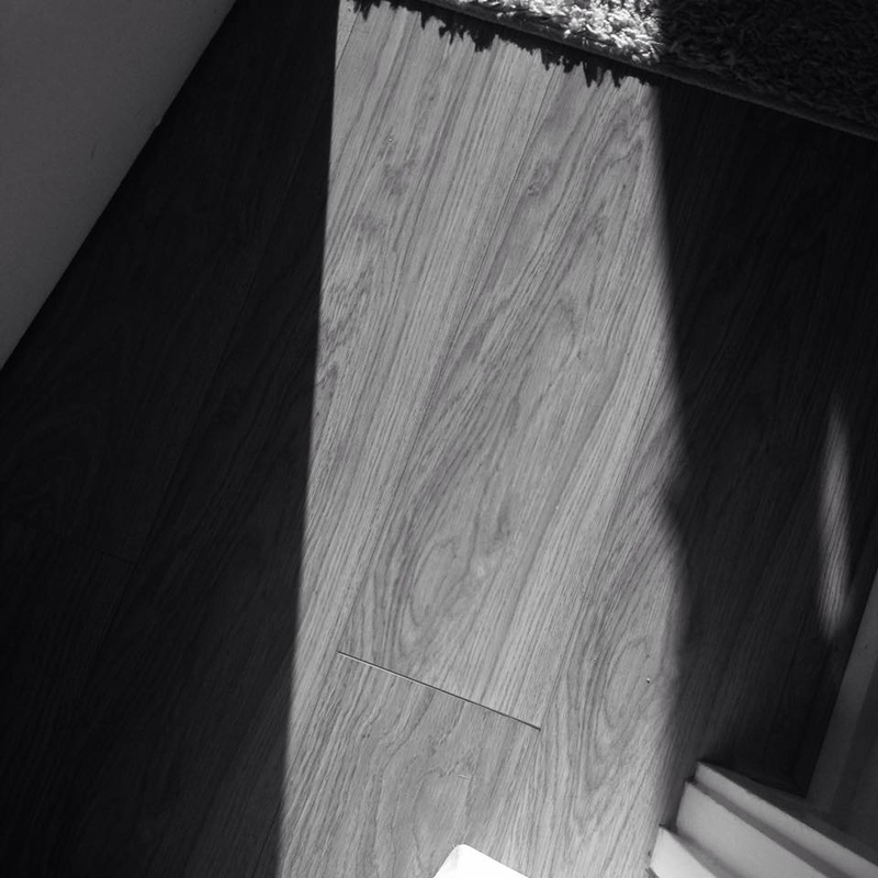
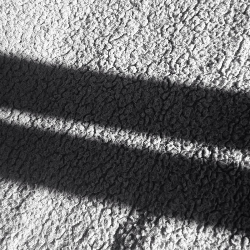
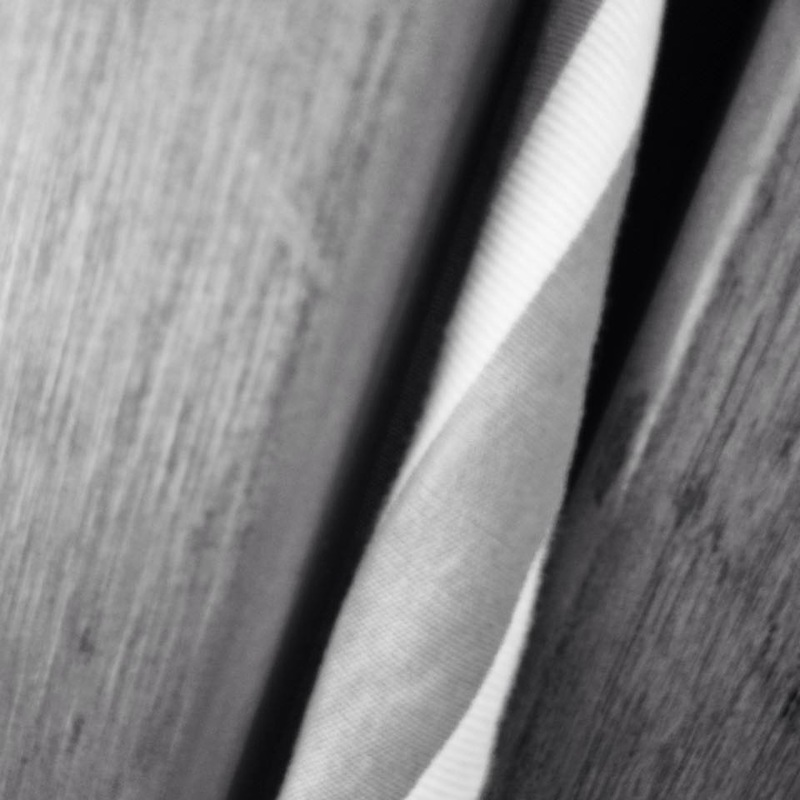
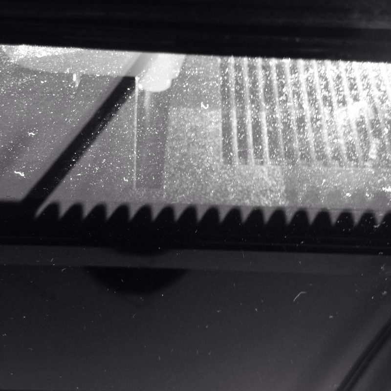
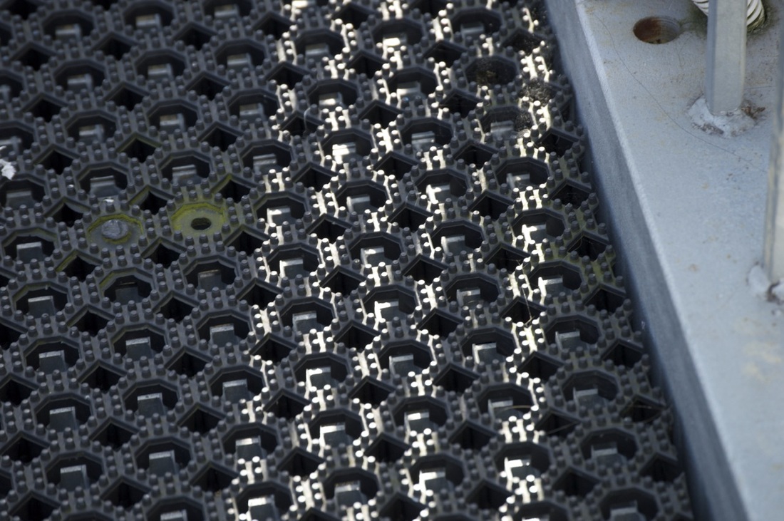
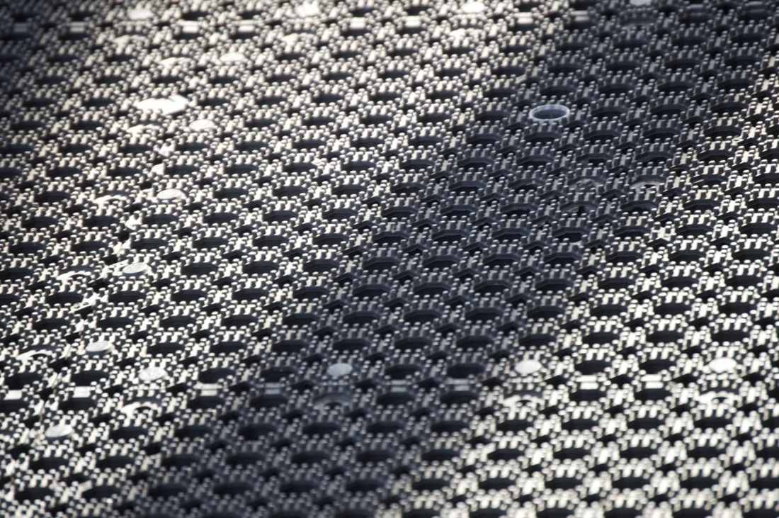
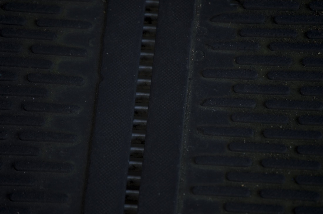
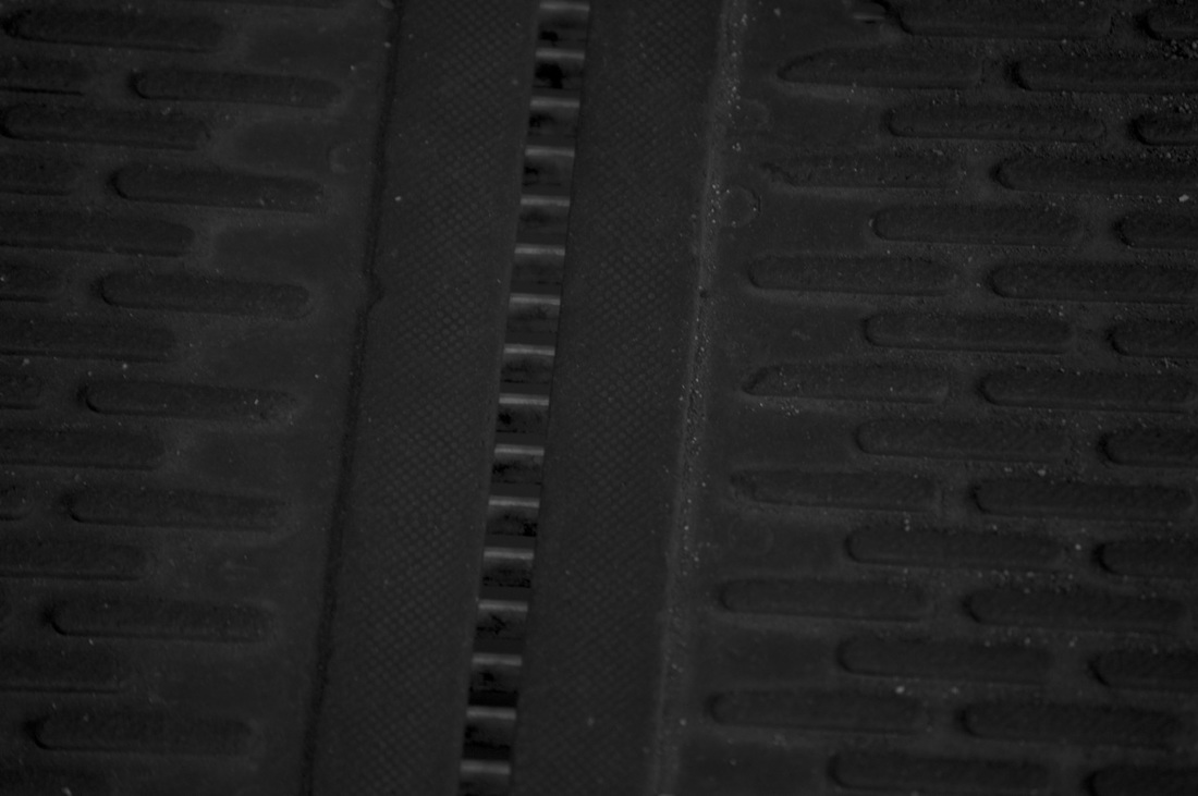
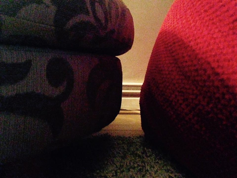
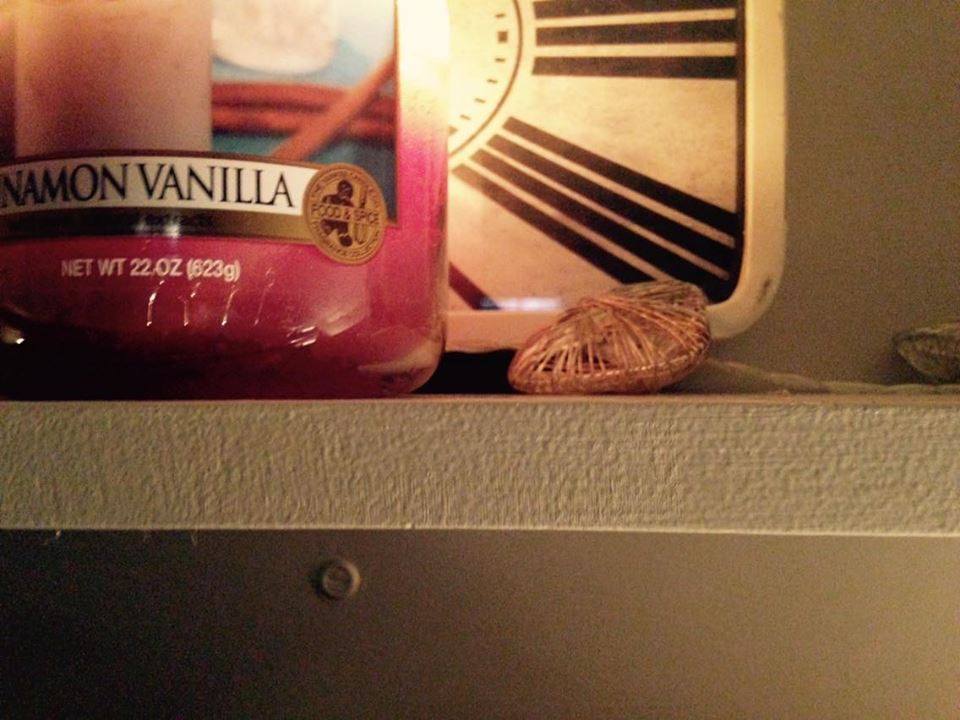
My second set of pictures (unedited)
With there pictures I was focusing on shape and texture.
Edited pictures
I decided to edit these pictures because I thought they would look more abstract and effective colourless
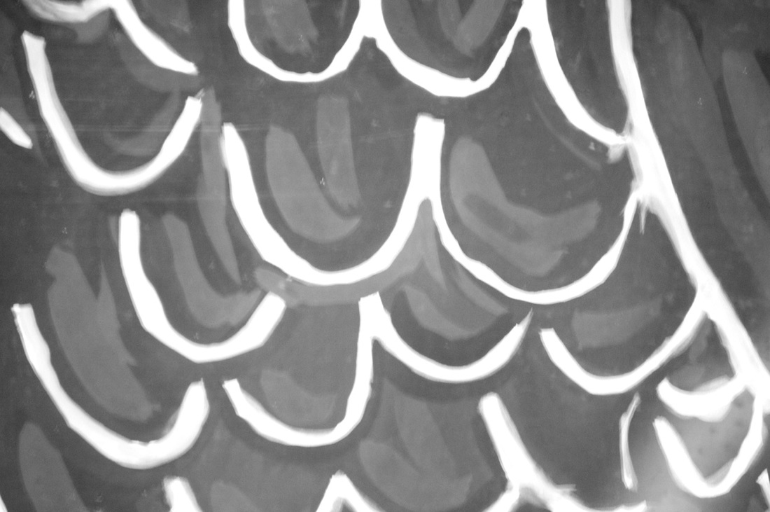
I was quite pleased with this set of pictures, however, I edited the pictures to make them black and white because I felt like they would look more abstract than the original ones. On the last picture I also made it lighter because I felt like you couldn't see the picture at all and that making lighter would make it look better. In this set of pictures my favourite picture is the 8th one because I really like how contrasted it is and how there are different shades of light which makes it stand out more than the other pictures. My least favourite picture is the 4th picture because you can make out what it is and also I don't think the lighting makes it good either because it's very straight and boring.
Formal element pictures
|
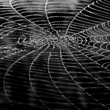
|
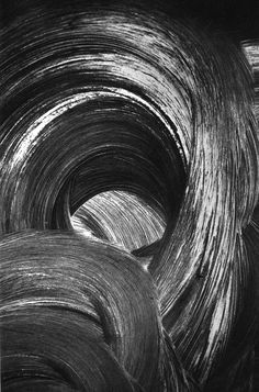
These two pictures show a good example of the formal elements, they both show a good use of lines,focus and tone. In the first picture there are straight lines, the focus is sharp and the tone goes from a brownish colour and fades into a dark colour.On the second picture the lines are more curved and the kind of go into a spiral,it is central point focused so the centre of it is focused but the surroundings aren't as focused and the tone is quite dark but it goes well with the lighter tone and give it ore of a dramatic look.
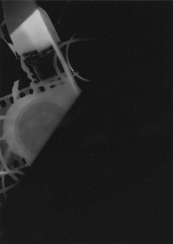
My photograms
|
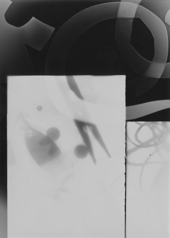
|
Unfortunately some photograms were not in the gallery however...Most of my photograms were very bright and simple so some were more abstract than others, what worked well is that I placed some items not directly on the paper so they were transparent whereas items directly on the paper were bright. I quite like the picture on the left as I think it really gives us an example of what abstract is because some parts of the photograms aren't very visible which give it more of an abstract look as you cannot tell what it is. Next time to make it better I could try and move some objects to make it look ghost like and also turn the light down so the white isn't as bright. I think that what went well is that this picture is very abstract and you cannot really tell what it is,however, most of the picture is black which ruins the picture and doesn't make it very interesting... Next time I will 1.) change the light from higher to lower 2.) take objects with me to make the picture more interesting and abstract and 3.) paint some developer on to make it look more interesting and unique.
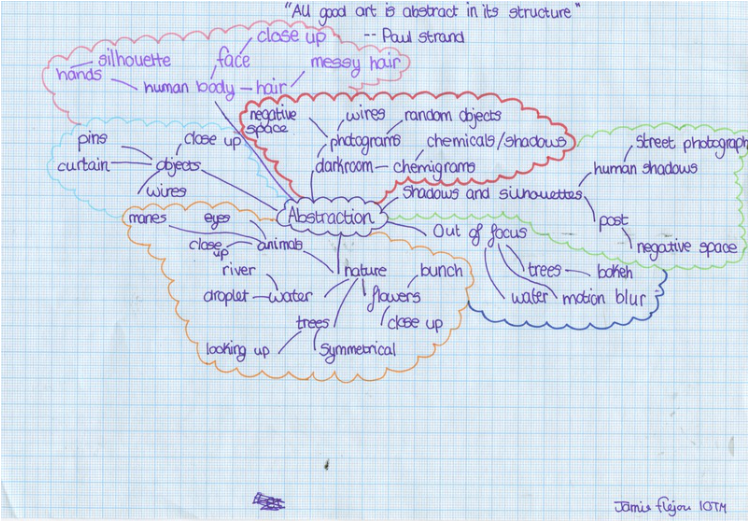
Abstraction mindmap
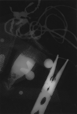
My photograms 2
WWW: I have made the picture look abstract by cutting shapes with paper and placing them on top of each other and in different so the light wouldn't hit some as much as other and it would make some parts more faded. I also placed another photogram on top of the paper to make the positives become negative. EBI: I could have left the light on longer as I only left it for 6 seconds, it would have made the objects whiter. |
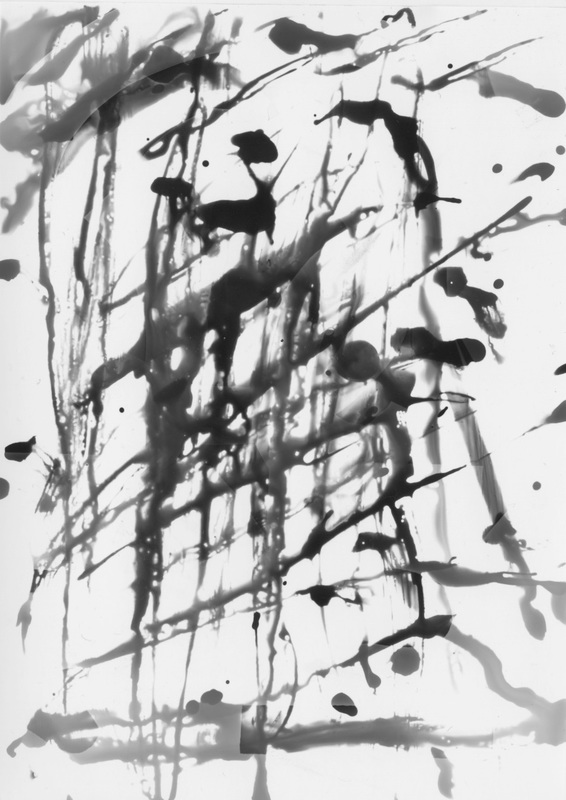
WWW: I have made a photogram the same way as others however I have painted on the developer so that it looks more abstract and dramatic. EBI: I could've added more paint on as we can't really see the picture just the paint. |
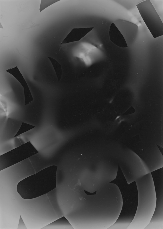
WWW: The light has gone through the paper which gives it an interesting fading look, I also coloured in certain parts of the paper so some of the light couldn't get through as much and I think it worked quite well. I also like the white splodge on the middle as it gives it a very abstract look. EBI: I could've placed thicker paper on some parts so it looked different and a little brighter on some parts. |
My weaved photogram
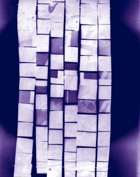
|
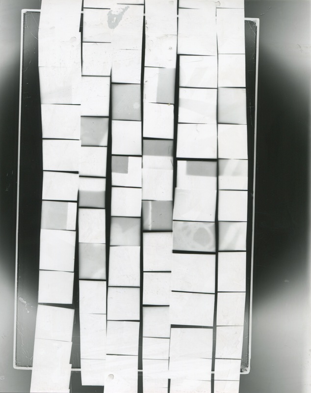
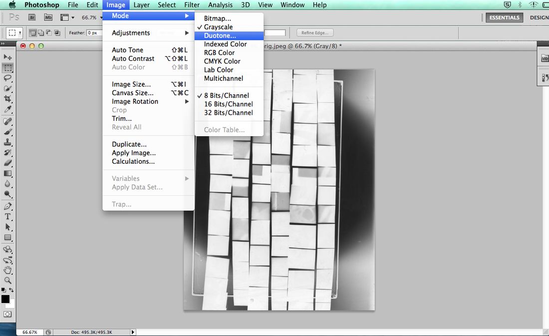
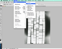
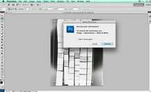
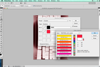
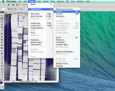
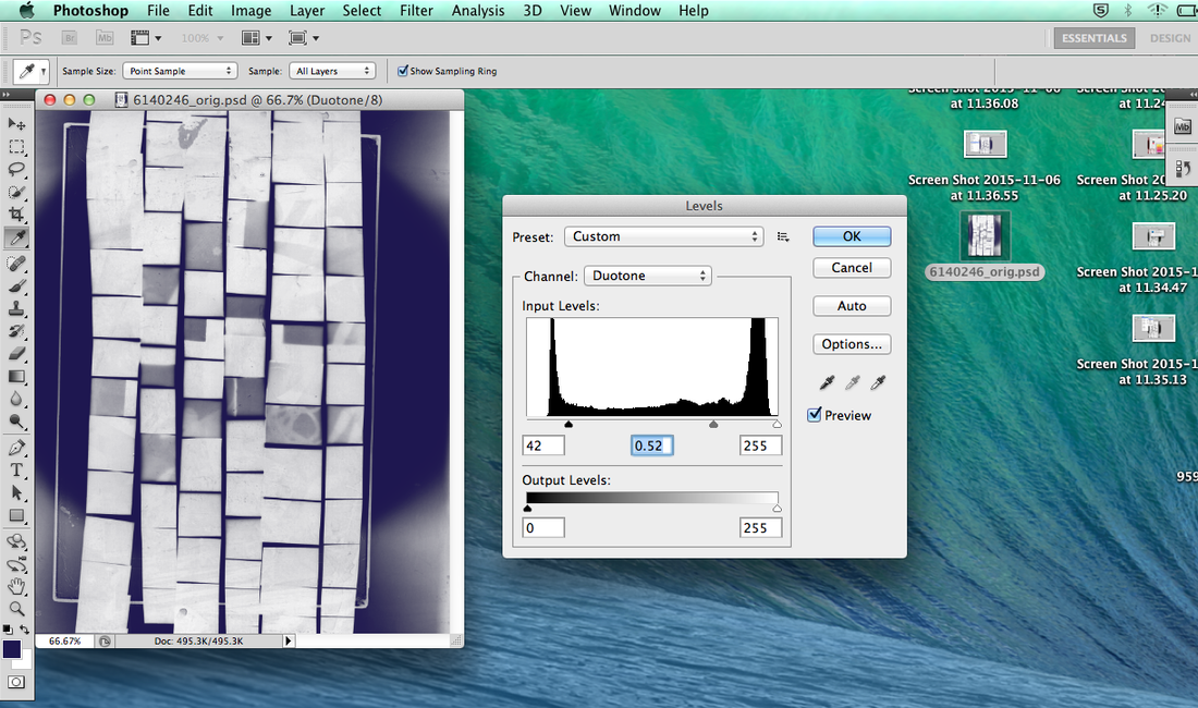
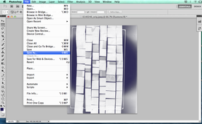
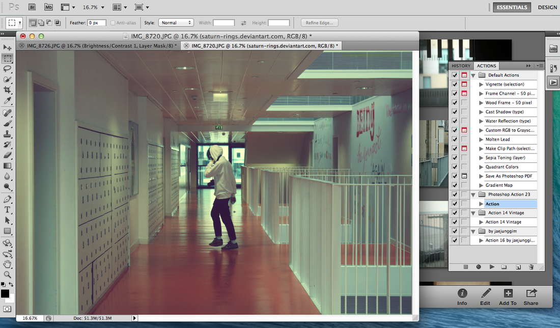
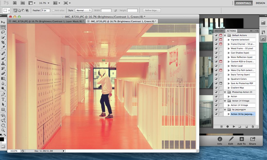
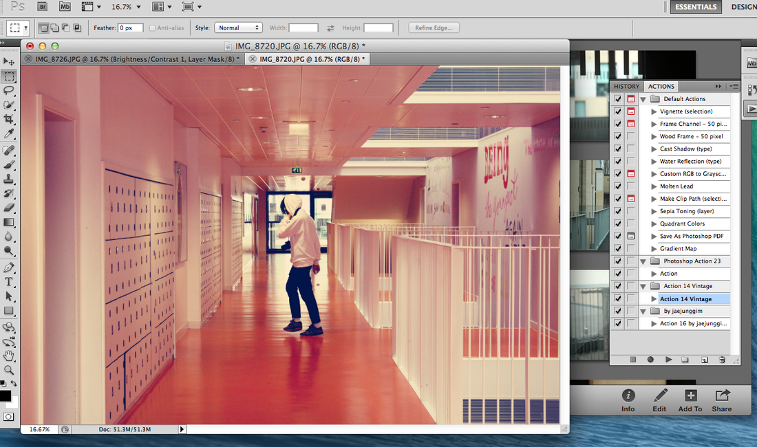
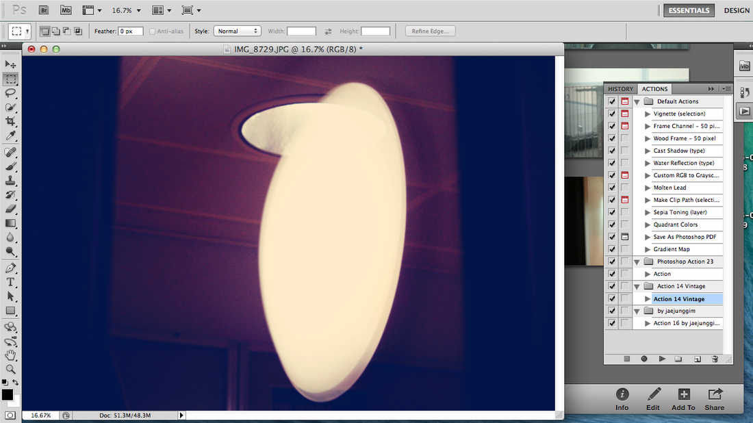
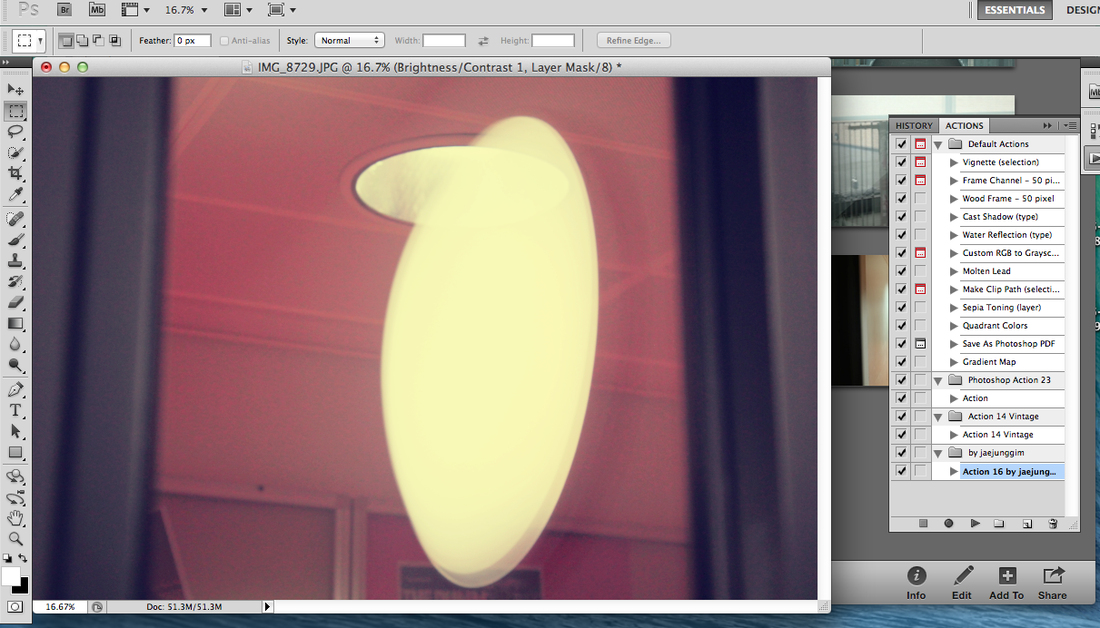
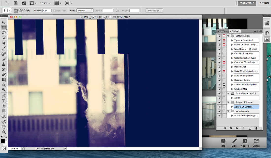
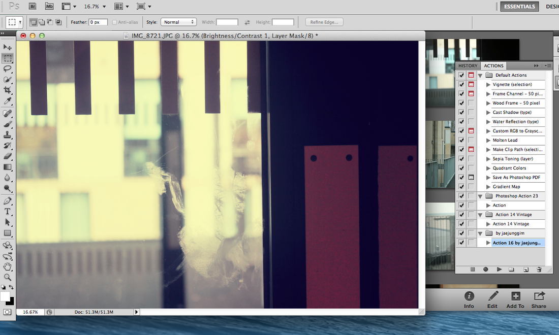
This is my weaved photogram, I don't think it went too well as there was too much light exposed to the paper so we cannot see what the picture really is. To make this I used 2 old and big photograms which were then cut up into strands, I did this so that I could put the pictures back together but with an abstract look as they would be in different places and upside down. I then cute them up again but horizontally so that I could make them even more abstract by putting them back together again but with a different style, so I would repeat the same process (different places/upside down).I then went into the darkroom to make my final which is this picture, you do it the same way as if it was a normal photogram but you put a piece of glass on top of it so that it stays flat.I then finished it off by putting it in the developing it and leaving it to dry. This gives you your final piece! Next time I am going to expose less light and for a smaller amount of time as you would be able to see more of the actual photogram and what was on the photogram so it will make the photogram look more effective as the colours will be well contrasted. This is my duotone, I have done this to bring out the texture ad detail of the photogram.I have done this by going onto photoshop and I have take some step by step screenshots to show you what I have done to achieve this. |
Duotone tutorial:
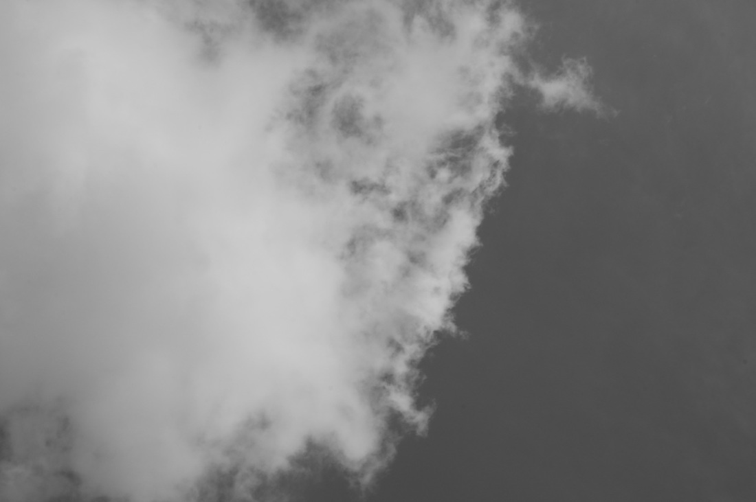
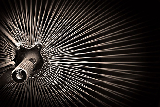
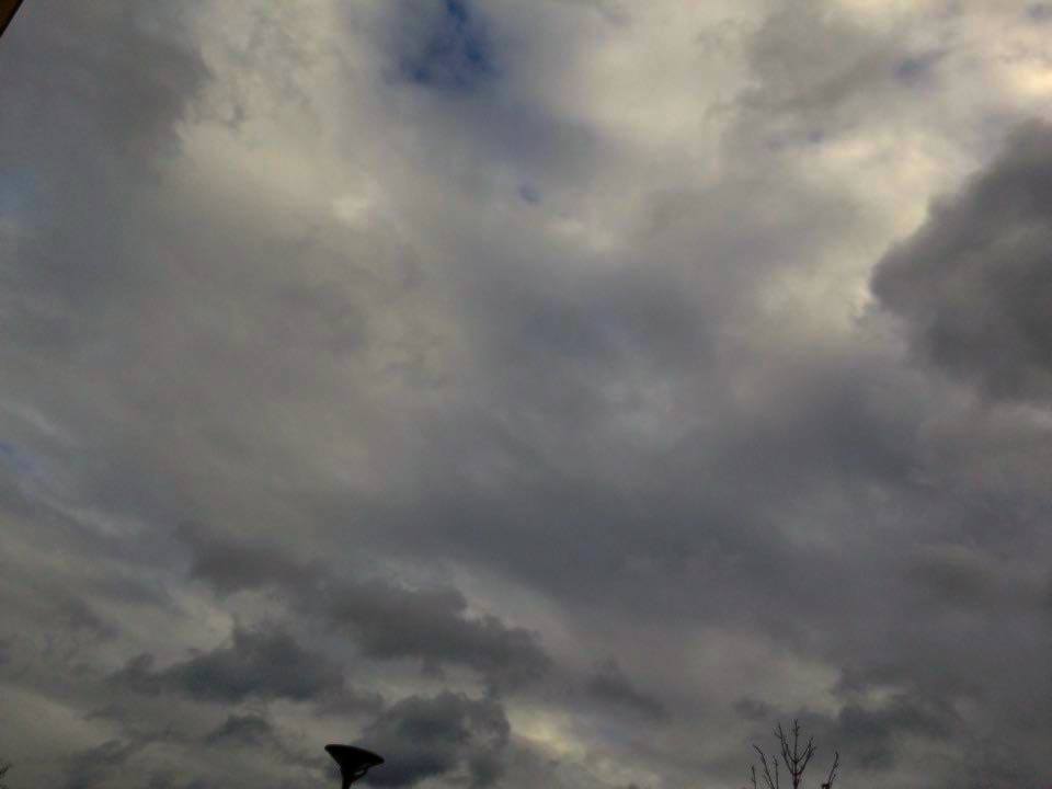
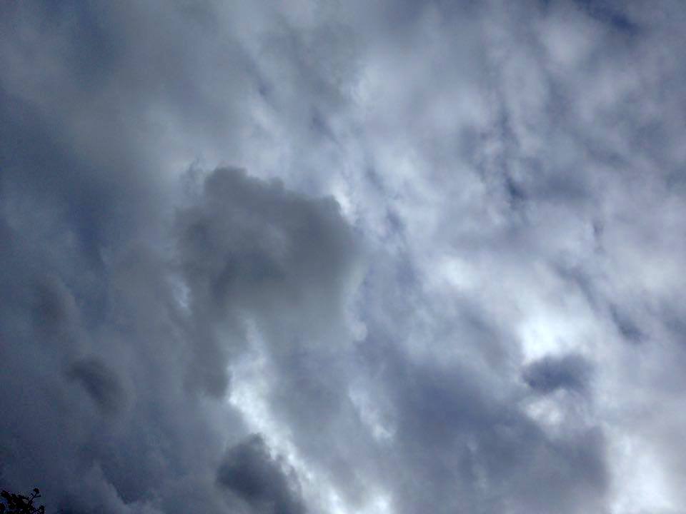
Alfred Stieglitz
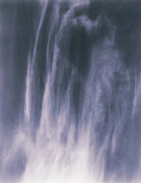
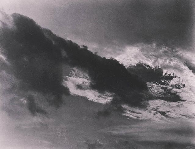
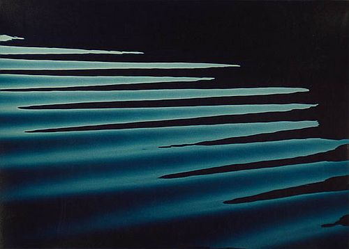
By photographing clouds, Stieglitz meant to demonstrate how "to hold a moment, how to record something so completely, that all who see [the picture of it] will relive an equivalent of what has been expressed." The 'Equivalents', as they are known, aim to create a sensation in the viewer similar to that experienced by the photographer. I wonder if this is possible. I will attempt to create my own 'Equivalent' pictures using a variety of subjects - clouds, fabric, walls etc. I personally very much like his photographs as they really show the abstract context and the pictures themselves explain abstract very well, I also really like how contrasted the pictures are. He uses the formal elements in those pictures but he particularly uses value/tone as his pictures all have different tones so they do not look the same and are quite unique.

|
This is one of my favourite pictures by Alfred because I think the picture is very abstract and the use of value,tone and texture really brings out the picture and makes it unique. My favourite thing about this picture is that it could be many different things, it could be a waterfall or a painting and that is what I like about this picture it's that you can make it as anything you want, that's how abstract it is. |
My gallery ( inspired by Alfred Stieglitz)
With this set of pictures I was mostly focusing on producing pictures which were similar to Alfred Stieglitz.
I am really please with this set of pictures of pictures because I think that I successfully produced photographs which were similar to Alfred Stieglitz because all of my pictures are the same thing however they are all different because I made sure the shapes and patterns were different and I also edited them to make them look more effective and interesting.
Harry Callahan
I really like the way that Harry Callahan uses repetition in his images and one of the things I also like in those images is the contrast because Harry seems to like very bold images with a lot of contrast. He has a wide depth of field in some of his pictures which I also really like. Here is a small clip of Harry talking about his photography.
Ernst Haas
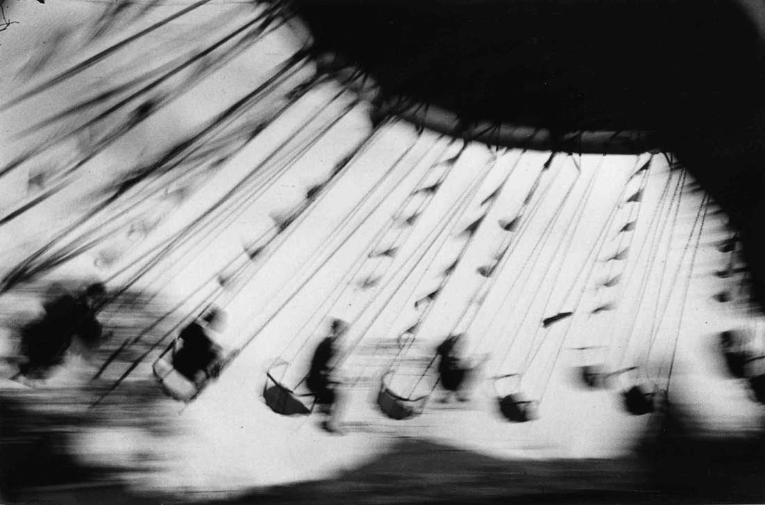
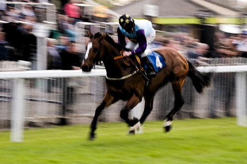
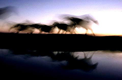
I love Ernst Haas's photography because he seems to like the idea of movement in a picture but keeping a slow shutter speed to make the picture look abstract and more interesting.He also didn't just focus on one set of things, he seemed to like all kind of subjects such as horses,water and fairground rides and also many other things!
My Ernst Haas inspired gallery
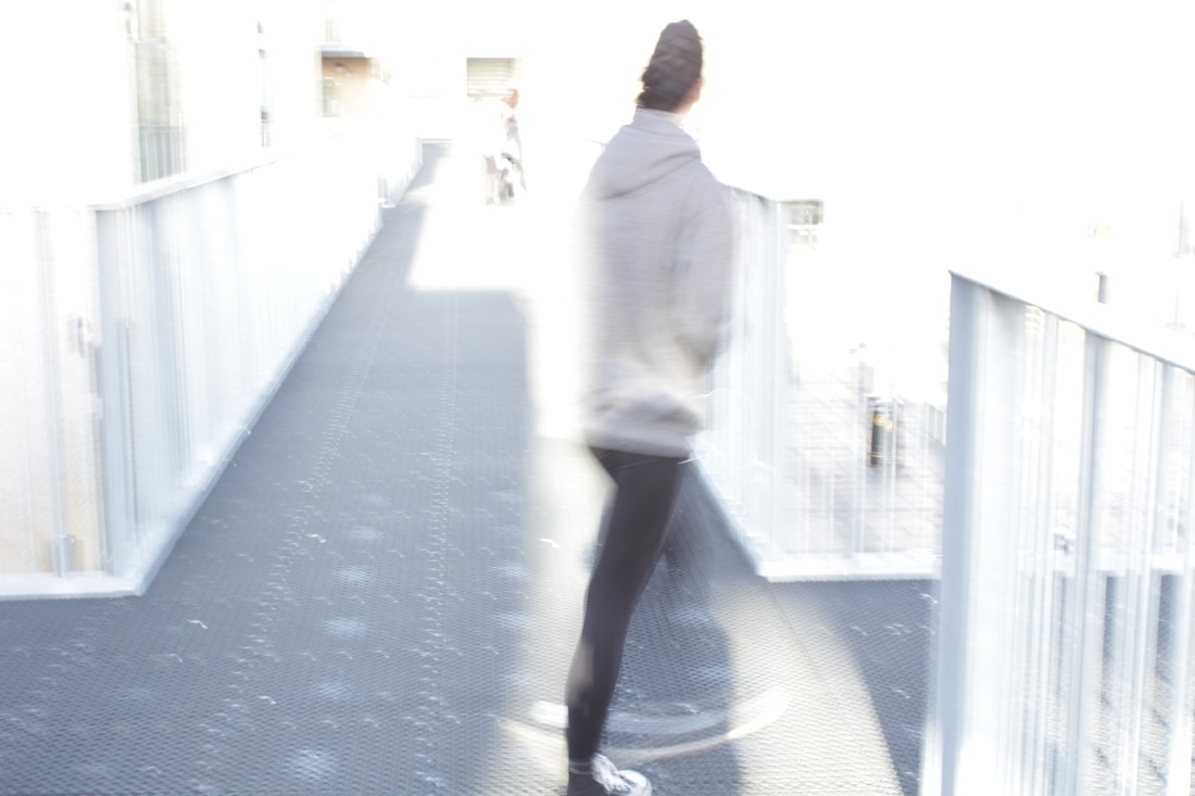
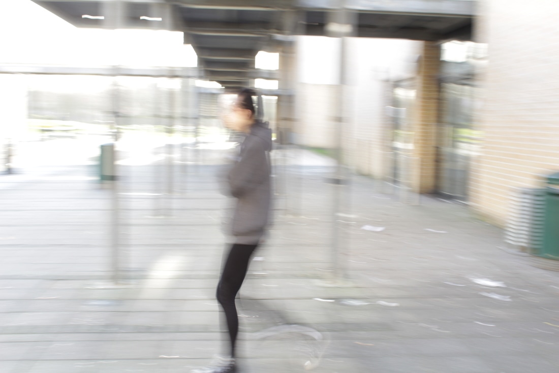
Some more abstract pictures

Edited versions
I decided to make the pictures black and white because I felt that the contrast was much better and made the pictures more interesting and more abstract.
Overall I was quite please with my pictures, however, I don't think they were my best set of pictures because they are not as abstract as I wanted them to be.Next time I will try and look for things which are more unfamiliar to people and zoom in on my pictures a lot to make them look even less familiar and more interesting.
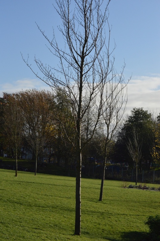
Controlled assessment
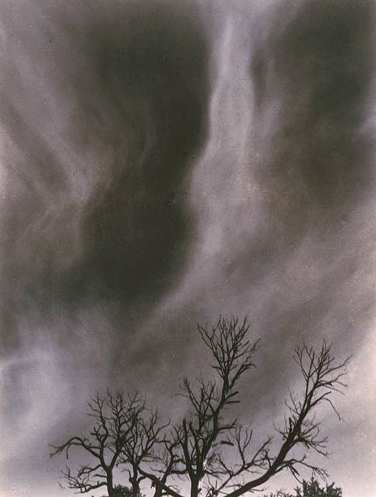
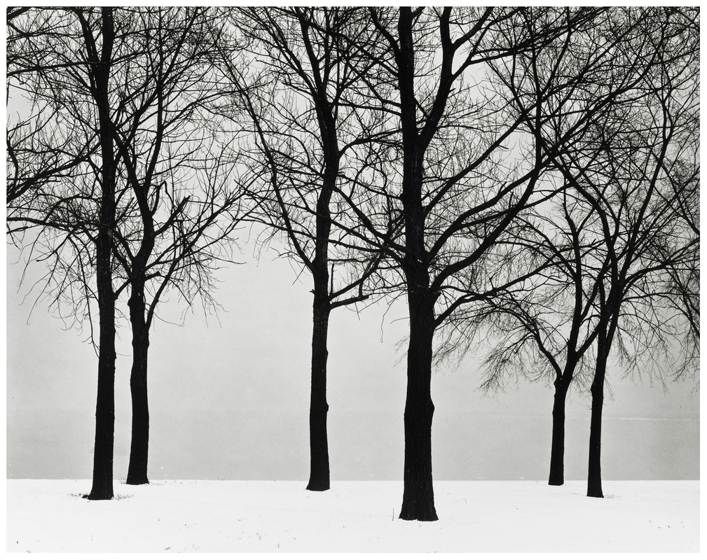
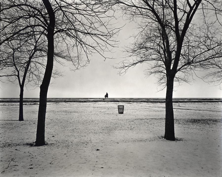
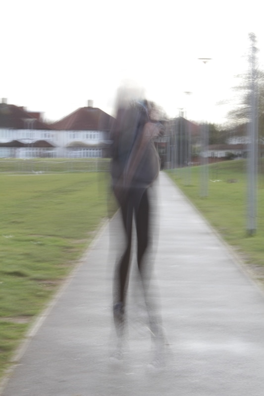
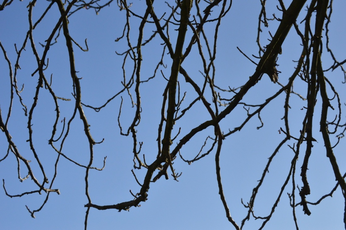
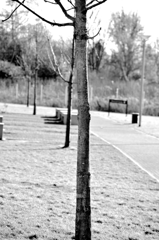
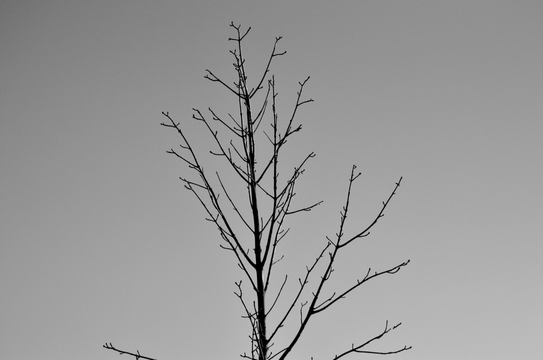
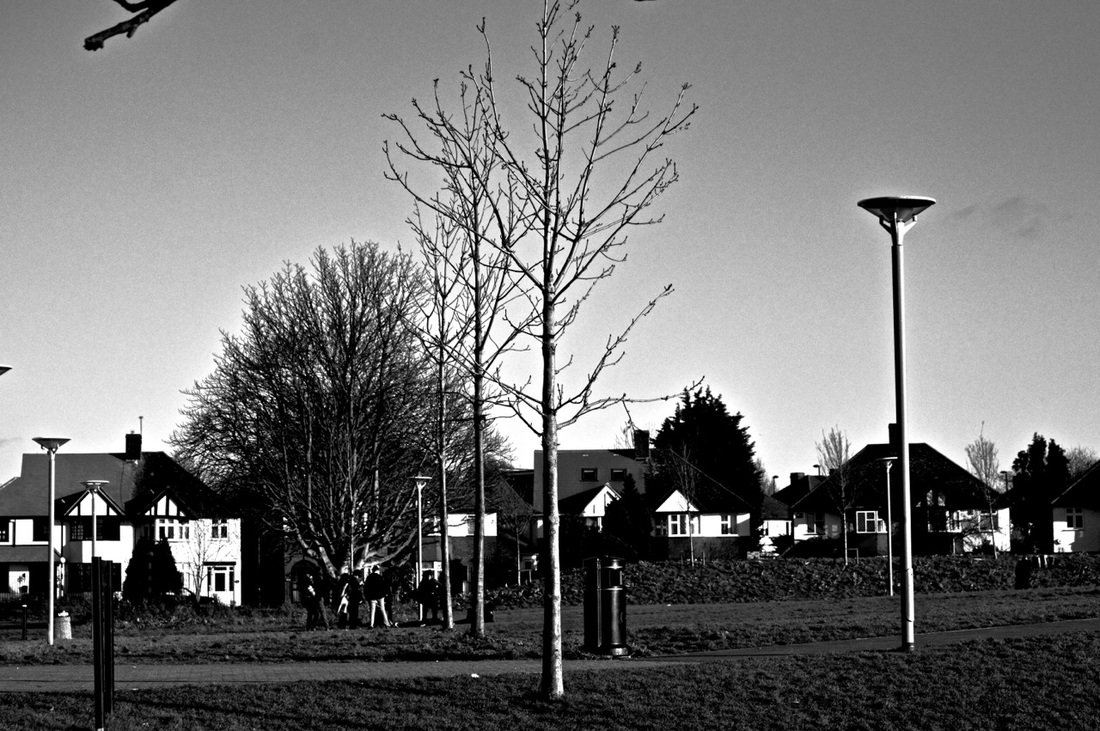
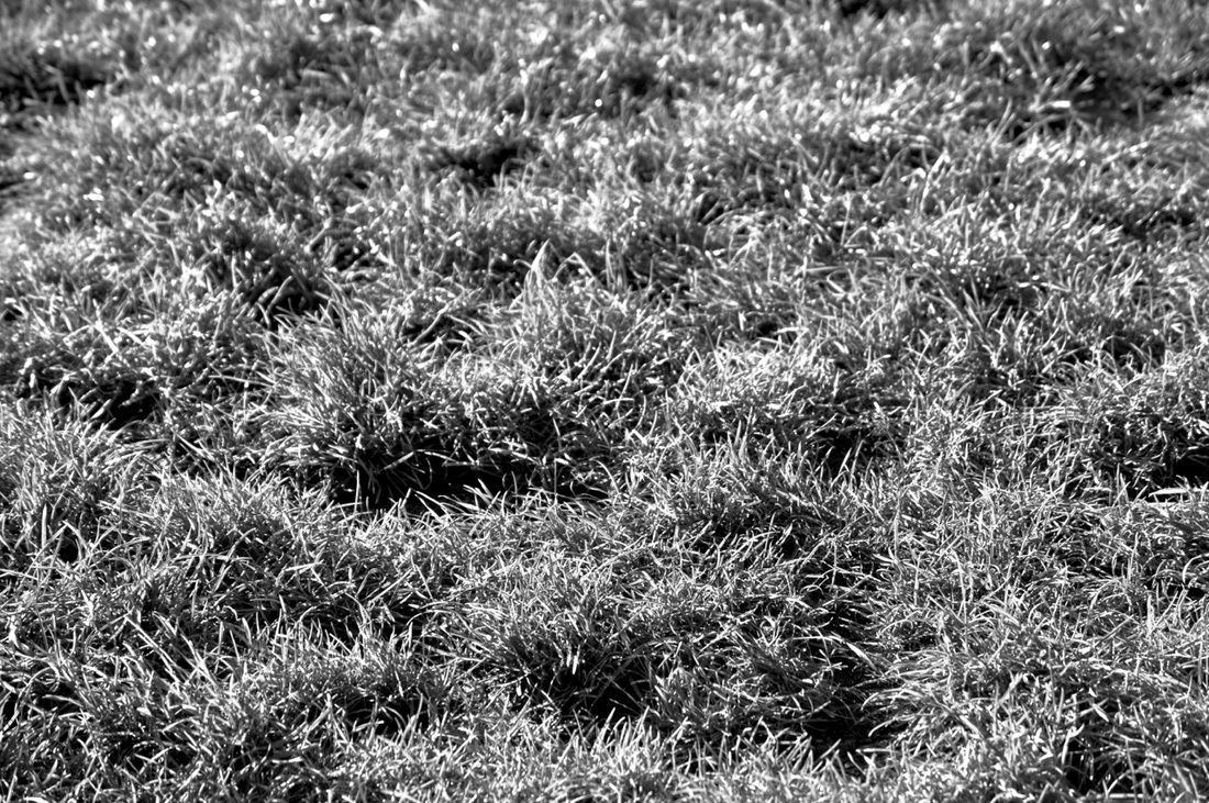
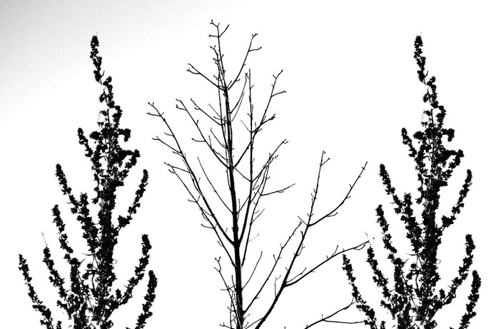
In this photograph I am able to see lots of black trees which look like they are in snow. To describe this photograph I would use the words "death" and "unhappiness" because everything in this picture looks very dark and sad, other than the white snow which could represent "happiness" and "calmness" , I also see death because the trees are dead and dark which to me represents mortality. For someone who could not see it I would ask them to imagine a snowy day in a foggy park with about 6 trees standing in front of them which were black and dead with no leaves, the park was also deserted and you could not see anything in the background other than white fog. In this photograph I can recognise many things such as the snow and the dead trees as that is not very abstract and it is very bold and the contrast is very dark, however, the grey colour behind the trees seems very bizarre and almost drawn on, this gives us a feeling that a very special was used to create this picture and make it more abstract.
To make this image, the photographer has used a large format camera to really bring out the details in this picture. This affects the way I am viewing it by making me think that this could've been a drawing due to the graininess of the picture. This photograph reminds me of sadness because the colours in those pictures are very blunt and people who are unhappy are usually very blunt people and aren't very vibrant just like this picture. However some people may argue that this picture makes them feel calm due to the snow and the very bold colours and also the fact that there is not much going on in this picture which is quite peaceful. I would describe the lines in this as quite tidy as the trees are all aligned and the snow and fog are in straight lines. The shaped in this picture are very abstract because you cannot quite tell what kind of shapes there are in this picture. For the tones I would say they are very bold and either very dark or very bright. The texture is very grainy and make the picture look like a drawing, the patterns are very clear and the trees are a clear pattern. I think that the photographer captured the light very well, he used the brightness of the snow and fog to bring out the darkness of the trees which is what makes the picture special because the contrast between the two colours make the picture. This picture is not real life anyway, it is simply an illusion, the trees are not trees they are just grains of silver and the same goes for the snow, none of this is real. The thing which interests me the most about this picture is the contrast and also the twigs because you cannot quite tell which trees the twigs are on so it makes the picture slightly abstract.
The use of space in this picture varies because at the bottom of the picture it is quite spacious however at the top of the picture it is very messy and cramped but I think that the use of space was used well because it makes us think that there are 6 trees but when we look at the top half of the picture it could make us think that there are actually more. The photographer has used the foggy weather to his advantage as it gives the image a much flatter look because we have no background so rather than making the picture look 3D the photographer has made it flat and more complex, also, if there was to be a background in this picture it would look too busy and also more 3D. If I met the photographer I would ask him why he made this picture and what has inspired him to make this picture because it's quite an original idea.
I would call this picture "Bipolar" because this picture could represent joy, sadness or calmness and I think that people who are bipolar could relate to this picture. If I was inside this picture I would feel confused because I wouldn't know wether to feel happy,sad or lonely because I love the snow but there is no one around me and I would feel lost and the trees make me feel sad as they are dead and not vibrant anymore.
How to photograph like Ernst Haas
- Think about the formal elements but especially texture and and focus because Haas liked to take pictures which were not focused
- choose a camera that has a slow shutter speed
- photograph in colours
- look for a moving subject ( i.e. horses)
- make sure your subject is fully in the frame and that the background is too so that you can see the motion
- think carefully about the light
- only focus on some of the subject but not all of it so that we can see the motion
- make sure your image is in high contrast yet low light
- the photograph must be moving as it is what makes the picture and make it original
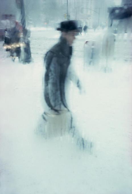
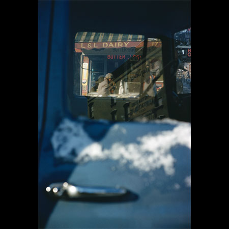
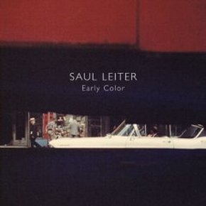
In Focus: Saul Leiter
- he uses a great range of space
- he zooms in a lot on his subject to give us the impression he is spying on them
- he seems to break the rule of thirds quite often
- the texture of his pictures are quite noisy
- he always focuses on one object or person
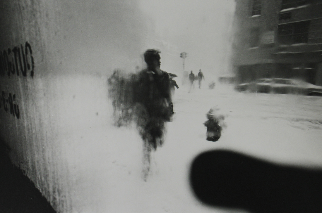
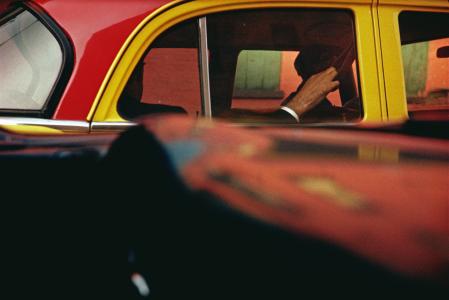

why are the formal elements so important to him?
|
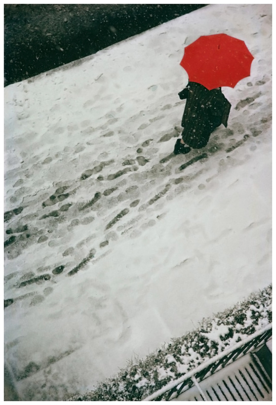
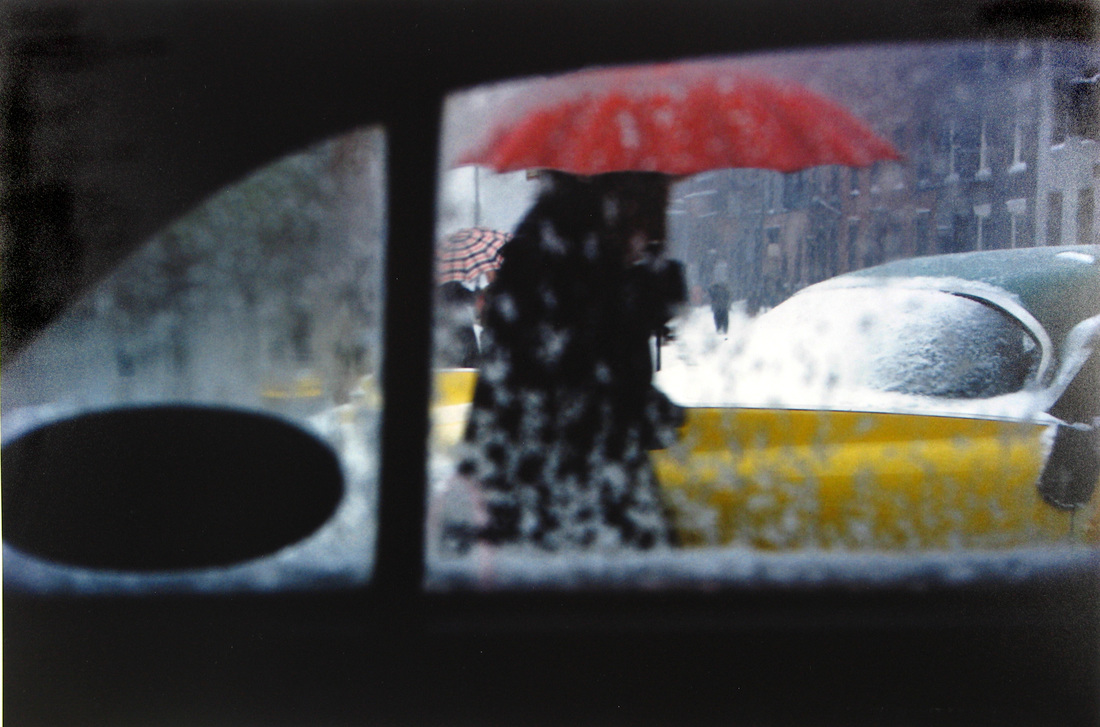
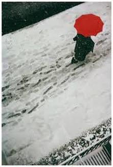
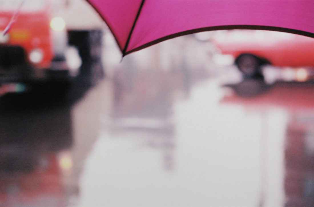
The formal elements are important to Saul Leiter and his photography as he likes to have symmetry and lines in his photographs, for example, in this picture to the left the lines are very significant and they are what make the picture original. I personally also think that he was quite interested in repetition,for example, with the picture with the red umbrella there's a repetition with the footsteps in the snow. I also think texture played a big part in his photographs as they all have quite a strong texture and if I was to touch the picture I would think I would be able to touch and feel what the objects felt like. |

|
I have chosen this image because I like how it has been constructed and I also really like how it's black and white however the umbrella is bright red and this really brings my attention to the image. The thing which is quite surprising about this image is that everything seems quite solum however the umbrella brings the joy in the picture as the colour is bright and it contrasts well with the other colours and brings your attention to the picture. I would say that Leiter uses lines very well in this picture as the sides are very straight however the footprints in the centre of the picture are muddled up which give the picture some character. Sauls photographs are abstract because the space he uses to capture his subject is very small and the object or things around it use quite a lot of the space in the photograph however it is very zoomed in so we do not know what the objects or things around the subjects are which makes the picture abstract. |
Seeing is a neglected enterprise. Saul Leiter |
I have chosen this quotation because I think that it is very true and this quote even applies to some photographers as some photographers may just take some pictures without truly thinking about it or seeing the true subject of the picture.
|
why so abstract?
|
|
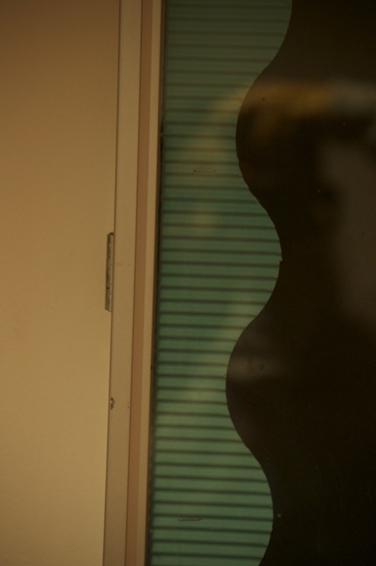
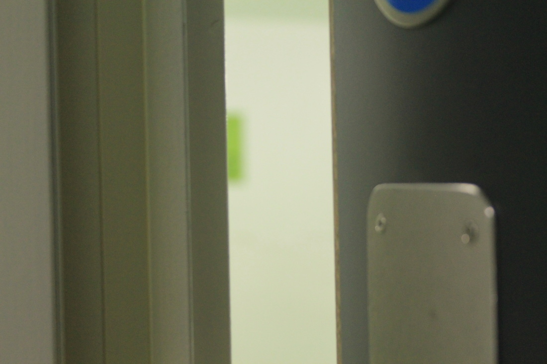
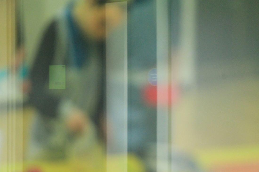
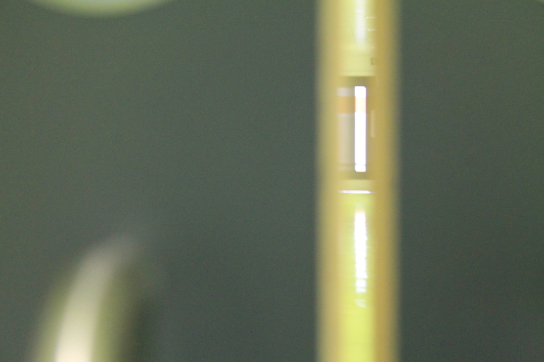
Saul Leiter's photographs are abstract because he firstly wanted to do things his own way and style. They are abstract because they have various different and blurred shapes which makes us think "what is this?" we cannot truly know what is it and that is why they are abstract. Saul Leiter usually used reflections of windows as you can see from the slideshow and there would be bokehs in the pictures form the lights inside or outside and blurriness from people and cars going past. |
BIG ideas:
these are the BIG ideas or threshold concepts which we are exploring in this project.
Camera's don't see the world like we do, when we use our camera's we're able to pick and choose what we see through the viewfinder and crop out whatever we don't want se we select what we photograph rather than invent because what we photograph already exist so there's nothing to invent we simply select what we want in our photographs to make them "perfect".
|
unlike different kind of arts such as painting or drawing we don't start with a blank canvas, we have the whole world and we simply select what we want with technology rather than with brushes or pencils.
|
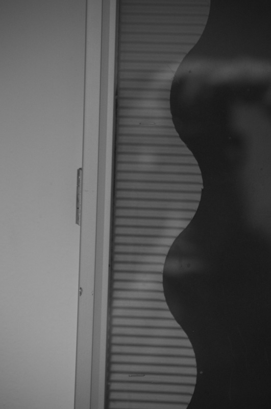
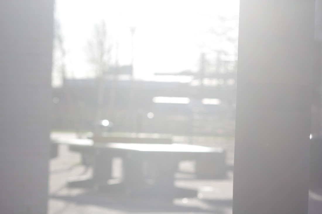
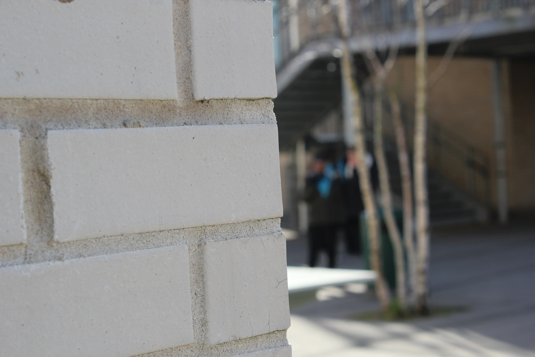
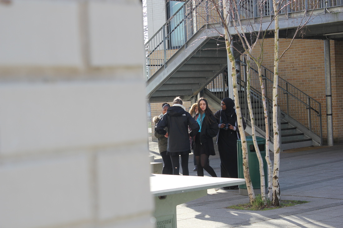
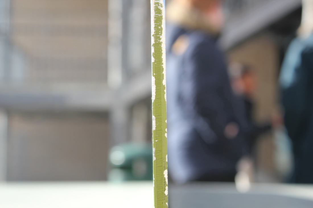
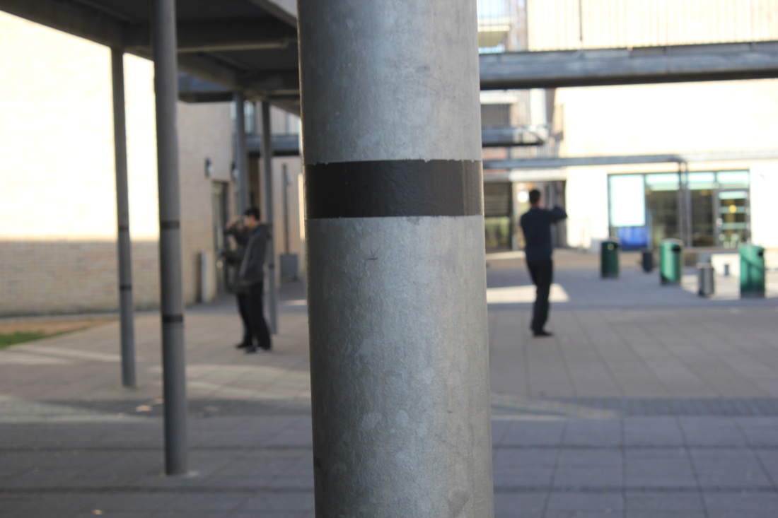
With these pictures I was working on my use of space and light.
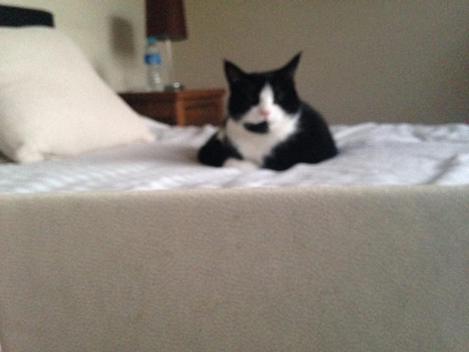
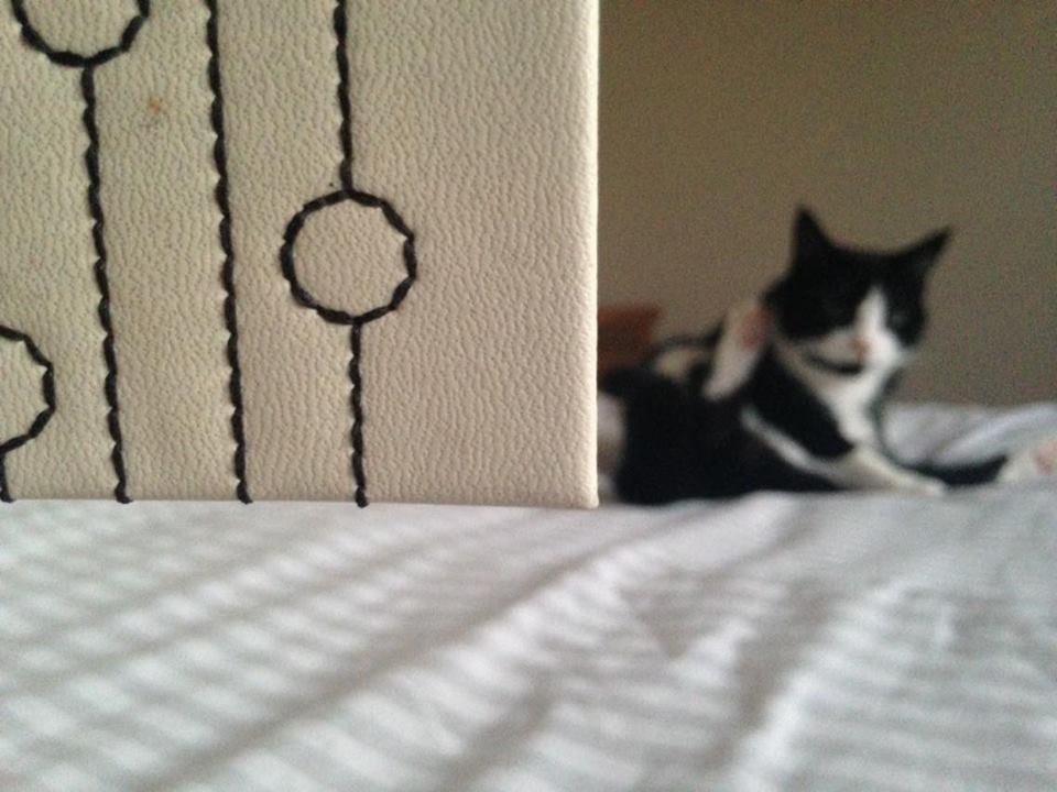
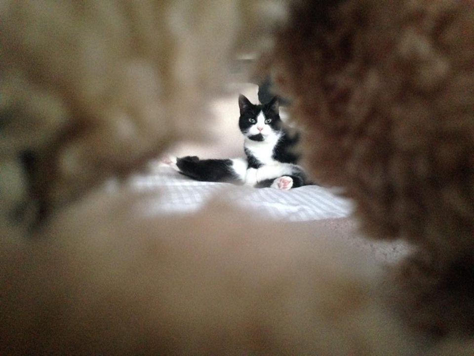
Images at home
I am only happy with a few pictures in this set I think that I need to work some more on my use of space, however I think I did quite well at producing pictures like Saul Leiter for my first time and I very much like the pictures with the cat because that is how Saul Leiter likes to use his space and he is quite geometric and I feel like I've achieved that in those 3 pictures.
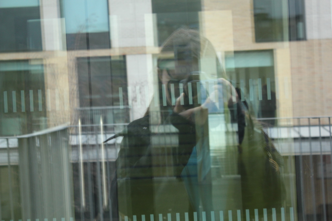
In this set of pictures I was focusing on my use of space again and explored reflections
2nd set of pictures
Overall I am very pleased with these photographs especially as I feel that I used my space much better than I did when I first started and I also find my reflection pictures very interesting and abstract.
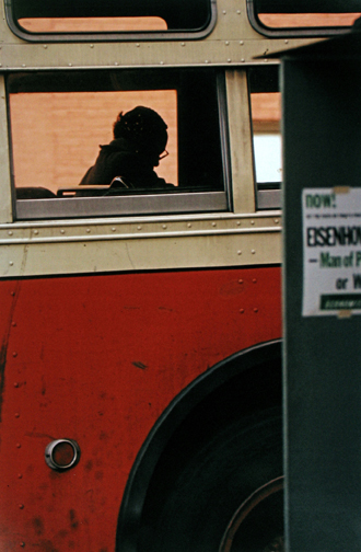
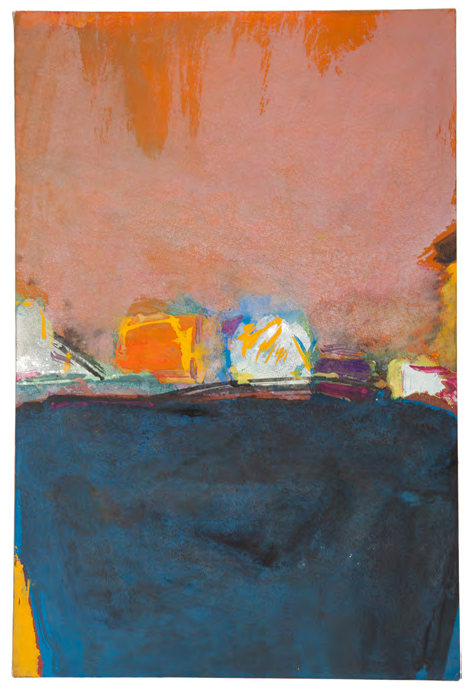
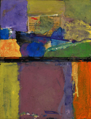
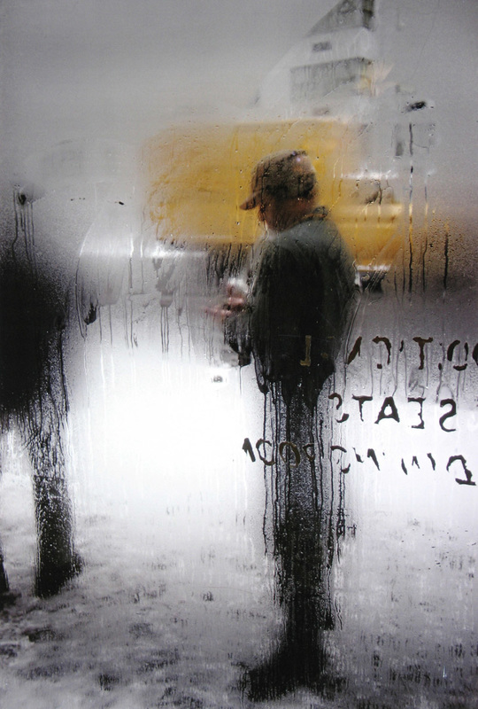
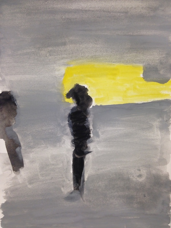
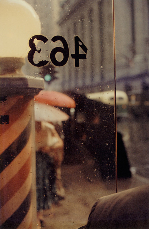
Saul Leiter

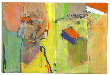
|
|
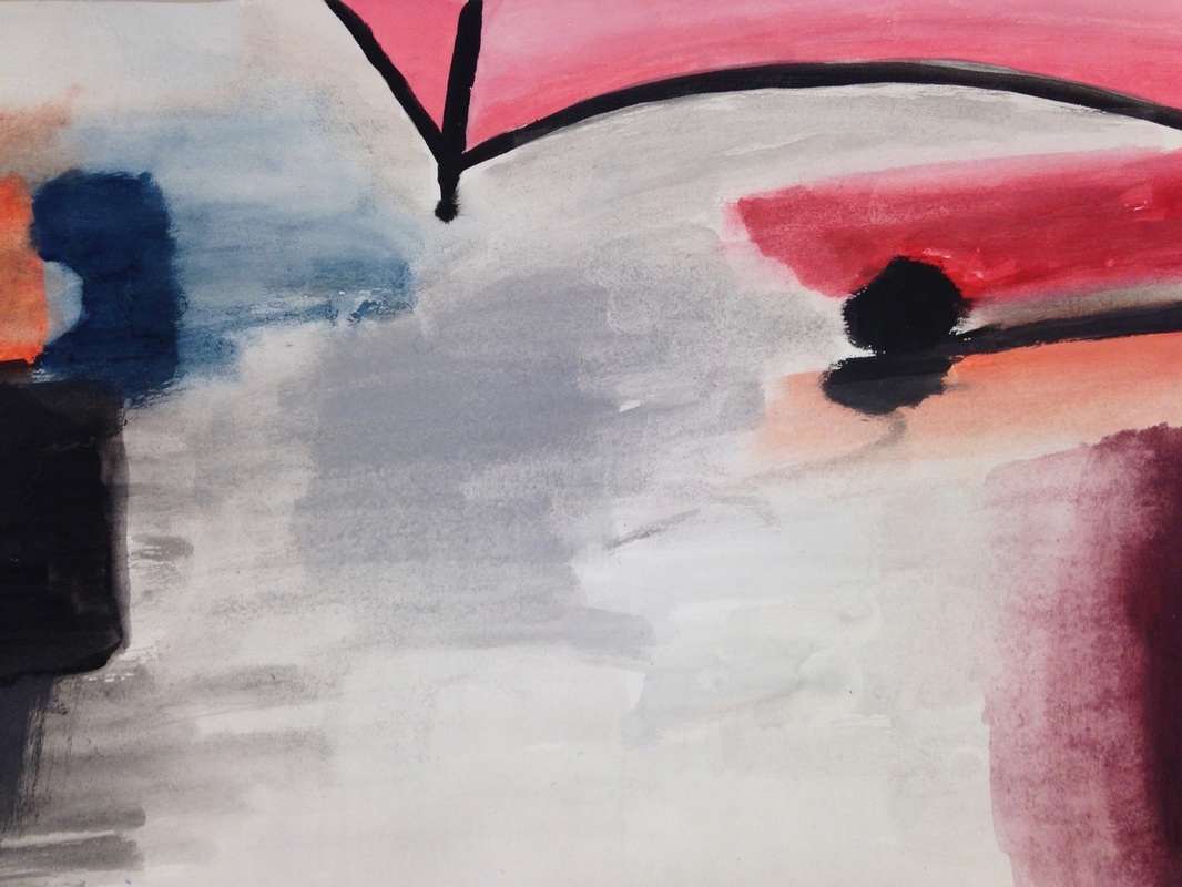
I think that these two pictures are quite similar due to where your eyes are going in terms of the of where the different colours and shapes are in the painting and picture. for example the orange square could represent the umbrella and the little splodges behind could be the footprints in the snow. |
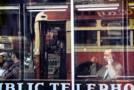
Saul Leiter inspired photographs unedited versions
In this set of pictures I mostly focused on reflections.
Overall I am happy with my reflection pictures, however, I am not so happy about my other pictures where I tried to get the subject in the middle of the picture as I don't think Saul Leiter used his space quite like that.
Edited versions
I decided to edit the pictures as Saul Leiter has quite colourful pictures, I think this worked quite well as the filters really bring the picture out much more.
In these pictures above I decided to add a little vintage colouring to it so that the colours and shades could come out one more.I had to download the actions off deviantart.com and then add them to my chosen pictures on photoshop.I tried to experiment with different kinds of actions which had different colours to see which actions suited most to the pictures, some pictures suited a more darker shade of colouring whereas some suited a brighter shade of colouring.
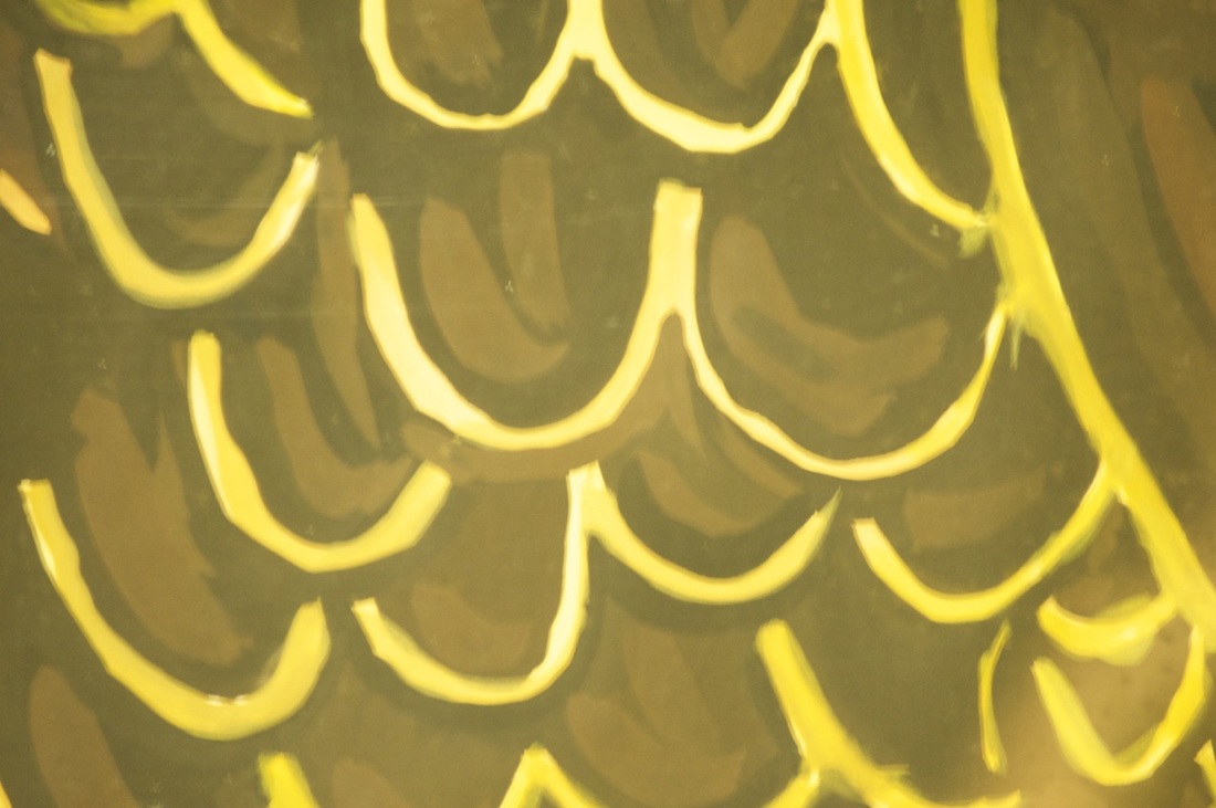
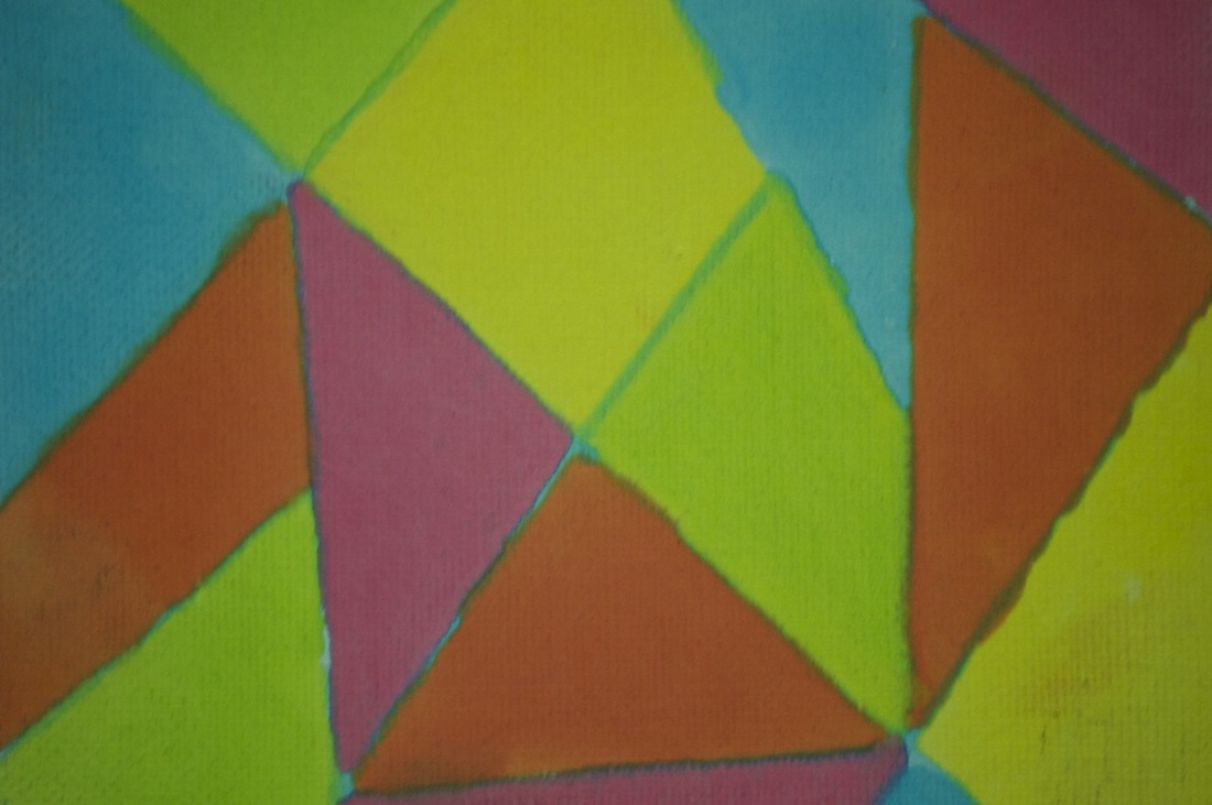
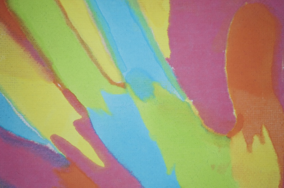
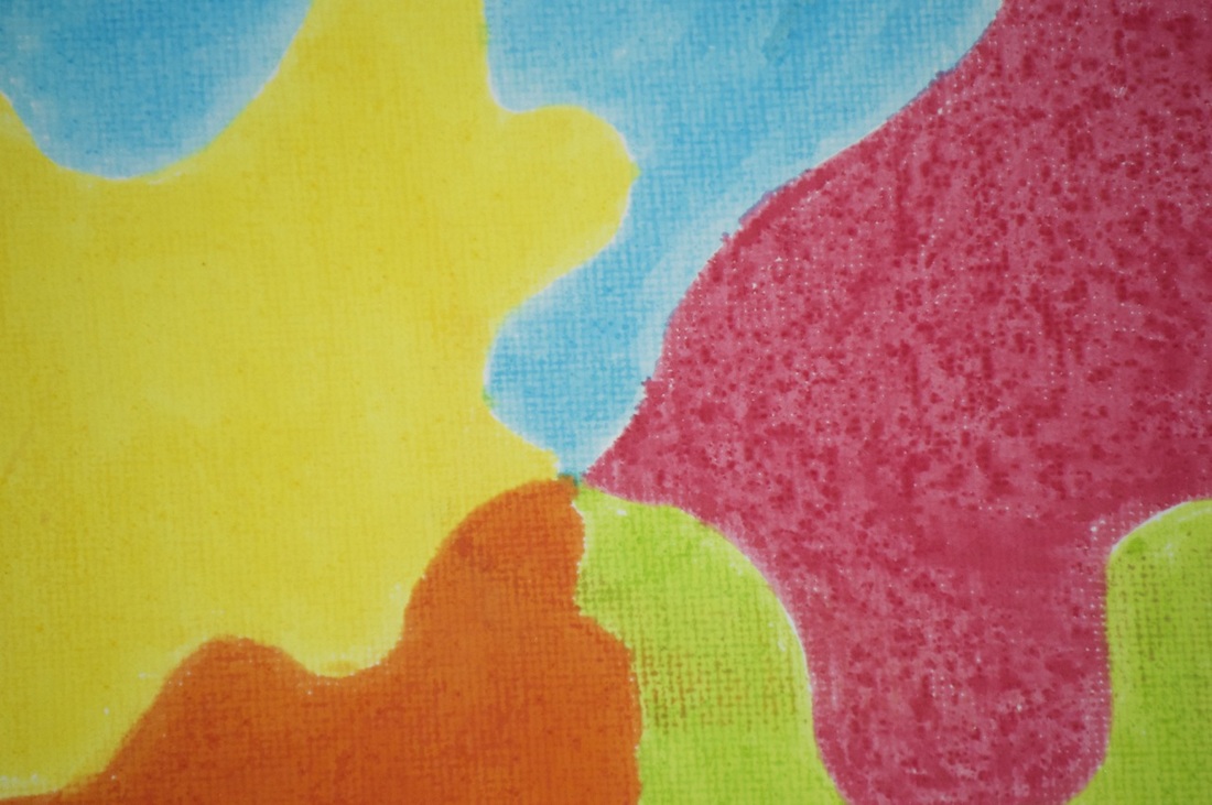
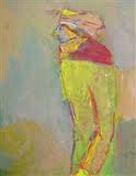
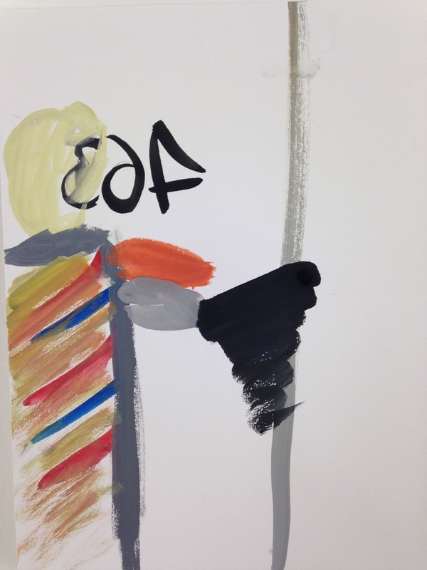
My abstract Saul Leiter paintings
|
|
These are my Saul Leiter inspired paintings. I chose to paint these photographs because I felt that they were quite abstract and that I would make them even more abstract by painting them. They were also quite easy to paint as the colours were bold. I didn't get to finish the last one as I didn't have enough time,however, I still quite like it as is it quite plain and abstract; the photograph may have more grey but I am quite happy with the result even though it's unfinished. My personal favourite is the umbrella as the umbrella itself is quite sharp but the background is unfocused. I also quite like how the colours smudge in some areas as it gives it a more abstract look. |
My Saul Leiter inspired gallery
This gallery includes pictures I have taken which were inspired by Saul Leiter
In this set of pictures we can see that my use of space has improved a lot.
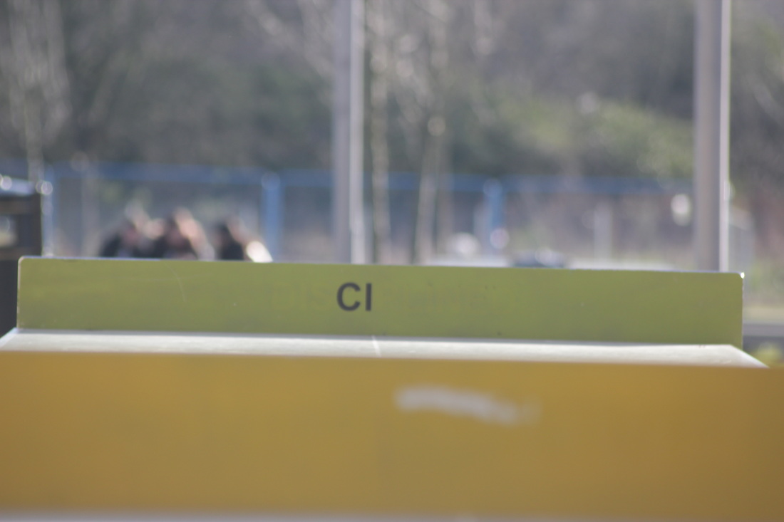
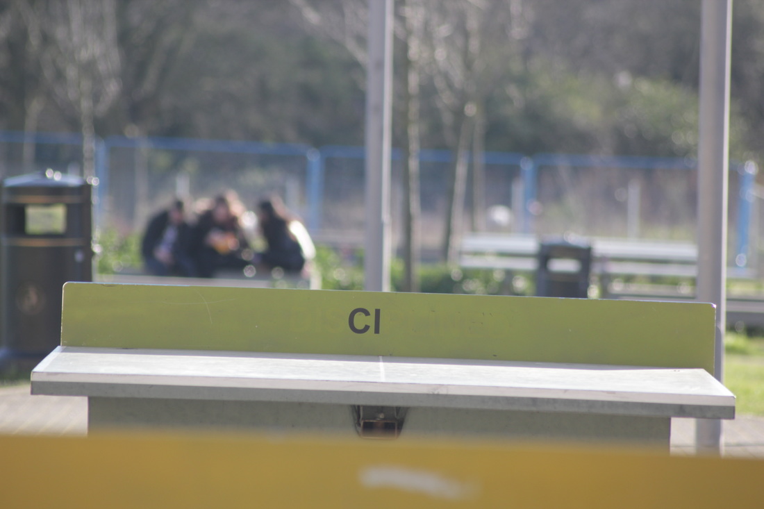
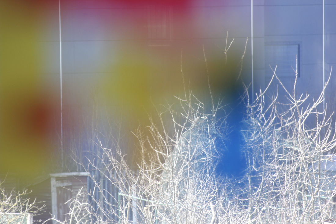
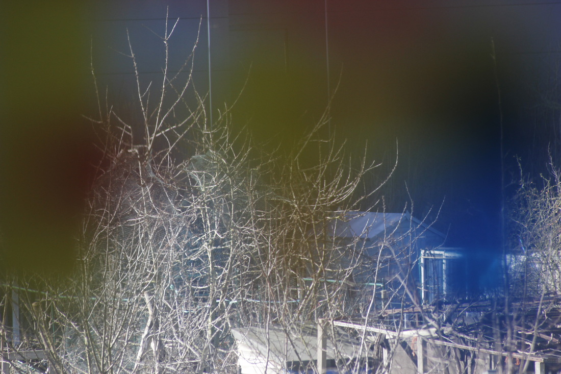
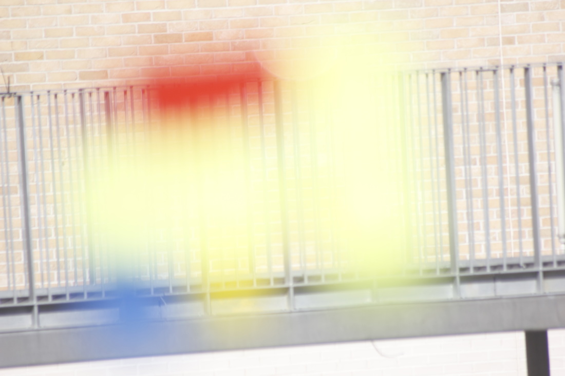
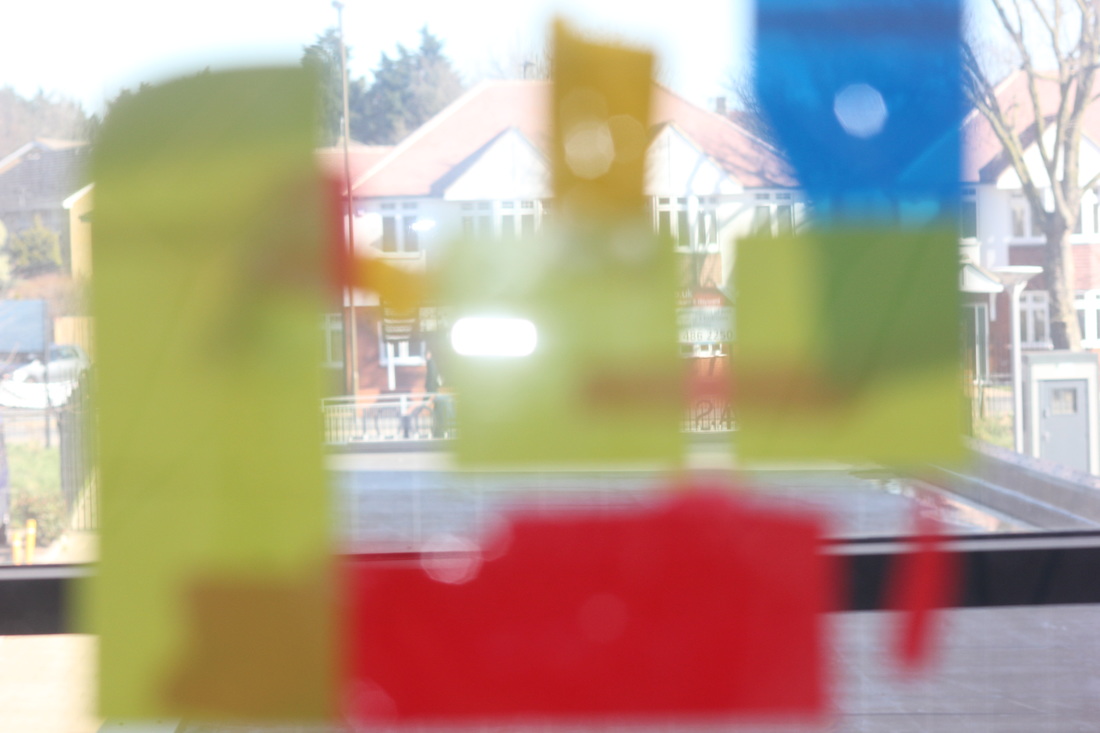
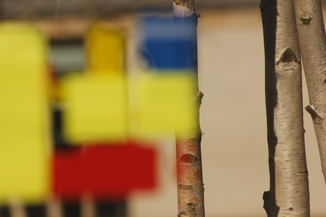
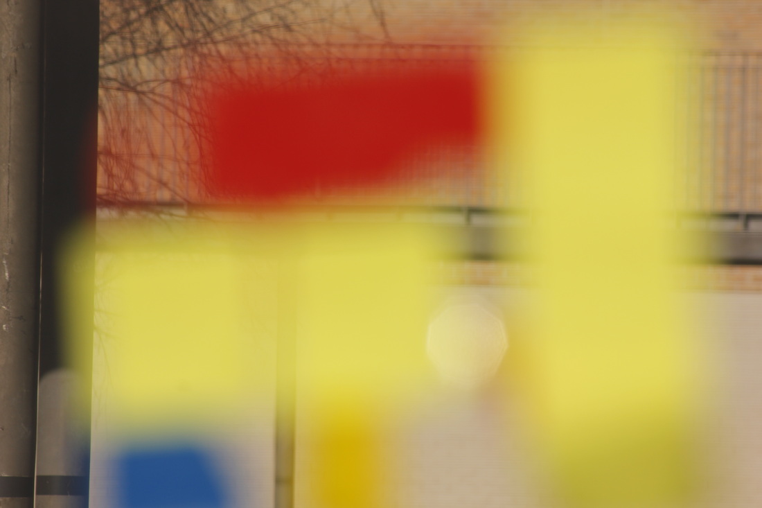
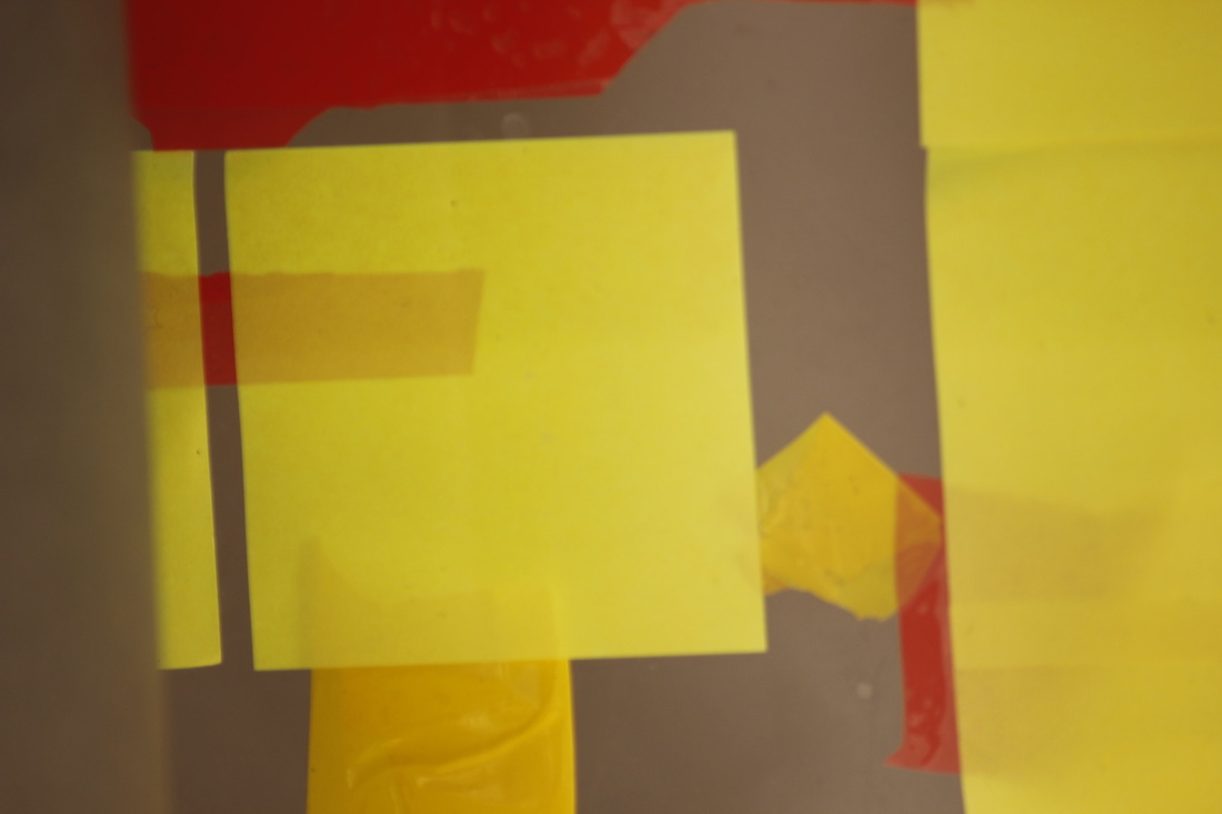
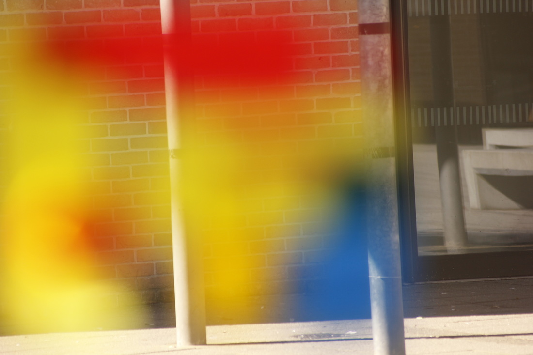
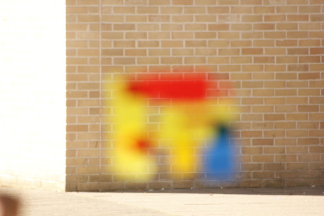
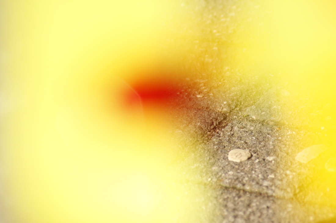
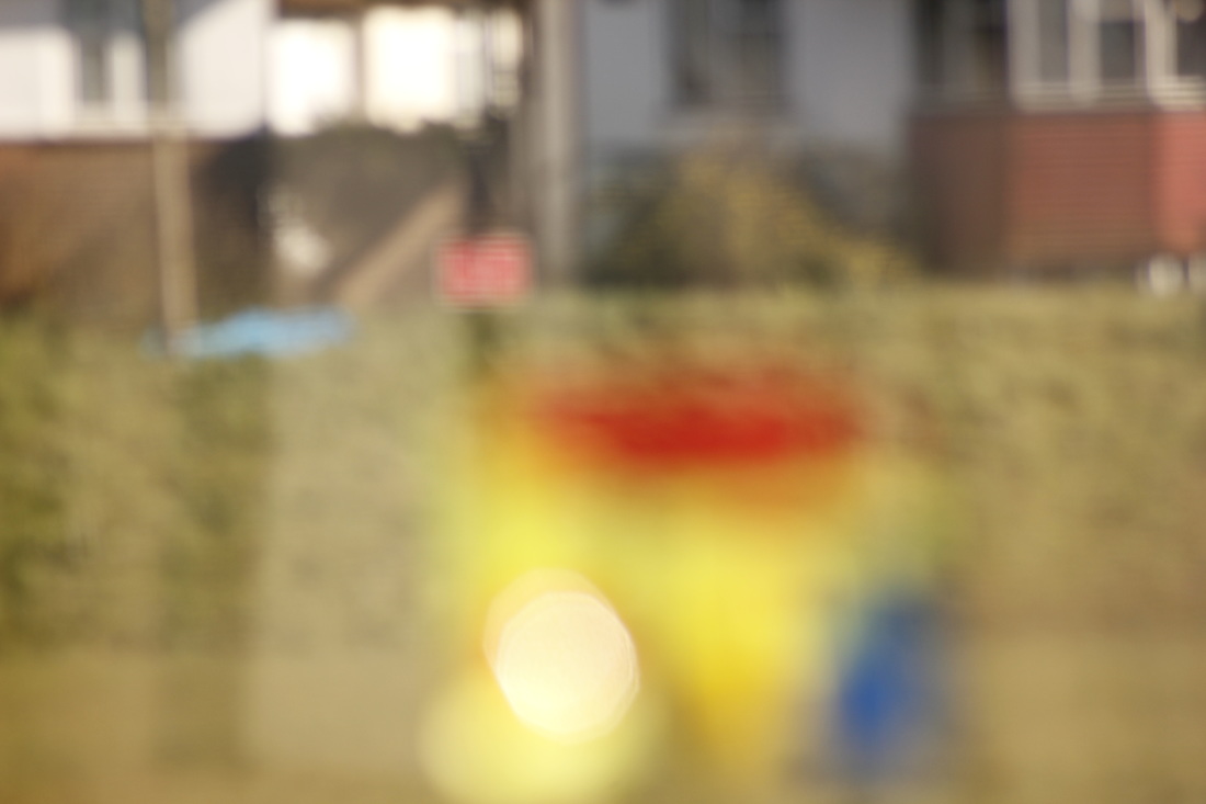
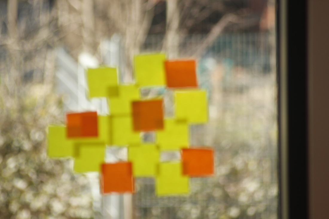
POST-IT NOTE ABSTRACTION
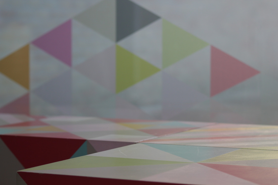
Here is a gallery of the pictures which Luis and I took, the day was bright and sunny so the colours really stood out
Overall I am very pleased with this set of pictures, they look different and I like how the colour obstruct the subject of the pictures.
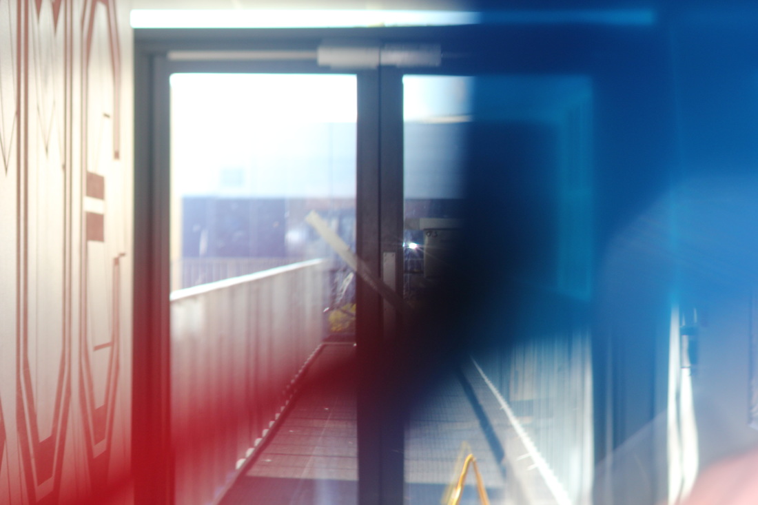
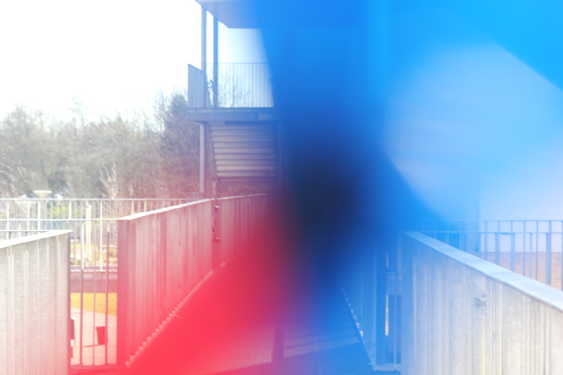
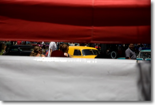
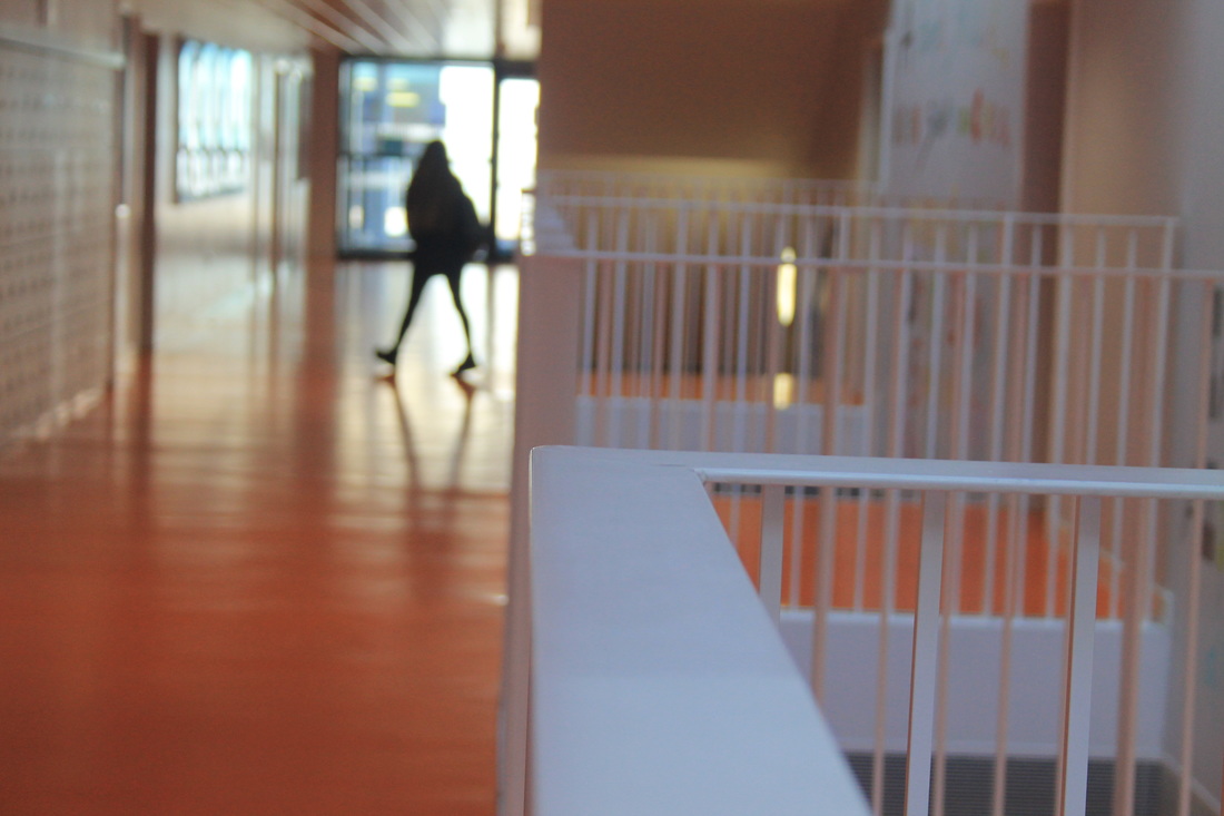
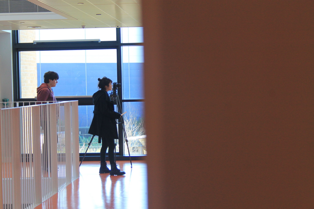
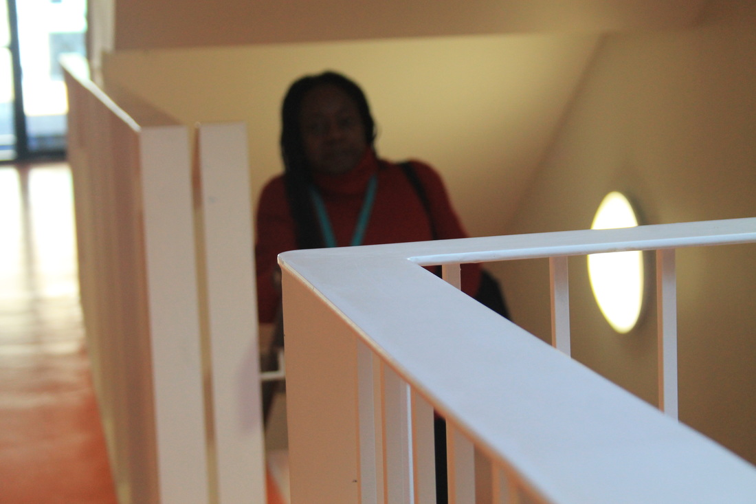
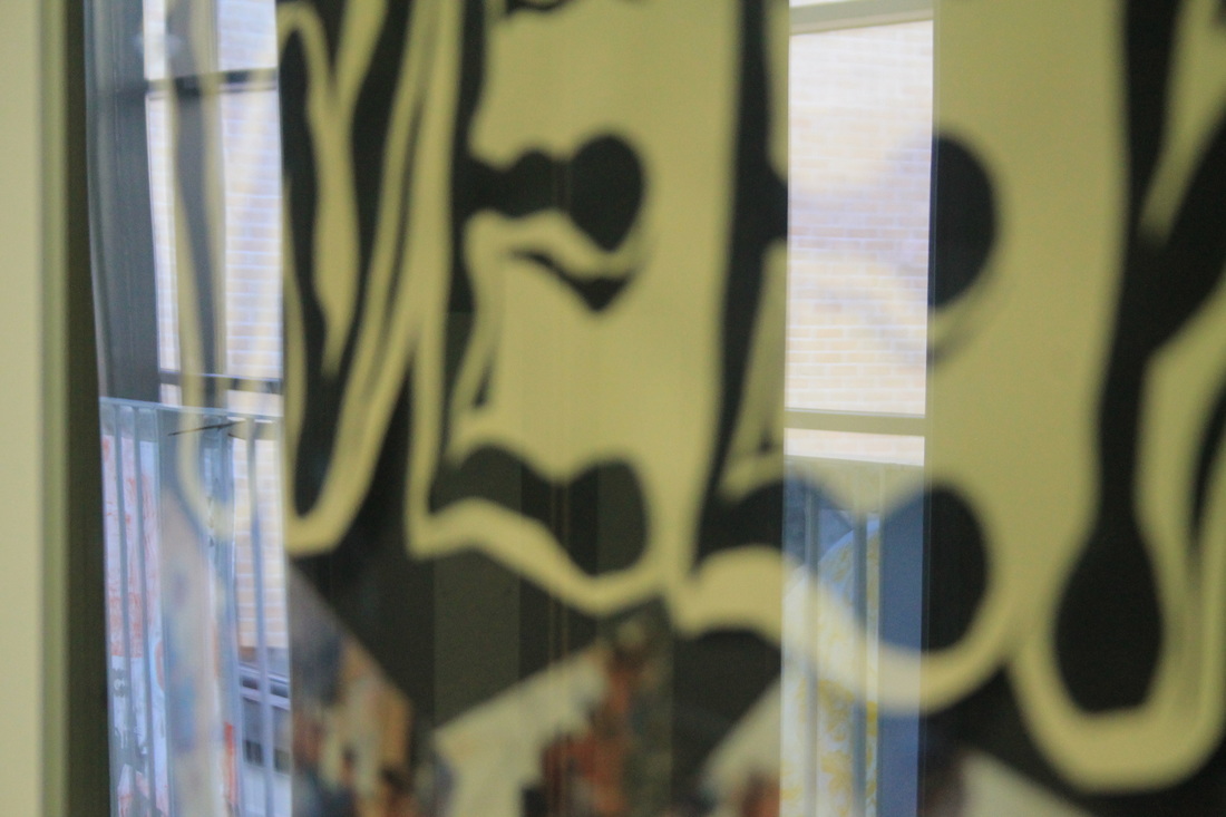
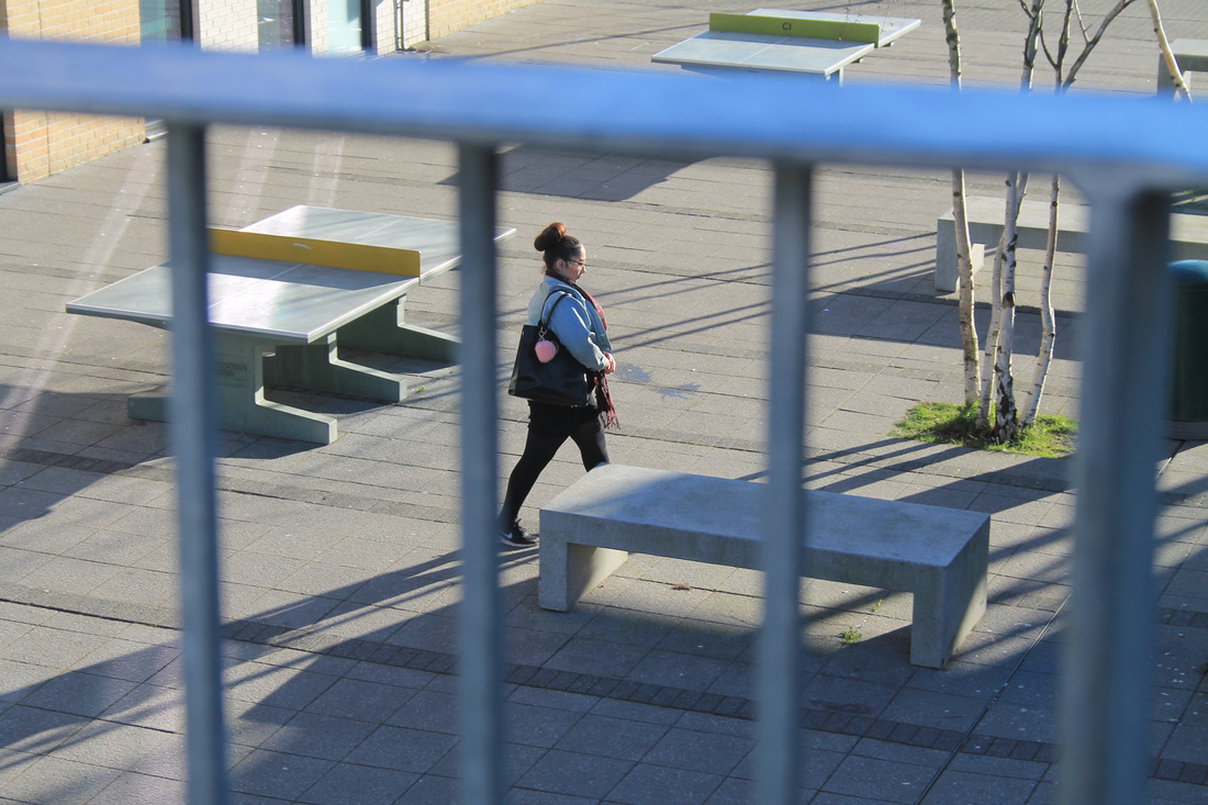
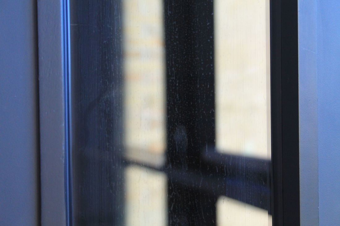
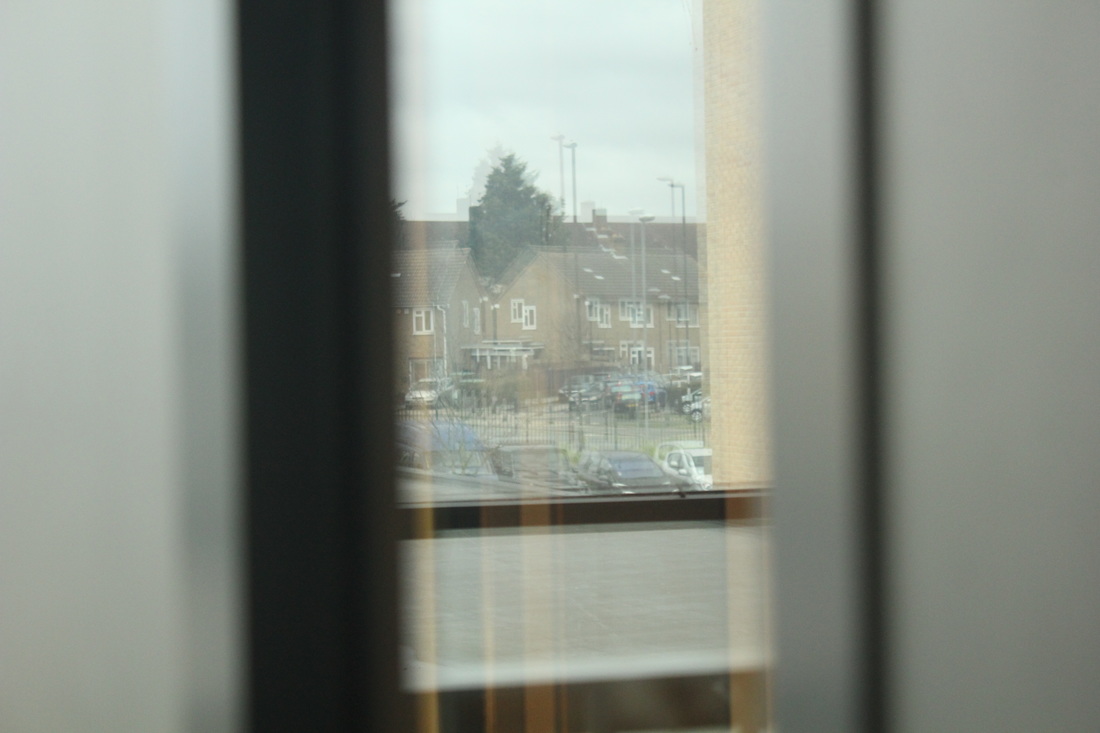
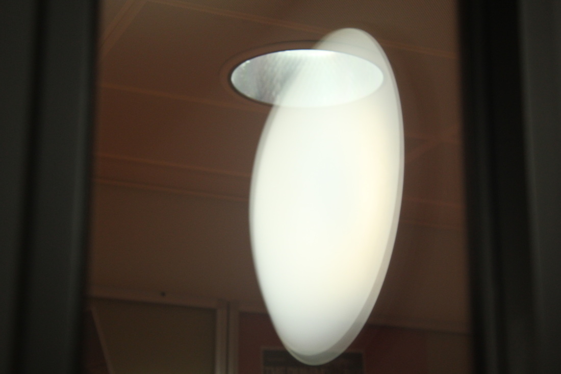
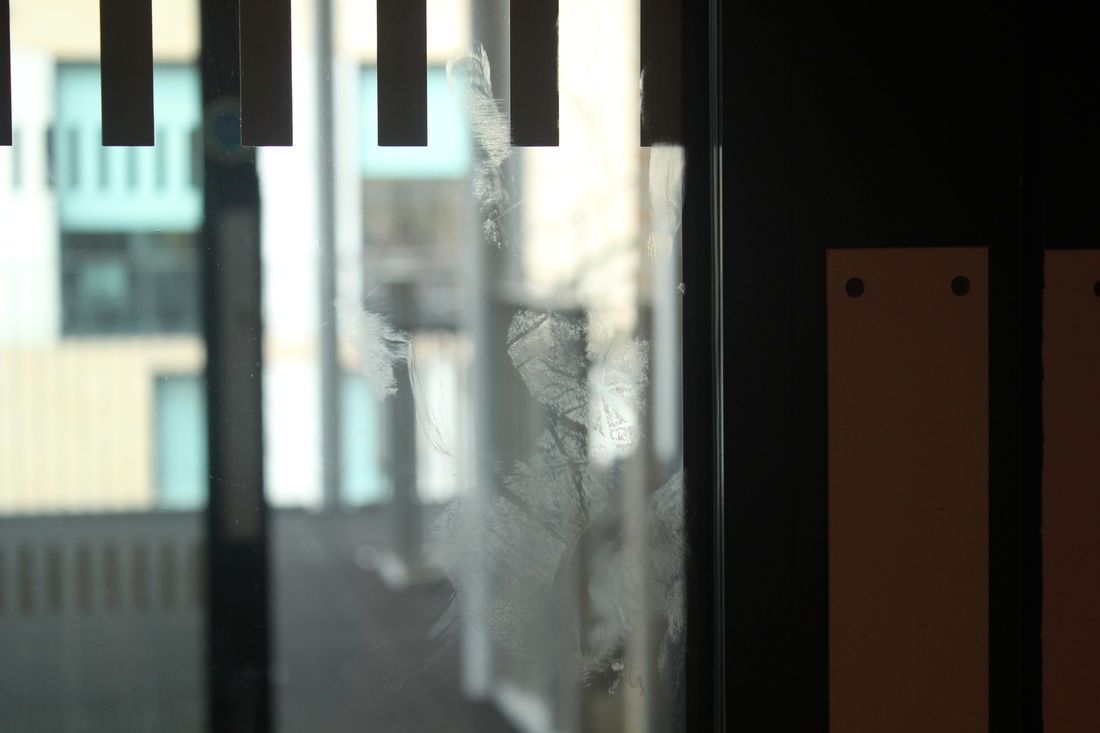
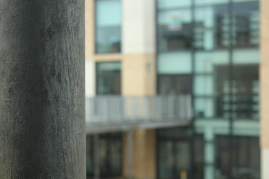
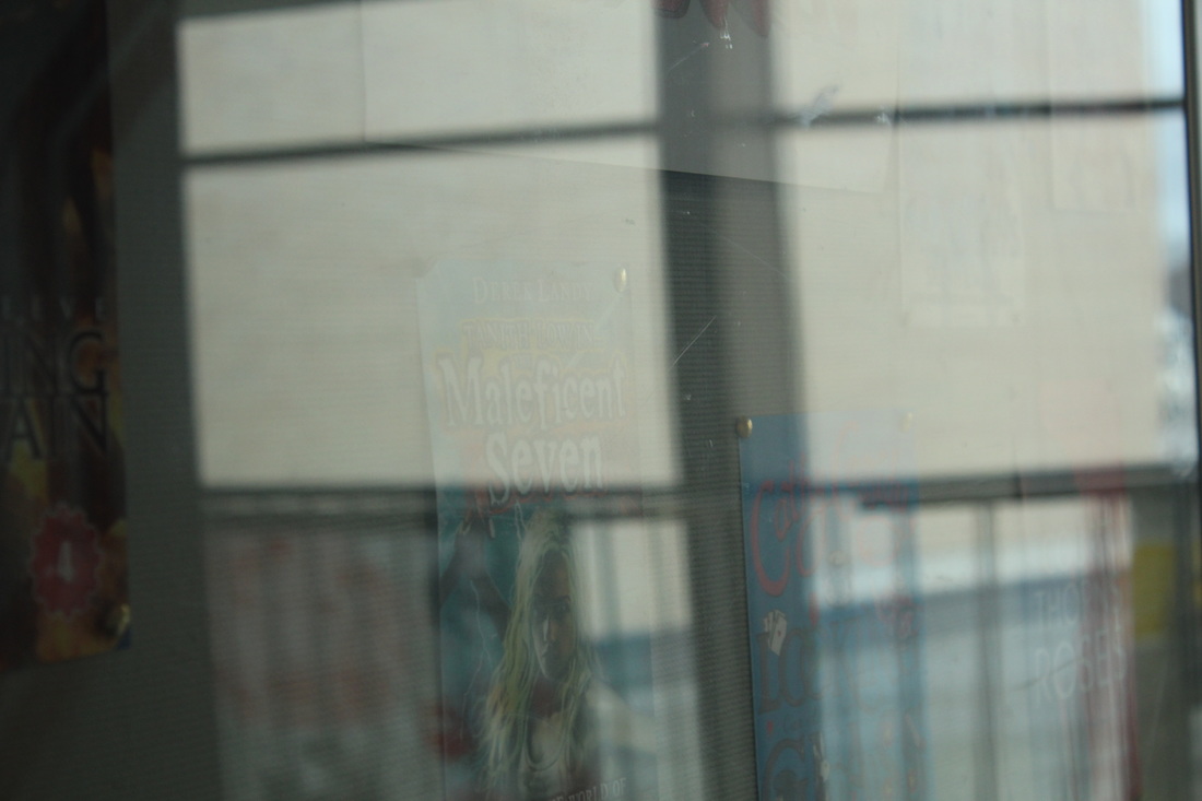
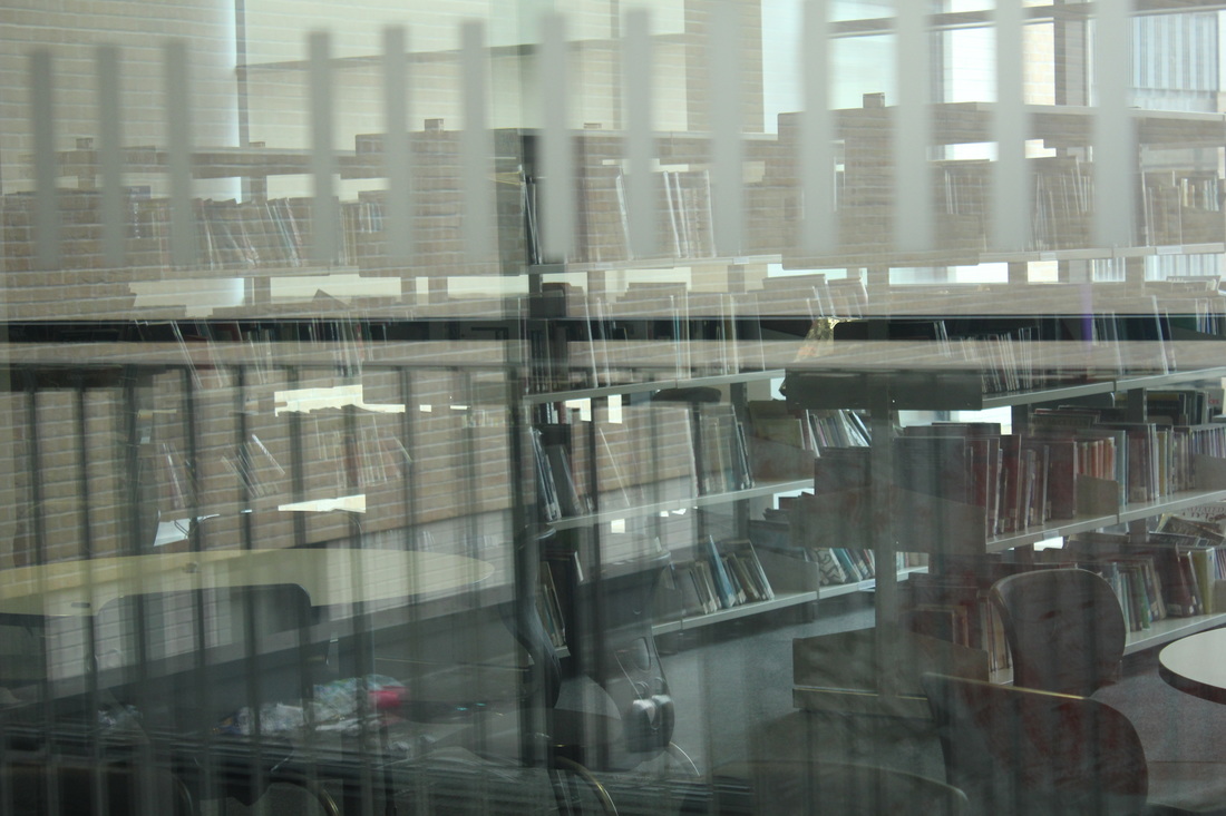
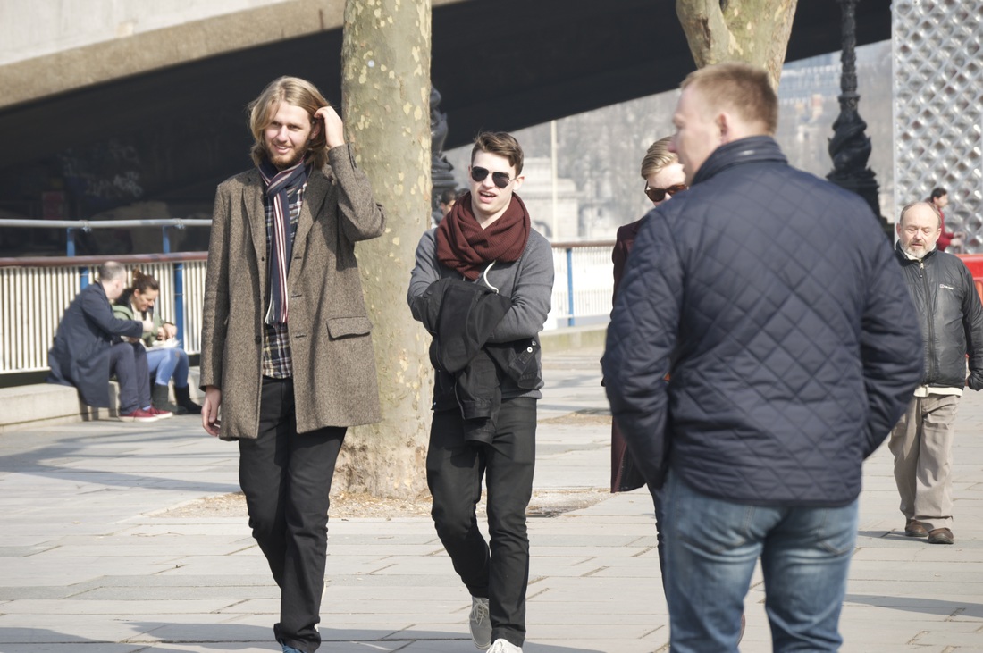
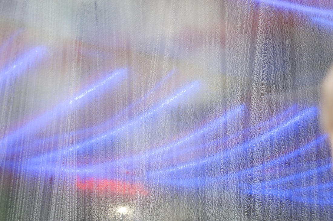
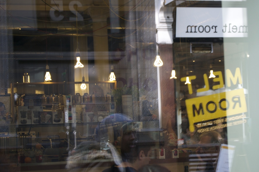
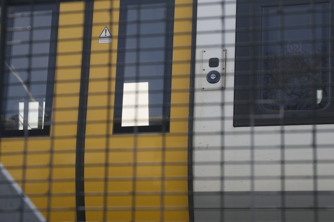
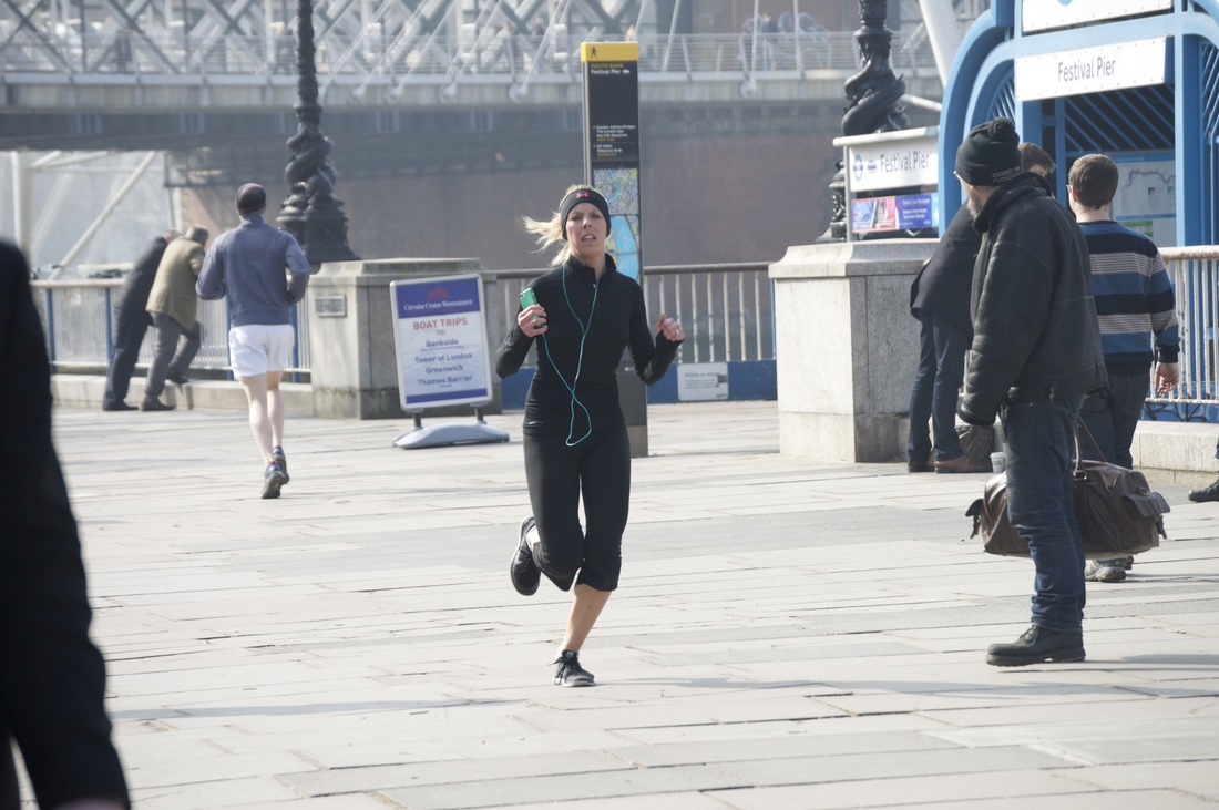
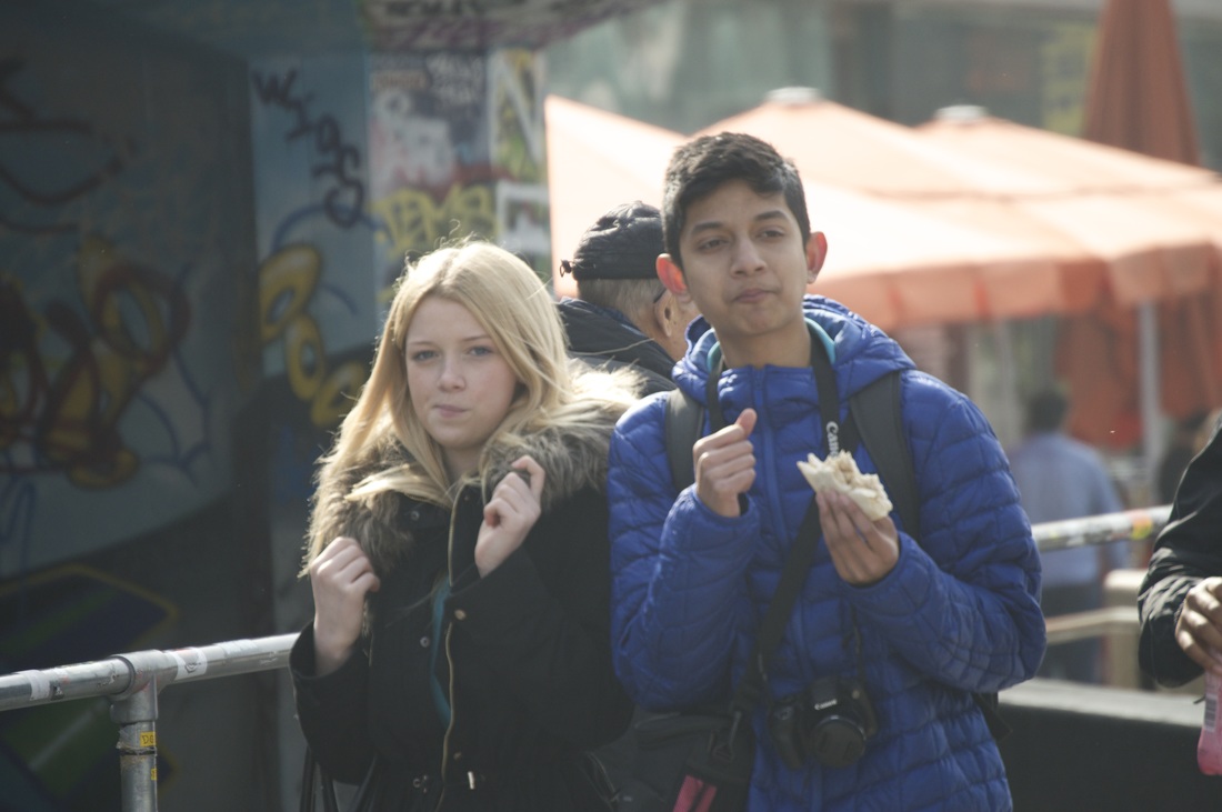
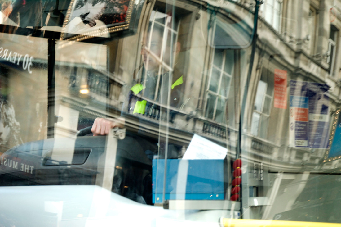
March 2016 Saul Leiter trip
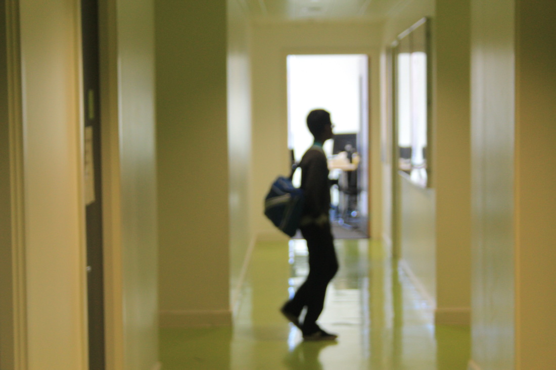
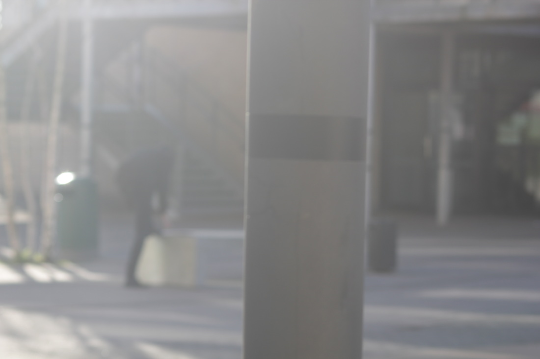
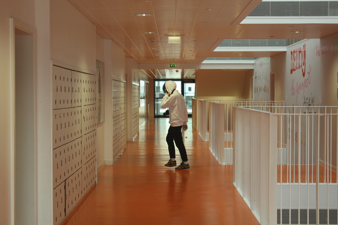
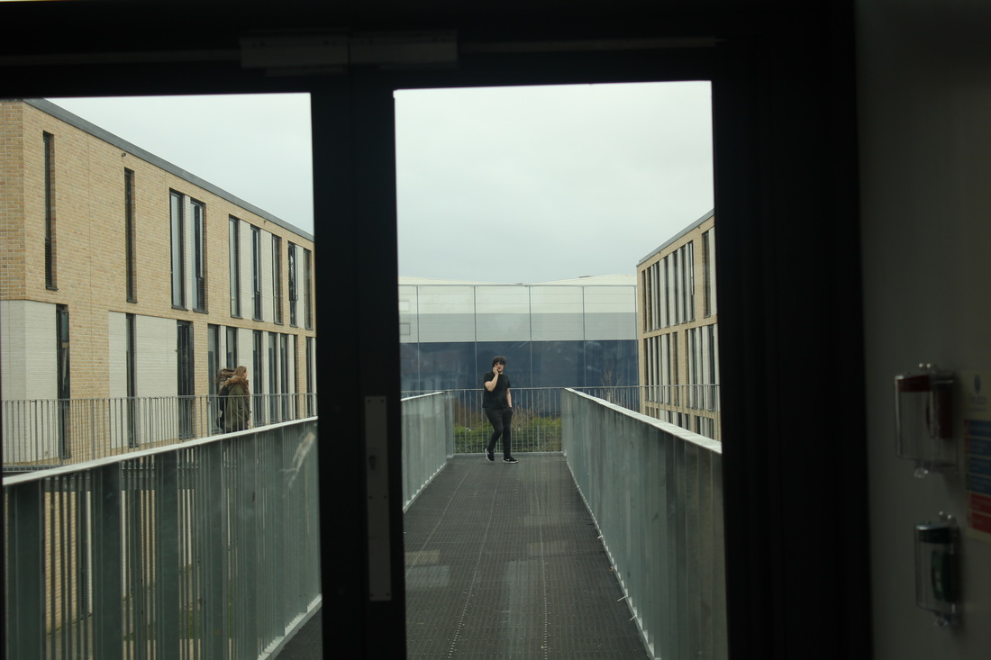
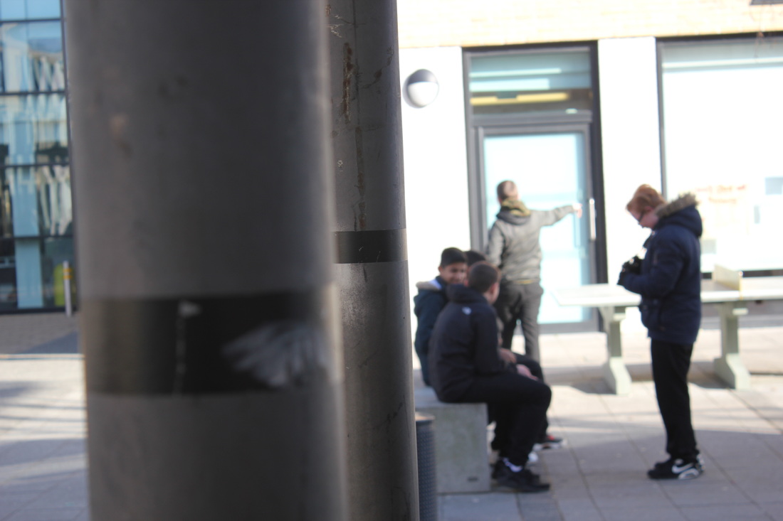
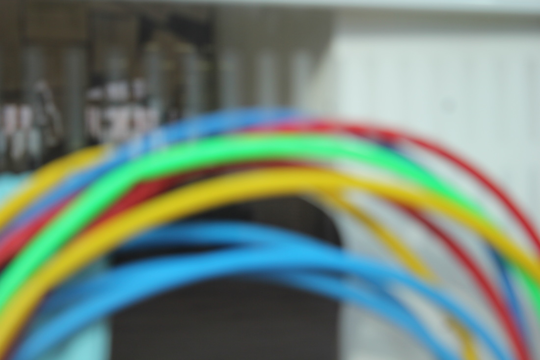
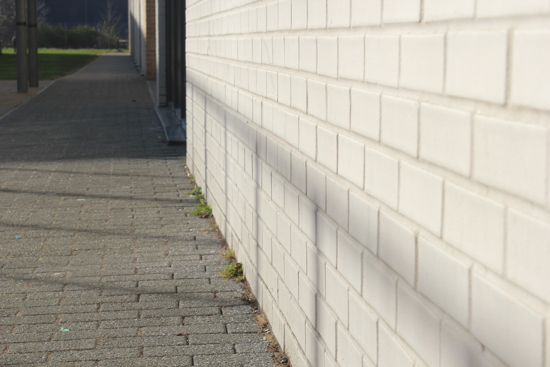
In this set of pictures I focused on reflections as I believed this was my strongest point and I would succeed more in it. I also did some street photography as Saul Leiter liked to combine his abstract photography with street photography too and all pictures are abstract so I very much liked experimenting joining the two together.
Overall I am quite happy with these pictures, however I think that I need to work some more on joining abstraction photography with street photography because even though all pictures are abstract I wanted them to look more abstract and I didn't want people to know what I was taking pictures of.
Evaluation
I really enjoyed visiting the photographers gallery in London and see more of Saul Leiter's work as it gave me some more ideas as to what photographs I was going to take during the day,it was also interesting to look at his painting as well as his photographs because I could see how his paintings influenced his photographs.During our time in the gallery we were able to write down some key features that helped us work out what we needed in our photographs for them to resemble Saul Leiter's photographs for example the texture and complimentary colours he used to make his work effective, this really helped me work out what I needed to do to make my photographs better.We also made some light and dark drawings to see whether there was more light or not, this really helped me too as I was able to see how much light I needed.
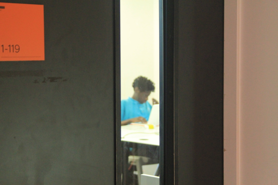
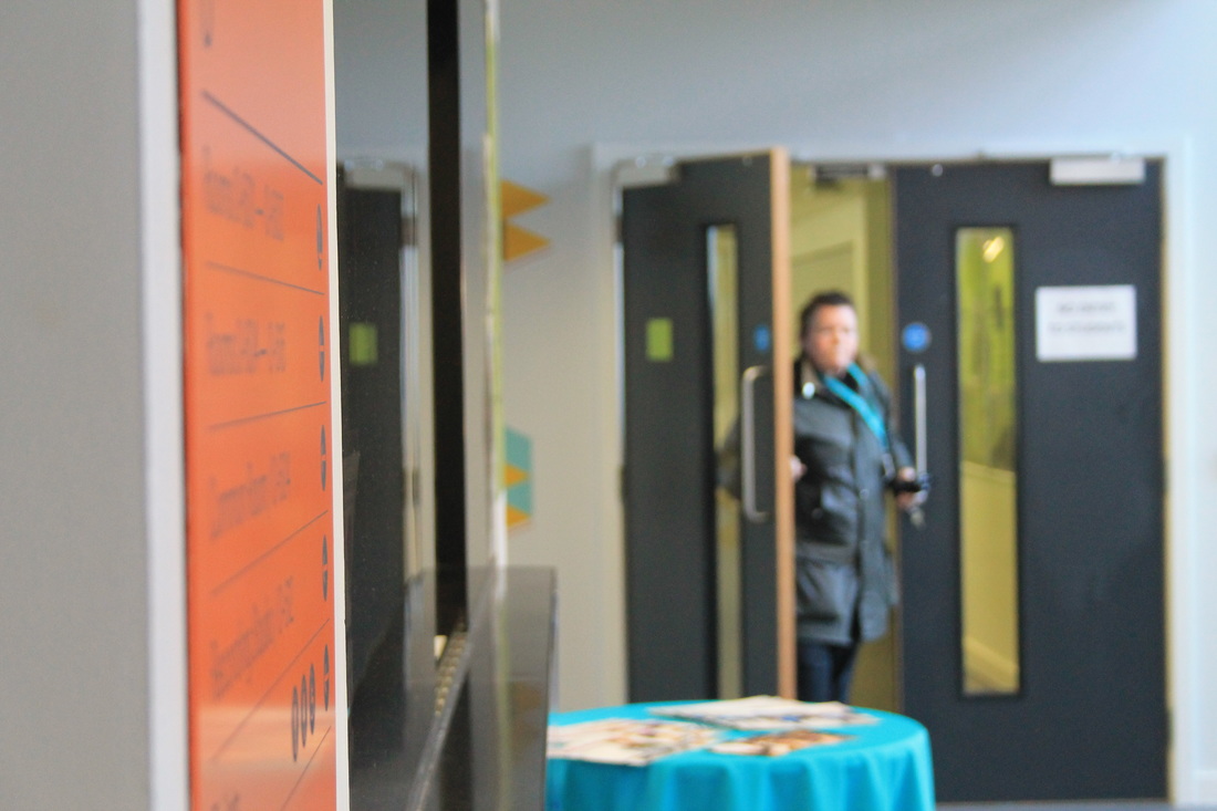
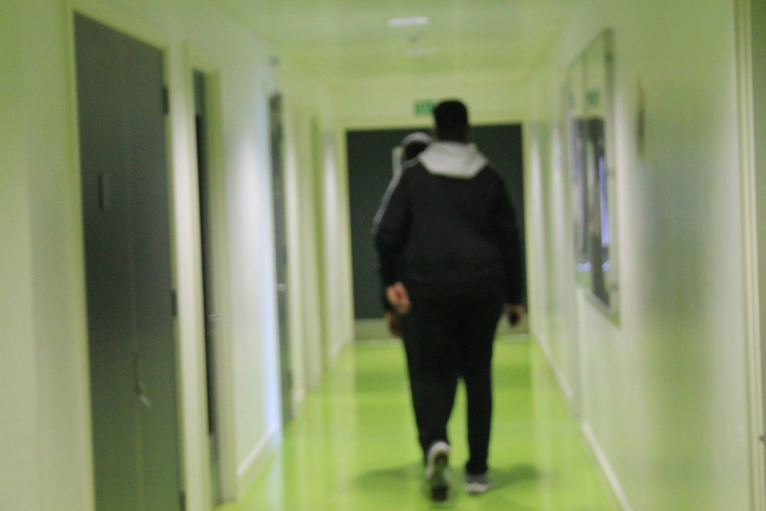
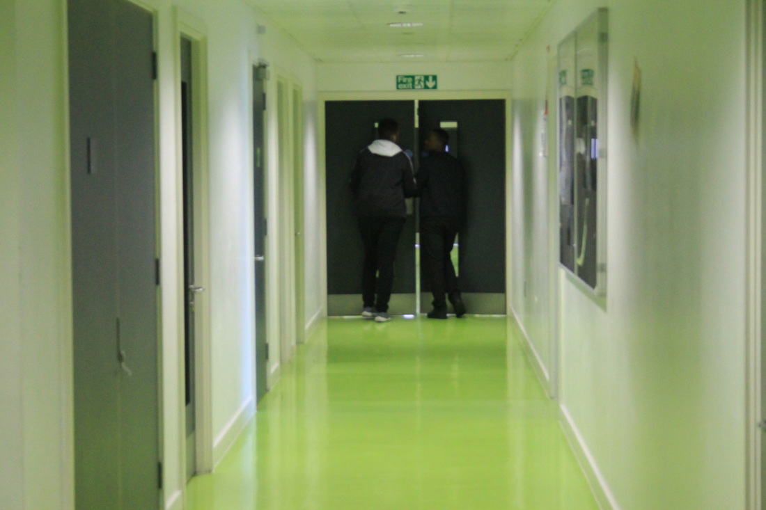
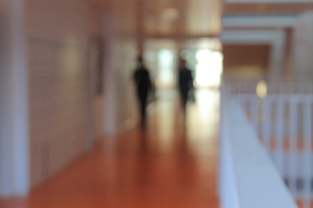
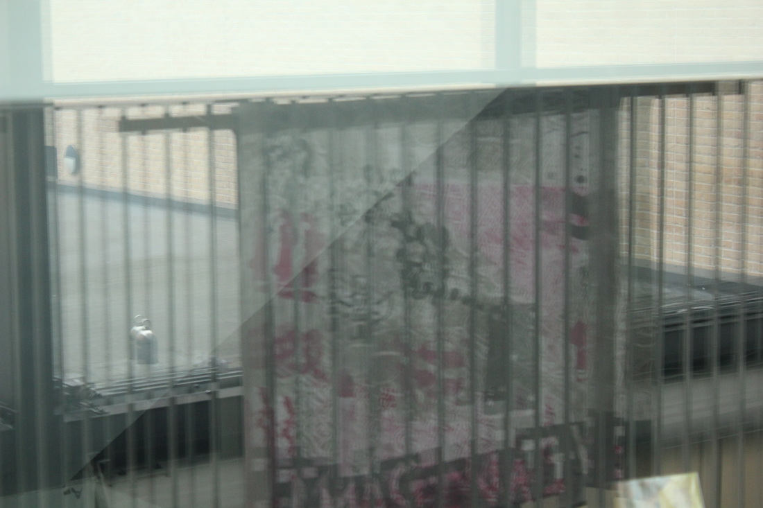
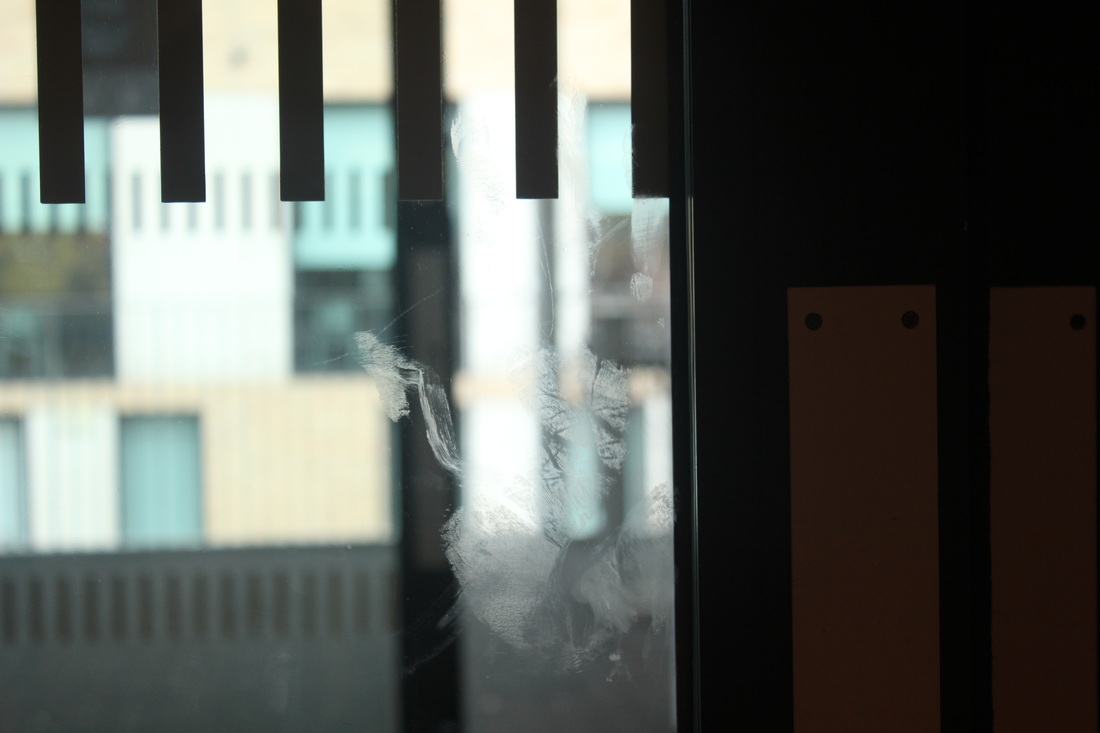
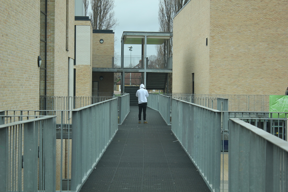
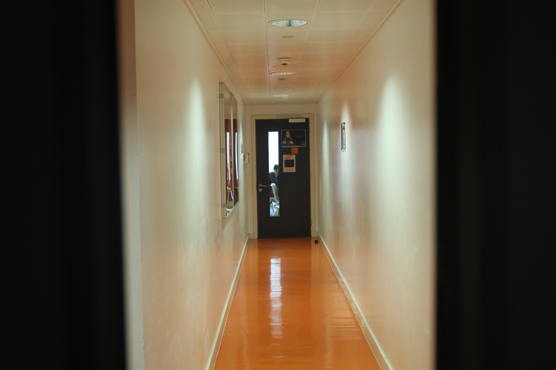
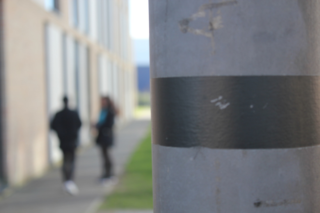
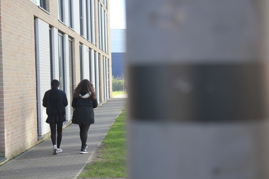
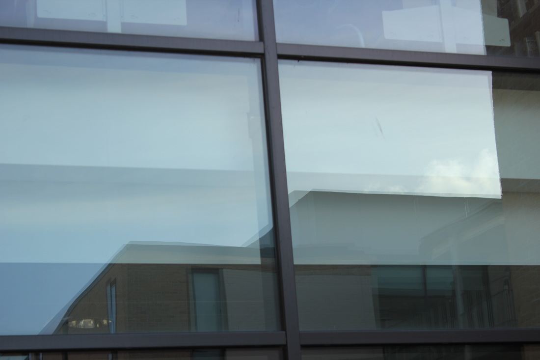
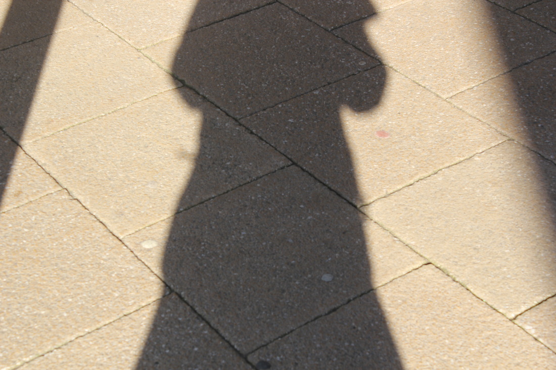
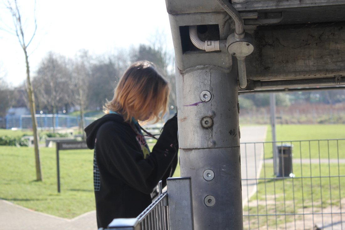
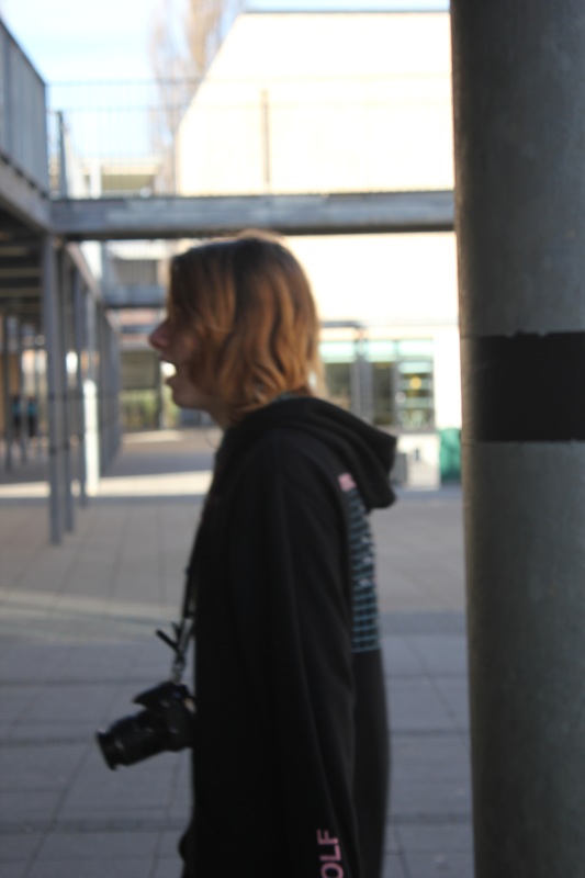
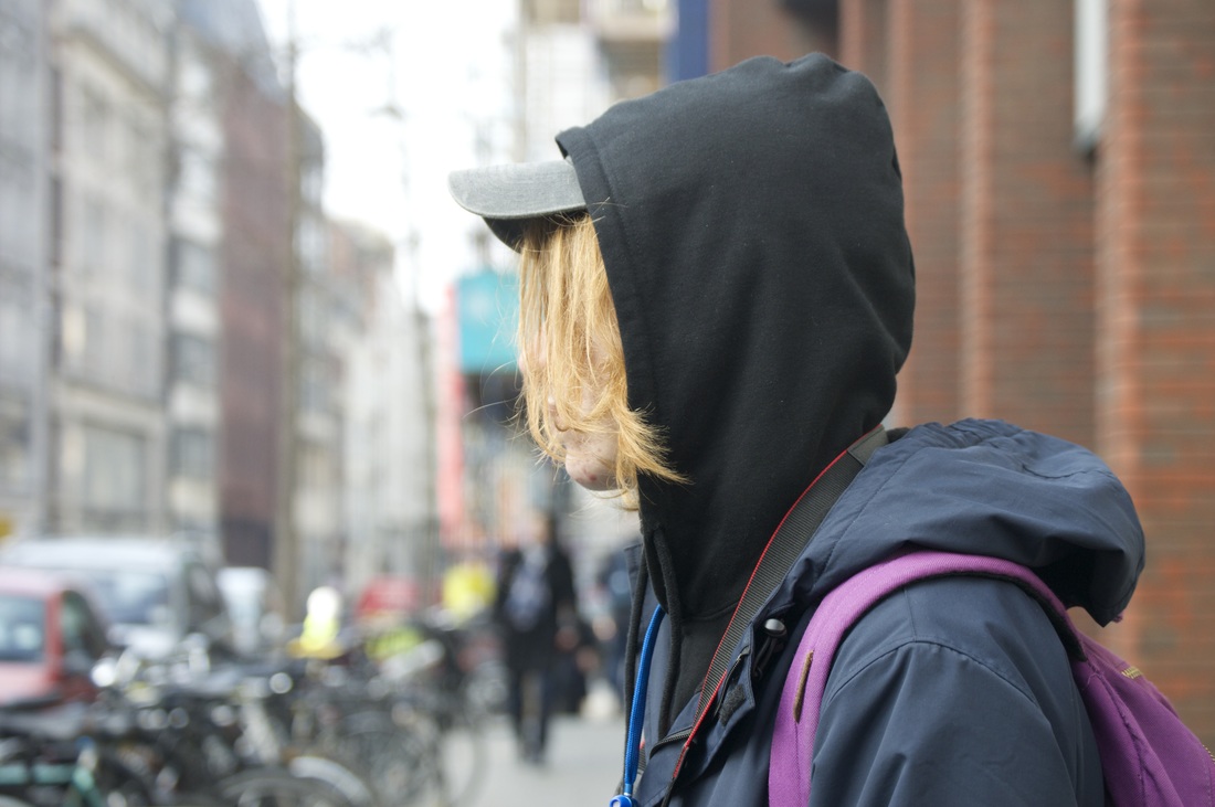
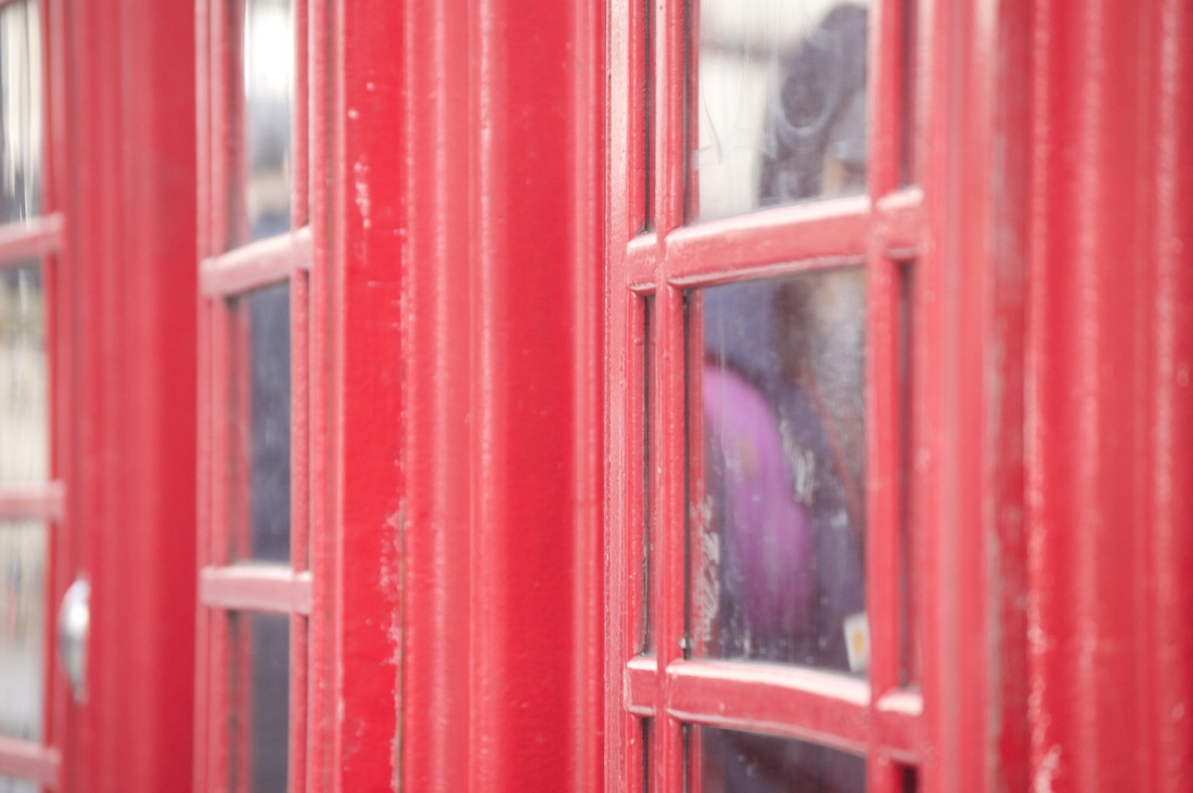
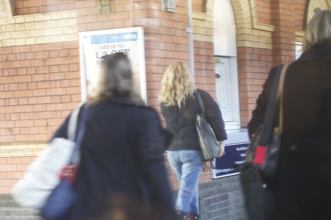
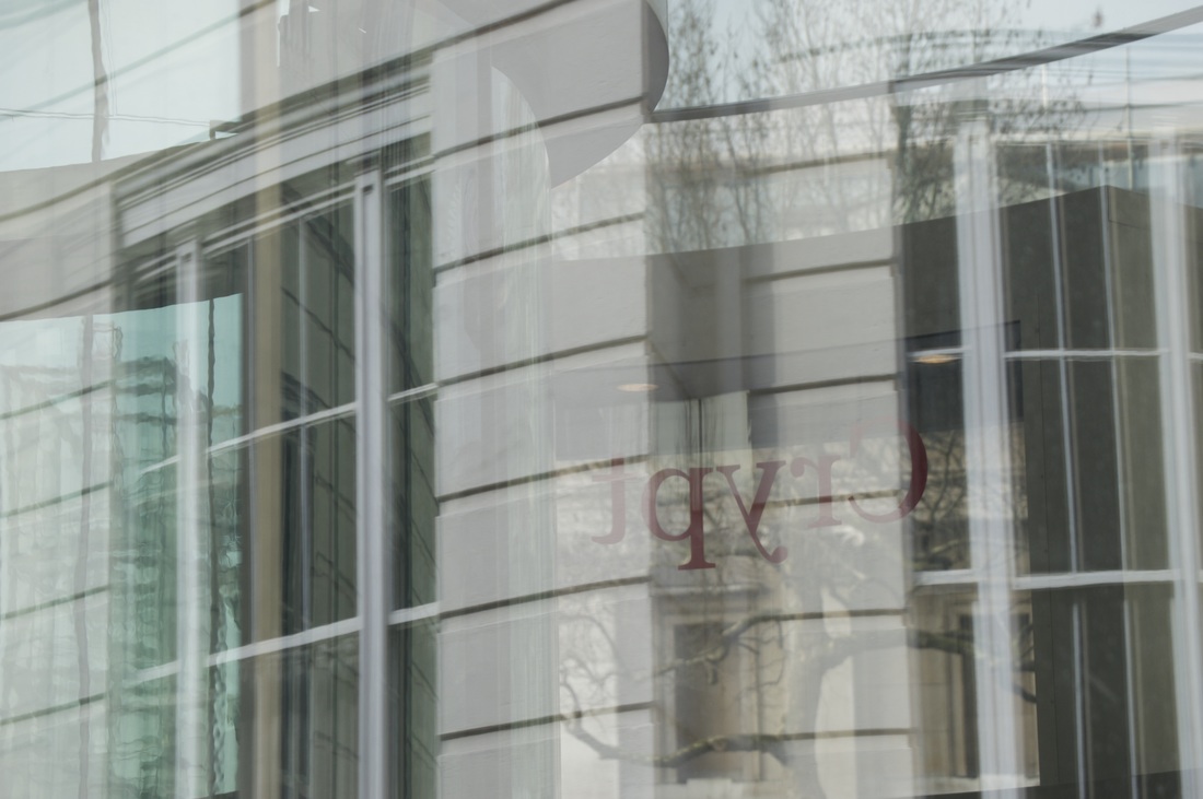
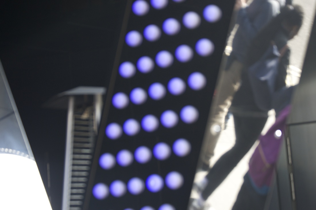
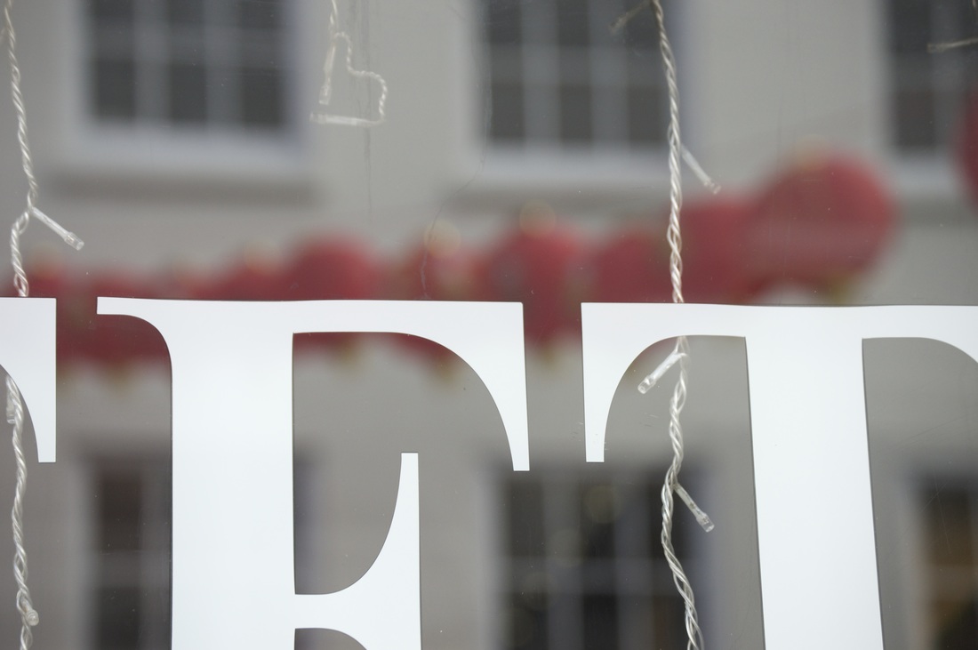
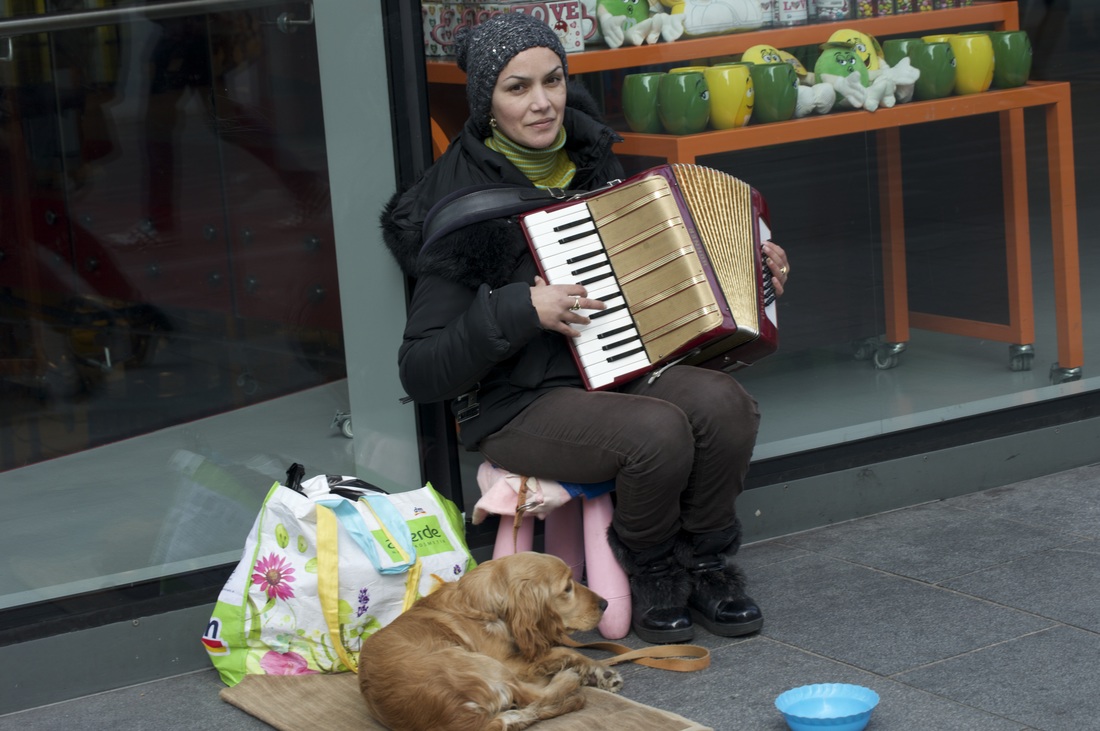
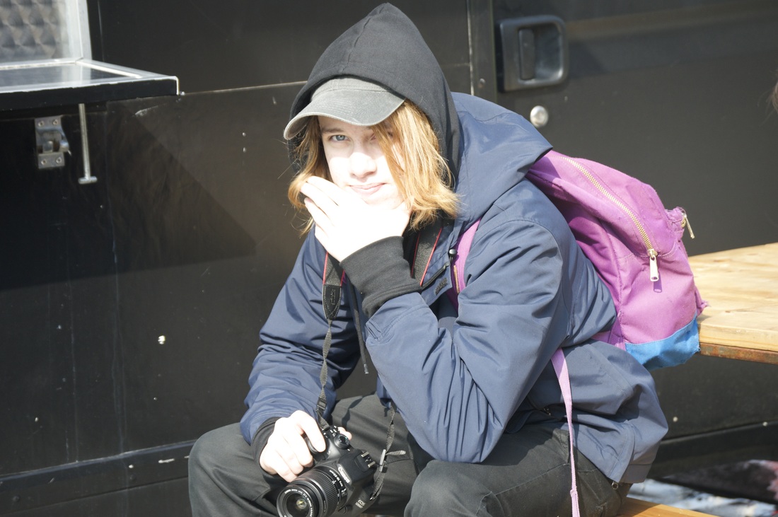
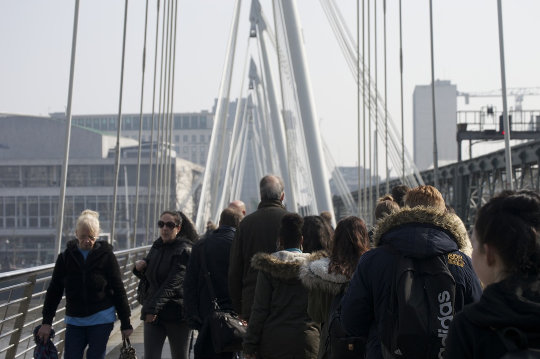
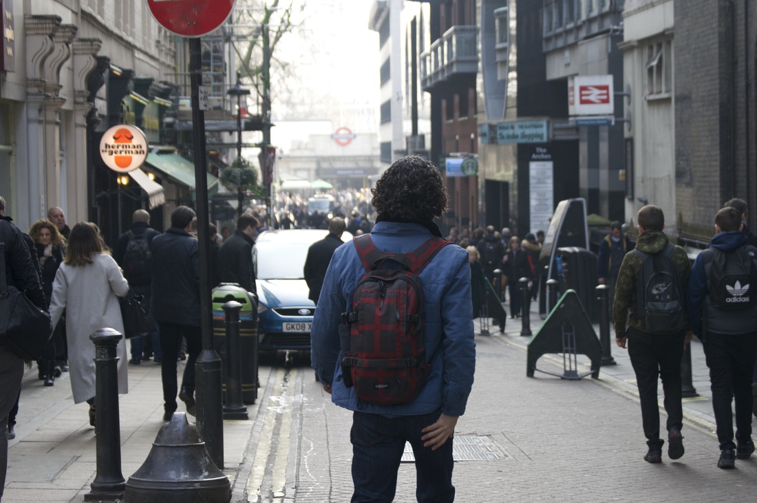
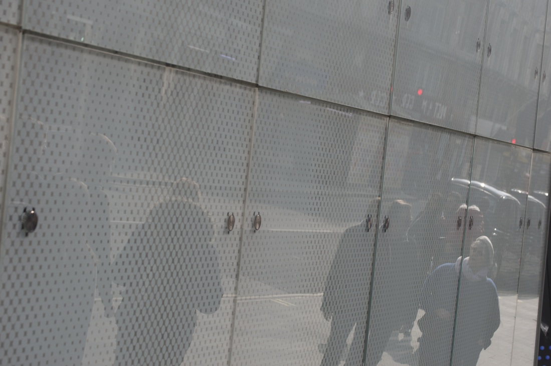
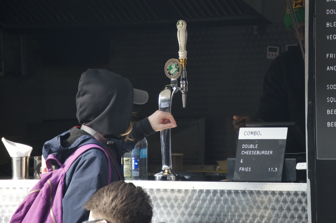
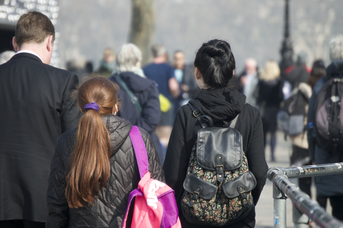
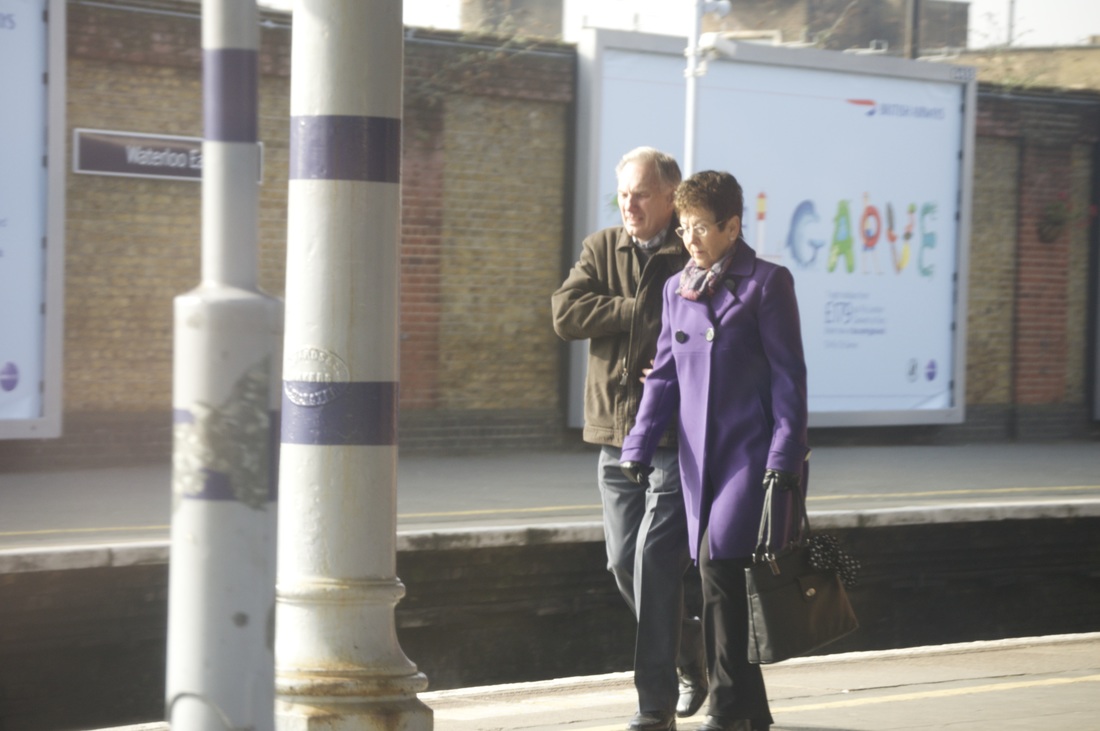
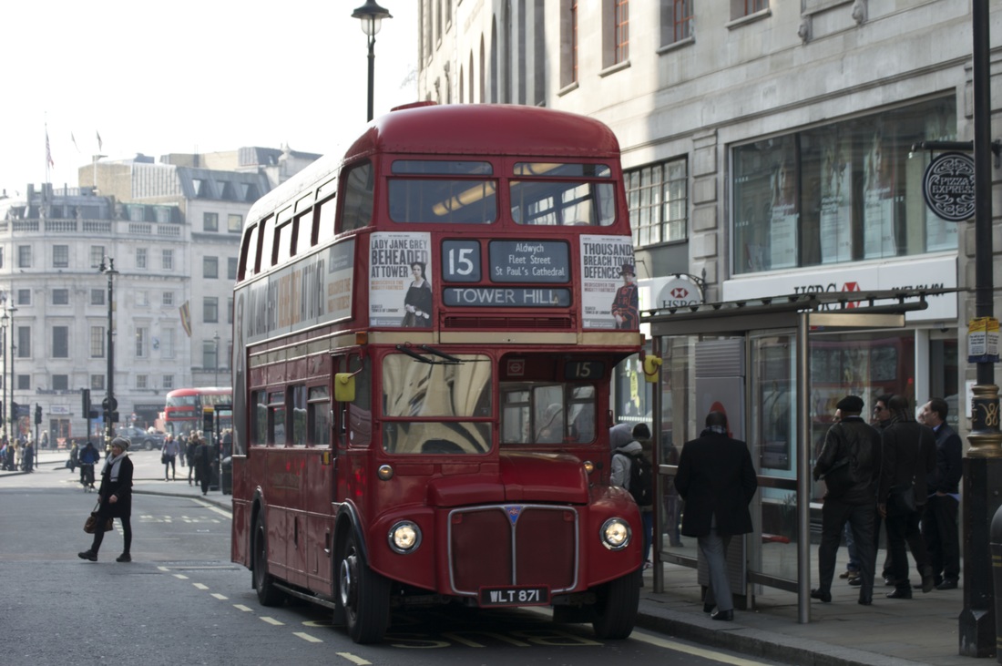
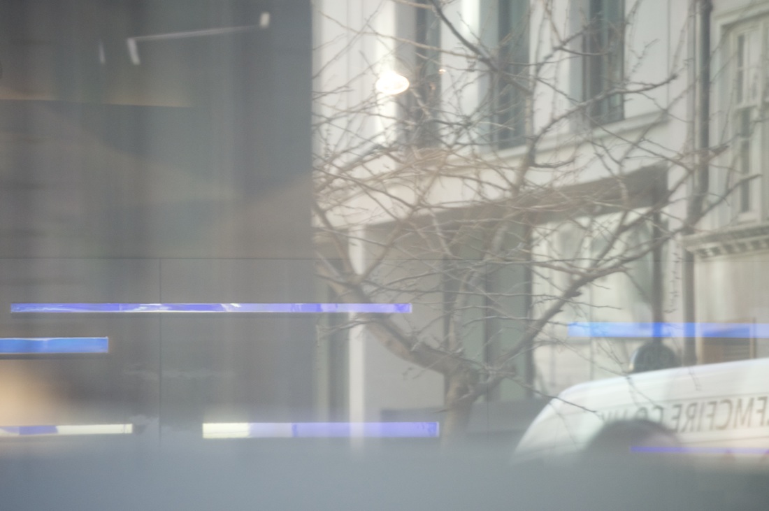
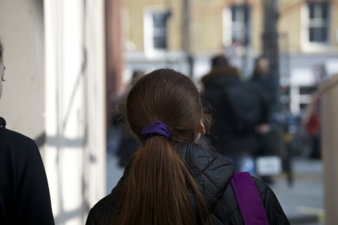
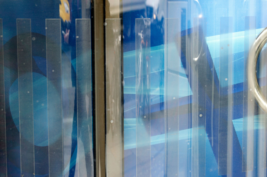
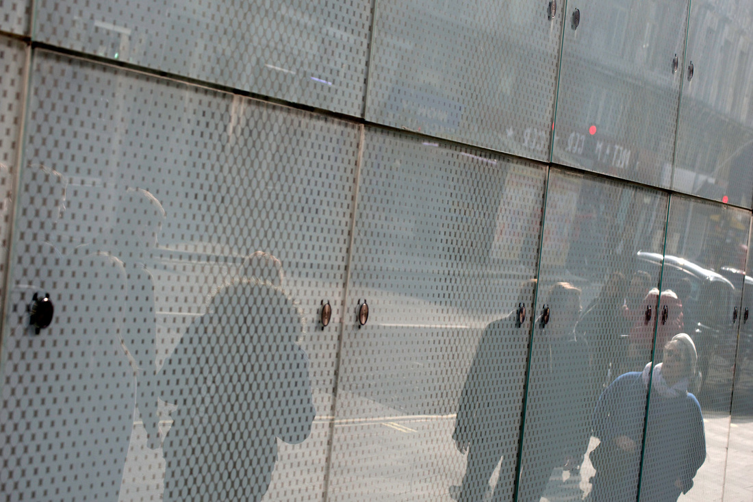
during our trip we were able to take many pictures in places like Soho and we were able to have a lot of time in Southbank to take pictures which were inspired on Saul Leiter's photography. I used my own camera which is a nikon D3200 with a 55-200mm lens.I concentrated mostly on reflections but also some street photography as Saul Leiter did sometimes do some street photography, however I attempted to have a few patterns, for example, I did over the shoulder type of photographs where we couldn't see there faces and I made sure we could see a lot of what was in front of them but in shallow focus so only they were in focus so it can give a sense of mystery as we don't know for sure what is behind them and this could make the picture "abstract".I also did lots of reflection photographs which were my personal favourites as they resembled Saul Leiter's work the most.
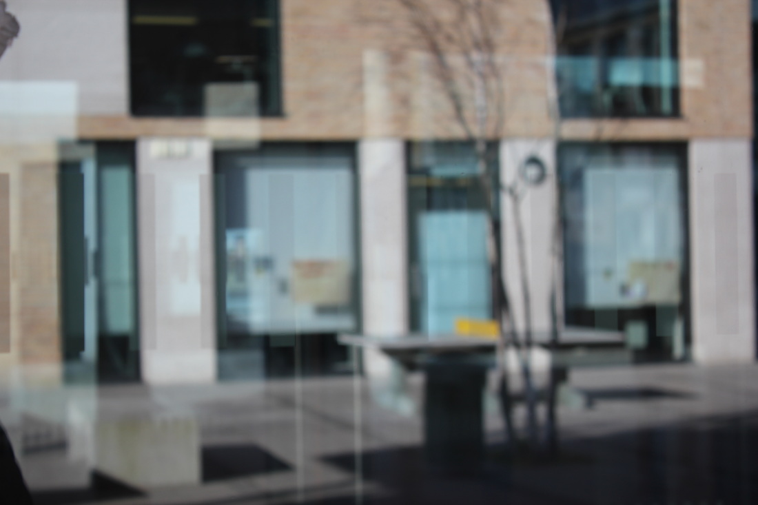
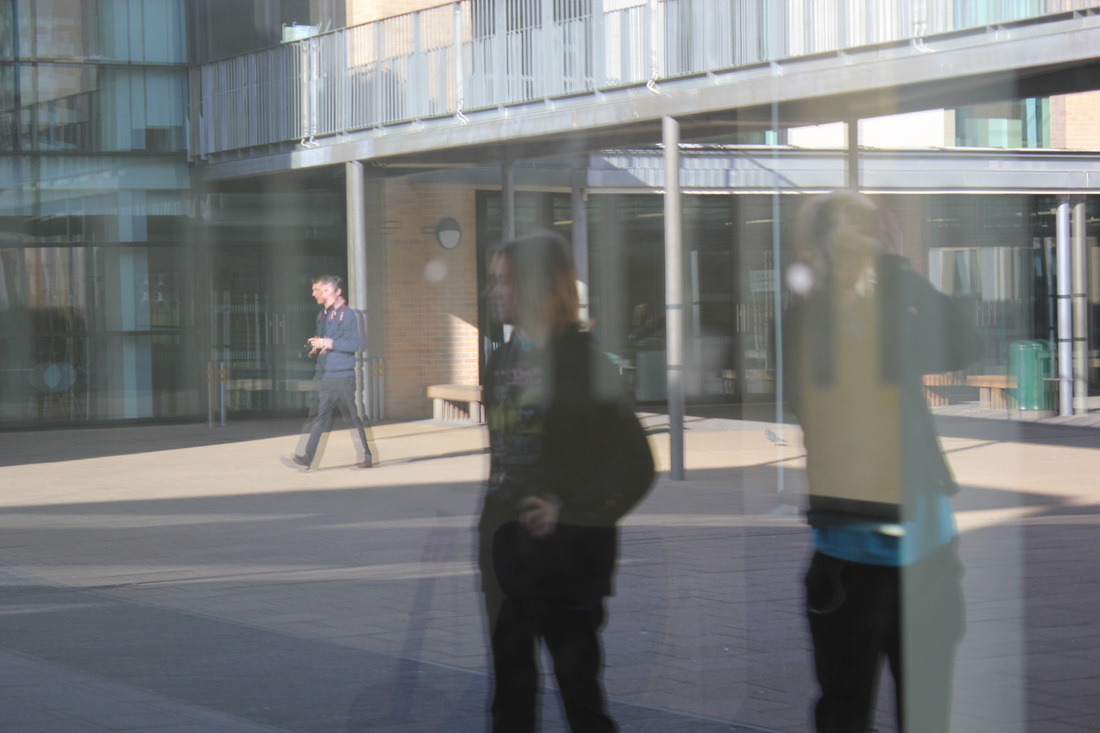
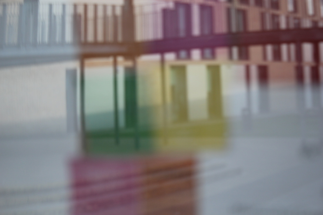
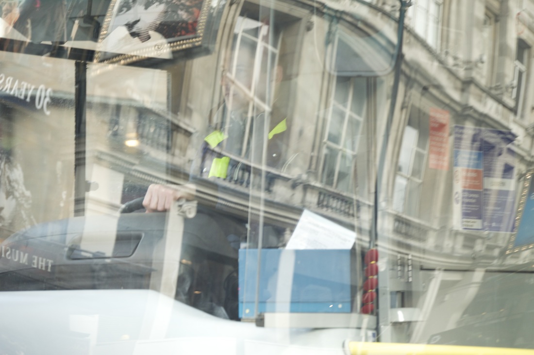
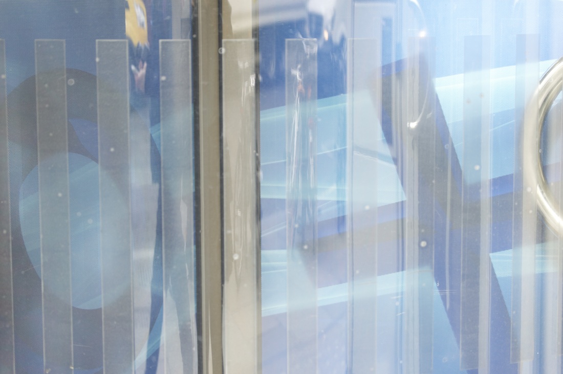
Overall I am quite pleased with the photographs I have taken. especially the 3 below which I have chosen to be my final piece, the fact that they are all reflections and quite abstract (especially the last one) makes it more interesting to look at. I slightly edited these photographs on photoshop to make them better and more effective, I sharpened them a little so that we were able to see the line more, cropped them if need be so they were more aligned and centred and added some contrast so the colours popped out some more.
during our trip we were able to take many pictures in places like Soho and we were able to have a lot of time in Southbank to take pictures which were inspired on Saul Leiter's photography. I used my own camera which is a nikon D3200 with a 55-200mm lens.I concentrated mostly on reflections but also some street photography as Saul Leiter did sometimes do some street photography, however I attempted to have a few patterns, for example, I did over the shoulder type of photographs where we couldn't see there faces and I made sure we could see a lot of what was in front of them but in shallow focus so only they were in focus so it can give a sense of mystery as we don't know for sure what is behind them and this could make the picture "abstract".I also did lots of reflection photographs which were my personal favourites as they resembled Saul Leiter's work the most.
Overall I am quite pleased with the photographs I have taken. especially the 3 below which I have chosen to be my final piece, the fact that they are all reflections and quite abstract (especially the last one) makes it more interesting to look at. I slightly edited these photographs on photoshop to make them better and more effective, I sharpened them a little so that we were able to see the line more, cropped them if need be so they were more aligned and centred and added some contrast so the colours popped out some more.
final outcome:
|
